Receive a presentation of services and expert advice
The best experts in the industry will oversee your brand development process.
→ Need branding, design, or creative solutions? Call us at +48 505 648 022 or message us on WhatsApp.
 WeLoveBrands.pptx

The best experts in the industry will oversee your brand development process.
Even if the names of popular brands weren't included in a logo, I believe most people on the planet could identify the brand it represents by its graphic symbol. Wherever we go, these symbols accompany us throughout our lives. They are ingrained in our culture and way of life. Yes, you heard that right: the logos of famous brands influence our decisions, communicate the company's values, and are often full of meaning. And if even the global recognition and recognizability of your residential complex still haven't convinced you to create your own logo, below are four more compelling arguments.
 Identifies. You might have watched old Westerns and remember how cowboys, when bringing cattle to the farm, branded them, as if confirming ownership. A residential complex logo conveys the same idea – it confirms that the property belongs to the brand. Displayed on all branded printed materials, it communicates the identity of your residential property and the benefits you offer to potential homebuyers. Before starting logo design, you need to fully immerse yourself in the environment in which the logo will exist. Learn everything about competing brands, what their logos look like, and what you need to do to make your logo instantly stand out from the competition.
 Invites potential audiences to explore your brand. Our world is far from monochromatic. People appreciate interesting design ideas and new color schemes. The logo that represents your brand is designed to pique the curiosity of your potential audience. The role of designers is not simply to create something beautiful. It's important to remember that we're not talking about art here, but rather a strategic business tool that will help identify your residential complex in a wider world.
 It will make it easier to tell the company's story and connect with consumers. When combined with a sound marketing strategy, a logo will evoke the desired emotions in consumers, leading to the desired action. The good news is that a graphic symbol doesn't have to be overly complex or expensive. Therefore, there's no reason why a residential complex can't have a good logo.
 A logo shapes audience expectations . And here, we must understand the full scope of responsibility. What will a potential buyer think when looking at your residential complex logo? Is it too corporate? Fun? Expensive? Radical? The logo and its associated corporate identity must fully convey the brand's message to the target audience.
After you finish reading this article, you'll be ready to begin searching for a branding agency or freelance designer to develop a logo design that will represent your residential complex. Create a creative brief to guide the development process and help you choose the right style: simple, vintage, elegant, high-end, luxurious, or modern? Have you decided on a style? Begin the design process.
 Still don't know the name of your apartment complex? Decide on one.
Choosing a name for a residential complex should be entrusted to a branding agency or namers. It's important to consider the overall brand strategy rather than satisfying personal ambitions. Of course, classic formulas can be applied here:
 Last name + property = name
 Your name + names of partners + property = title
... and get the unremarkable name of one residential complex.

Or a name developed by a team of specialists can become part of a strong marketing campaign.
 Do you want a slogan included in your logo? Should you use a slogan in your logo?
If you do decide to go with this, make sure it fits harmoniously with the logo. Including a long sentence and visually ruining the design due to imbalance isn't what you're aiming for. There's a perfect solution: create two versions of the tagline: use the shorter version in the logo and the longer one on other branding assets.
 Think about the color scheme.
Logo color scheme. What could be simpler? – you'll smile. But we're not talking about your favorite color here; you need to consider your industry, key competitors, and potential audience. Each color carries its own meaning, so it's important to ensure the color scheme aligns with your company's values and positions it appropriately.
The meaning of flowers
 Blue: logic, completeness, stability
 Turquoise: independence, loyalty
 Purple: luxury, luxe, wealth, success
 Green: desire for everything natural, youth, freshness, health
 Pink: frivolity, youth, sweetness
 Red: passion, confidence, energy, ambition
 Yellow: happiness, optimism, summer, friendliness
 Orange: passion, creativity, joy Gray: strength, maturity, formality
 Select a graphic symbol
At this stage, decide whether your logo will be text-based or include a graphic image. The advantage of a graphic image is that it can be used over time without text. The chosen graphic can either seamlessly integrate into the logo or simply detract from it. If you decide to use a graphic, the designer has many creative options: choose an abstract design or something more specific to your industry. There are two common mistakes made by designers and apartment complex owners: an overly cluttered image or one that's too literal. The graphic shouldn't be generic or look like clip art.


 Check out the available font options.
Choosing a font is a crucial decision that influences the perception of a residential complex. Each font tells its own story. For example, if your residential complex is modern and striving for growth, a sans-serif font is ideal. If you strive for a timeless classic look and honor tradition, then a serif font is a better choice. The name of the residential complex should harmonize with the slogan font and not clash.
So, let's talk about color schemes. According to statistics conducted by marketers at the University of California, color increases brand recognition by up to 80%. Did you immediately think of Home Depot, Target, and T-Mobile with their unusual shades of orange, red, and pink? How can you create a unique color scheme for an apartment complex logo? Do you already have some favorites? Then consider how they align with your brand's keywords. To determine your color scheme, create a list of keywords (adjectives) that describe the company and its mission.
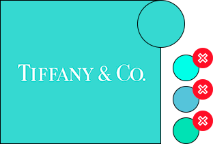
Remember, consistency is key to creating a recognizable brand. Let me explain: Tiffany's doesn't use different shades of blue—they use the same shade over and over again. So, a residential brand should be thought of as a system or an equation, where you plug in values and get the correct answer. This system will take shape as you add visuals.
The power of fonts . The right font (the phrase is no accident) can do a lot for your brand. It will give the logo its core meaning and purpose. Choosing a font for a residential complex logo is no easy task, as there are thousands of options. It's best to limit it to three: one for the headline, one for the subheadline, and one for the body text. More than three variations will create chaos, which is difficult to incorporate into content marketing.
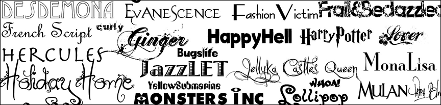
Here we'll look at several categories of fonts and how they reflect brand identity.
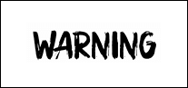
This group includes highly stylized and creative fonts. Typically protected by copyright, these include fonts such as Disney, Lego, and Toys R' Us. Here are four decorative fonts to consider if you want to showcase your brand's originality:
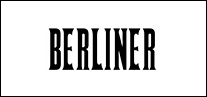
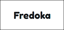
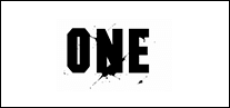
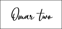
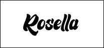
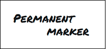
Want a casual way to choose a font for your residential property logo? A handwritten font will help make it recognizable. Here are four options you can consider:

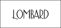
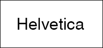
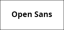
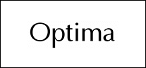
Simplicity and minimalism embody a modern and elegant style, making it easy to read even from a distance. Consider four font options that could be incorporated into your logo:

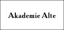
This font was created in the 15th century. It uses decorative stems at the ends of each letter, creating a sophisticated visual effect.
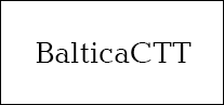
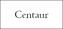
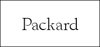
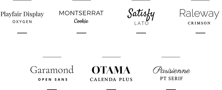
First, decide on the primary font for your residential complex's name. Of all the font options (and remember, a logo can only combine a maximum of three), this should be the most attractive. The other options should be significantly thinner. Alternatively, you can combine different versions of the same font. Focus your search on fonts that share common qualities: proportion, structure, etc. Even if they belong to different groups, their shared qualities will create a cohesive logo. If you plan to include a graphic element, consider how the fonts will complement it. For example, if the graphic element is feminine and features swirls, it will pair well with loops and flourishes. If your logo features detailed, realistic graphics, they will work well with a thick, sans-serif font. And most importantly, don't settle for poor quality. You need a high-quality font that is legible at any size. The words on your logo should be clear and legible on any advertising medium: a banner, a business card, or a social media icon.
This is probably every other designer's favorite topic. At the beginning of this section, I want to emphasize that trends don't last forever, and neither does your brand. This year, abstract-style painted textures are particularly popular. And it's worth noting that most of these painted textures are truly beautiful. But if you choose them simply because you like them, this design won't last. And if you're creating a brand identity that fits a trend based solely on its popularity this year, remember that the trend will fade, and with it, your residential complex's logo and brand identity will also look outdated and unfashionable. Instead, you need to seek visuals and styles that will help establish a strong emotional connection with your potential audience.
If you're looking for inspiration, trends can be helpful. They'll give you a sense of where the market is heading (remember, we're talking about visual style and how to engage with a real audience). So, what I'm trying to say is that when searching for trending visuals, you need to maintain a healthy approach, because blindly following trends will make your visual style look like your competitors'.
Here are the main trends in logo design that define the modern approach:
3D gradients. A fusion of two well-known trends: gradient and 3D. Gradient is a great way to transform any group of colors into a vibrant and creative spectrum. Designers embracing this trend will delight us with the results of their exploration of the potential of gradients, combined with stunning 3D effects, shadows, and depths never before seen in logo design. It might look something like this.

80s Style. It seems the time has come for a comeback for 80s style. This year, all the trappings of those years will return: chrome, neon, lots of pixels. We'll also remember the old technology that preceded the glowing triangles and other geometric shapes that captivate us today. Why has this style become popular again? It's simple: people are once again collecting vinyl, cassettes, and game consoles. Logos in this style have a distinct aesthetic: bright, technical, and even a little glitchy. Incidentally, most logos created in this style are dedicated to the most important entertainment of the time: video games.
Rough logos. After neon signs, gradients, and video games, hand-drawn logos are taking over. They completely ignore the smooth, perfect visual effect made possible by the multitude of design programs. Logos in this style harken back to the days of sketching with a sketchbook and pencil, drawings featuring asymmetry, jagged lines, and shading techniques. This year, they will take on a more sketch-like appearance, as most modern brands strive to create an organic image. Incidentally, a brand that strives to establish itself as a company with principles and an emphasis on traditional values can easily use this style to showcase its individuality.
Ultra-fine lines. Digital media has left its mark on design this year like never before. Notice how designers have gone beyond the thin lines and created an effect that only works in the digital realm. The extreme level of detail creates a sense of complexity and even etherealness. This style has gone far beyond standard logo requirements. There are brands that operate exclusively online, and therefore, the limitations of print are not an issue for them. Three words that describe this style: modern, futuristic, and mysterious.
Bold typography. Logos created in this style elevate the text from simple phrases that merely enhance the graphics to the core focus. We present logos with bright and bold fonts, just like the companies they represent. The market demands a unique brand character, and this trend has become quite popular. Think of this style as typography with a distinct personality: bold, funky, and wild. Designers encourage playing with it: flipping it, reflecting it. Use a font that resembles something else (animal paw prints, fish scales, etc.). But make sure the text is legible.
What should a residential complex logo look like? Graphic images of keys, roofs, and buildings immediately come to mind. In this section, I want to show examples of company logos that have managed to transcend preconceptions and create striking and memorable logos.
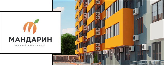
Budova Company, originally from Odessa. When creating the logo for the Mandarin residential complex, they pushed the envelope in both the name and the graphic design. The orange circle can be seen as more than just a tropical fruit. Consumers conjure up images of sun, high-rise buildings, and greenery, conveying positivity, eco-friendliness, and friendliness. The designer accomplished their task well, and today the Mandarin residential complex logo can be considered a successful example.
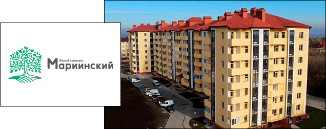
The Maryinsky Residential Complex, located in the suburbs of Odessa, also caught my attention with its unusual logo, which features a branching green tree. Trees have long been a symbol of lineage, extended family, comfort, stability, and so on. And it is precisely its lush crown that has become the symbol of this residential complex. The green color also conveys messages of eco-friendliness, youth, and energy.
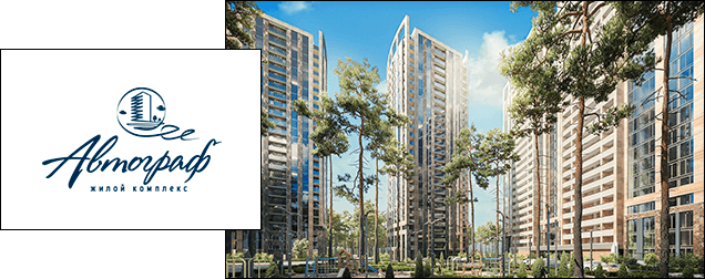
When creating the logo , the Avtograf residential complex opted for a classic design that conveys consistency, foundations, classicism, and tradition through both graphics and colors. The image of a house, trees, and the sun is expected, but the painted-style curl and unusual shade of dark blue really catch the eye. Overall, the logo can be considered a very successful concept.
Here we'd like to showcase examples of vibrant American logos related to construction and architecture. Incidentally, bold colors (orange, red, yellow, etc.) are popular among construction companies in the US. Brands that want to position themselves as environmentally friendly often prefer to use all shades of green in their logos. These examples of bold, clean, and creative logos will be a great source of inspiration for designers and construction company owners still searching for logo ideas.
Where to create a logo? Where to start? How much does a logo cost? – these and a thousand other questions are probably swirling in your head. A professional freelance designer or a branding agency? More questions? Let's start with the question of cost. Logos start at $0 and can cost up to $100,000. That is, the cost of creation depends on the quality and the person creating it.
from 0 to $150
Logo generators. The semi-finished product of the design world. And the end result can be something truly weird, completely out of touch with your brand message and the preferences of your target audience. Yes, you're right. It's only worth the risk if you're extremely tight on cash and have plenty of free time to tinker and tinker with the idea yourself.
from $50 to $350
Freelancers . It's certainly possible to find a talented genius working remotely. If you're working with this specialist for the first time, it's important to rely on a recommendation or carefully review their portfolio and reviews from people who have worked with them. But as you can imagine, there are no guarantees in this case.
from ... to $100,000
Branding agency. This budget implies choosing a branding agency, which typically offers comprehensive branding services along with logo creation for the residential complex. This means that a team of multidisciplinary specialists will conduct market research and competitor analysis to determine how your residential complex logo can stand out. Creative teams will work on its creation, drawing on business data.
WeLoveBrands will create a unified image for your audience. To get started, invite one of our specialists to conduct an interview. To contact our managers, use the chatbot or the phone number listed in the contacts section.