Receive a presentation of services and expert advice
The best experts in the industry will oversee your brand development process.
→ Need branding, design, or creative solutions? Call us at +48 505 648 022 or message us on WhatsApp.
 WeLoveBrands.pptx

The best experts in the industry will oversee your brand development process.
When we're looking to buy a product, we first look at the packaging, and only then at the price and ingredients. This happens on a subconscious level: we're not responsible for this process and don't understand why some products are attractive and trustworthy, while others are repulsive.
It's all about the packaging.
Today we'll discuss packaging design for milk and dairy products, explore the current state of the art in Ukraine and Europe, and explore key design trends.
Designers use only those colors and elements in composition that will entice us to buy milk, bran yogurt, or cottage cheese. We've identified four key trends in dairy packaging design. Let's take a closer look.
White is the primary color for dairy product design. Most people strongly associate it with milk. If you don't believe me, test yourself. Here's an old joke about it. Answer without thinking.
Convinced? Now let's compare packaging in Europe and Ukraine.
|
|
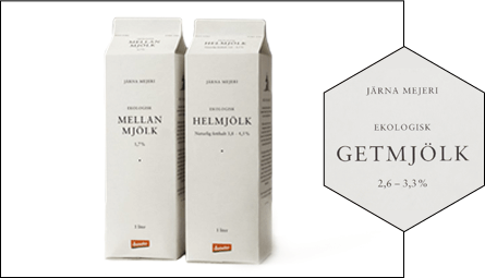
Europe. European manufacturers favor minimalist packaging. A good example is the design of Järna Mejeri dairy products. Note that the packaging is completely white, and the black serif font creates the image of a serious company committed to product quality. Another important detail is that European manufacturers hide their logos and highlight the product name. |
|
|
|
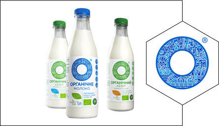
Ukraine. Ukrainian manufacturers don't risk creating minimalist white packaging. If white predominates in the design, it's always complemented by an illustration, blue or red, or folk ornaments. Perhaps only Organic Milk can boast minimalist packaging. Note that, unlike European manufacturers, Ukrainian companies don't hide their logo; they highlight it. In the case of Organic Milk, it's a wheel with folk ornaments. |
Depicting greenery and meadows on packaging is a classic trope for dairy brands. When consumers see flowers and green grass, they associate the brand with a natural product. Besides greenery, packaging also features cows, haystacks, and mills, symbolizing the peaceful countryside.
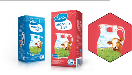
Europe. European manufacturers don't stray far from traditional approaches. A great example is the design of Valio dairy products. Notice the classic blue and white packaging, with a green meadow and a cow in the foreground, and the company logo tucked away in the lower right corner. Also note the handwritten font of the name. It creates a friendly atmosphere and says, "I'm your friend. Take me with you."
|
|
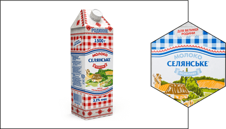
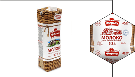
Ukraine. Ukrainian producers love using greenery and often draw on images of rural life. In the case of the brands "Nasha Ferma" and "Selyanske," the packaging design reflects the brand's message and positioning. Note that the packaging for "Nasha Ferma" imitates a wicker basket, while the packaging for "Selyanske" imitates a checkered tablecloth. Both brands utilize images of villages and green meadows.
 |
 |
Packaging with vibrant illustrations and stories attracts young people, who are willing to pay for interesting designs. Cartoon characters are aimed at children and entertain them.
|
|
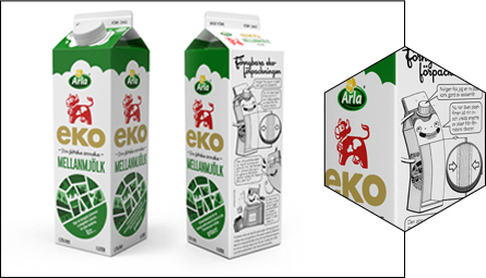
Europe. The Swedish company Arla Foods is considered the most prominent example of high-quality storytelling. Every month, their packaging features illustrated stories. They released a special series for Earth Day, telling stories about dinosaurs and explaining what causes depression. |
|
|
|
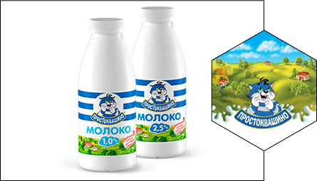
Ukrainian producers are using cartoon characters. A prominent example is the Prostokvashino brand. Familiar since childhood, Matroskin the Cat and Sharik inspire confidence and a positive outlook. |
***
As we can see, dairy product manufacturers, when designing their packaging, primarily focus on those things and elements that consumers associate with naturalness.
European companies are more daring: they're not afraid to use minimalist packaging designs, love to tell stories, and even emphasize the name rather than the logo. Ukrainian producers have room for improvement. While village images and cartoon characters remain the most popular, interesting packaging is hard to find.