Receive a presentation of services and expert advice
The best experts in the industry will oversee your brand development process.
→ Need branding, design, or creative solutions? Call us at +48 505 648 022 or message us on WhatsApp.
 WeLoveBrands.pptx

The best experts in the industry will oversee your brand development process.
The agricultural sector is one of the most successful in Ukraine. Various agricultural firms and farms produce agricultural products, sell them on the Ukrainian market, and export them to other countries.
In a highly competitive environment, demonstrating to consumers that you care about their health and well-being by providing high-quality, organic products is essential to build trust, increase interest in your products, and drive sales.
An agricultural company logo can help increase company recognition, highlight its advantages, and differentiate it from competitors. It can help communicate the company's focus and reflect its core business values.
A trademark isn't a whim, but a necessary tool in building a strong and reputable brand. In the agricultural sector, it combines technology and nature, denoting naturalness and high quality.
A successful logo allows you to :
gain the trust of potential clients;
expand sales beyond your country in the future;
acquire a base of loyal regular customers;
establish themselves as specialists in the agricultural sector;
present your company effectively;
increase recognition;
stand out from the competition;
reflect the idea, mission, and values of the company.
A good logo communicates your business, highlights your strengths, and helps build a deep emotional connection with your audience. It lets you show people what's important to you and how you contribute.
Logos play a key role in the development of an agricultural company. They are created to communicate to clients what the organization does and what it can offer.
No matter what your business is, whether it's food crops, meat products, or agricultural equipment manufacturing, you need a unique brand name to attract your audience and guarantee high-quality products.
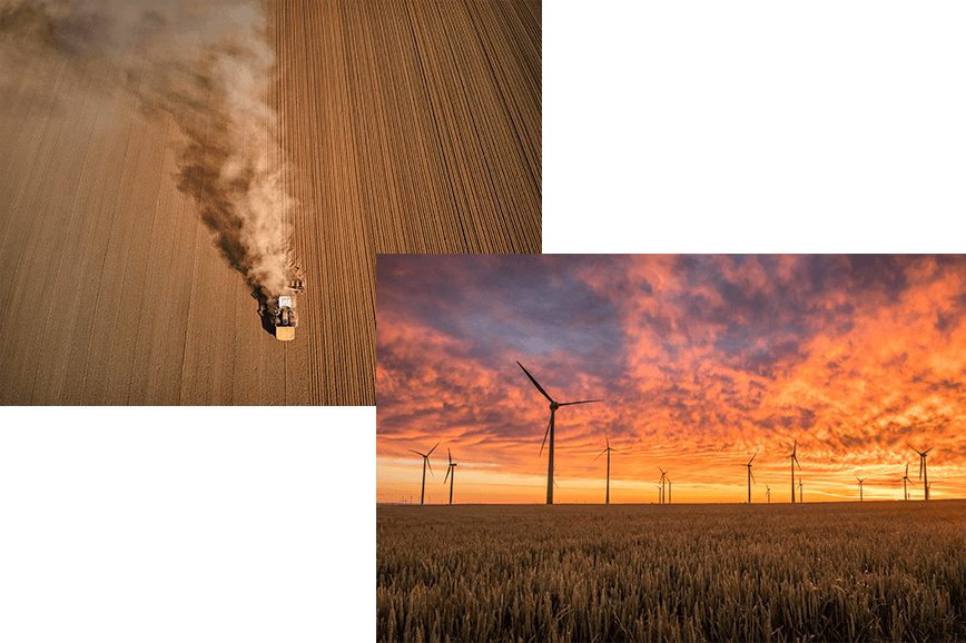
At the same time, when creating it, you should remember that it should be easy to perceive, informative and evoke positive emotions.
 Decide on the type of logo
A logo shapes a company's image and is one of the most important ways to differentiate it from competitors. You'll use it on a variety of media (from business cards to your official website), so it's crucial to choose a logo that reflects your essence.
There are several classifications of logos by type. Hilda Morones, for example, divides all symbols into three main groups. Let's take a closer look.
Monograms (acronyms)
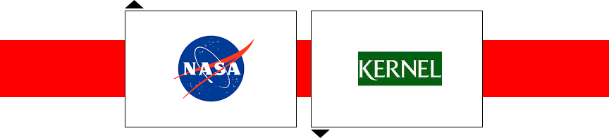
If your company name is too long or consists of several words, it's best to shorten it and use only the first few letters. This will provide more flexibility in logo design, and customers will find it easier to remember an acronym than several words. For example, NASA (National Aeronautics and Space Administration).
When designing such a logo, you need to be careful when choosing a font. It should be easy to read and consistent with the company's image.
Text signs
This logo is suitable for companies with a short, clear, and easy-to-remember name. Here, too, it's important to carefully select fonts to ensure the logo is easy to understand. You can also play with letters and words to create an original and stylish logo.
Signs and symbols
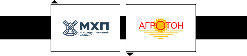
As you can imagine, a well-designed logo can differentiate an agricultural company from the market, attracting more customers. You can engage your audience with symbols and unique images. These symbols are imbued with meaning and convey the main idea. Popular images in the agricultural sector include a sunflower, a drop of sunflower oil, a field, farm animals and poultry, fruit, leaves, a grain of wheat, and others. A map of the region in which the company operates can also be included in the design.
Abstract logos
These logos are fairly easy to create, which is their main advantage. The key is that they convey a specific mood and look great on packaging, websites, and other media.
It's also worth noting that this type of symbol is ideal for international companies. If you plan to sell agricultural products globally, it can be difficult to create an image that evokes similar emotions in different countries. And if it's an abstract symbol, it will be perceived better across different continents.
Mascot
The advantage of this type is direct interaction with the audience and building trust. This logo depicts a character that is part of the company and reflects its unique qualities.
Text + image
Here, the company name and image work together, maximizing and reinforcing each other's impact. Any symbol can be used that is relevant to the business and conveys the necessary information to the audience.

Coat of arms/emblem
Most often, this is a logo with text within an image. It's chosen by companies that want to emphasize their commitment to tradition, such as educational institutions or automobile manufacturers. And if you want to show your respect for tradition, you can use this type of logo.
Once you've decided on the type of logo, you can move on to the next steps – choosing a symbol, color, and font.
 Make sure the colors and fonts you choose evoke the right emotions
Use only one or two colors. The same goes for fonts. A complex design with too many elements will only confuse viewers.
Since different colors have different impacts on people, use only those that evoke the desired feelings and associations with your brand. And fonts are the best tools for giving your logo a unique personality.
 Focus on industry standards
Make sure potential clients understand what you do at first glance at your logo.
To achieve this effect, complement your logo with a variety of elements that people associate with farming. These could include animals, tools, nature, various crops, or other products from your farm. It all depends on what you do and what you want to convey to your customers.
To determine your color palette, simply look at the shades found in nature. Green, brown, orange, and yellow are ideal for an agricultural business. They will help you create a lasting association with the eco-friendliness, naturalness, and quality of your products.
If you take all these aspects into account, you will get a logo that will ensure your recognition and a constant flow of customers.
Any template or standard design can harm your business, as customers tend to associate a low-quality and confusing logo with inferior products. Therefore, it's important to develop a unique, distinctive brand mark that conveys a specific message.
 Choose light shades
A dark logo for the agricultural sector isn't the best choice. To convey freshness, naturalness, and lightness, choose lighter shades. You can also combine them with brighter shades to emphasize a specific element.
 Remember simplicity
Make sure your agricultural company's logo design is simple in structure and appearance. This will make it easier to read, understand, and remember.
A minimalist approach to design means using only those elements that are sufficient to convey a message. Therefore, remove all unnecessary elements, especially if they serve no purpose.
 Pay more attention to fonts
Fonts should be used carefully in agricultural logo design to avoid confusing or alienating the audience. It's best to choose simple, classic font styles to emphasize the company's reliability. Capital letters are also acceptable, but ornate fonts with flourishes should be avoided, as they don't quite fit the specific nature of the business.
 Choose the right images
An agricultural company's logo should foster a positive image, enhance its reputation, and attract customers. This can be achieved through symbols and images that reflect the company's activities and values.
 Define your target audience
Don't rush into design without learning everything about your target audience. Remember that a logo can't appeal to everyone. It's aimed at a specific group of people, who the company sees as potential customers.
Find out who buys your products, their lifestyle, their interests, what they care about, and what they don't. Then you can create an effective brand that attracts the right people.
 Develop a unique concept
Look at your competitors' logos and determine what's special and what's generic. Use this information to create a unique logo that will stand out from the crowd.
For example, the arched architecture is the concept of the McDonald's logo, the swoosh is the concept of the Nike logo, and the retro and classic lettering is the concept of the old Coca-Cola logos.
 Consider the influence of color
Another important point to consider when creating a logo for an agricultural company is color selection. Every serious business has a specific message for its target customers. Choose a color that best conveys your message.
A common mistake in logo design is using incompatible colors. Ignoring the psychological impact of color will result in yet another boring and meaningless logo.
Human emotions, naturally involved in sales, drive a company's success. After all, they are nothing more than triggers that motivate action—that is, purchase.
A good logo directly appeals to the target audience's subconscious. It's a matter of associations. If a particular color evokes pleasant emotions, people will pay attention to your product. Therefore, in the agricultural sector, it's best to avoid unpleasant shades that might be associated with dirt. or garbage.
What emotions do colors evoke ?
Red . The most vibrant, expressive, and dangerous color. It is the shade of passion, aggression, fear, and power.
Orange . A little softer than red, less dangerous, hinting at excitement.
Yellow. The warmest color in the spectrum, it symbolizes the sun, warmth, wealth, and gold.
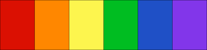
Green . A cozy color that symbolizes freshness, perseverance, serenity, and nature.
Blue . A subdued and reliable shade, but it's duller than warm tones.
Purple . Sometimes a striking choice. It symbolizes nobility, creativity, sensuality, and balance. However, if applied to the wrong background, it can appear dull.
Black and white logos, popular in business, aren't particularly suitable for agricultural companies. While they look stylish, they detract from the naturalness of the logo. Black and white can be used separately, or combined with bright colors for accents.
Generally, a logo's color is its most noticeable element. After all, it's much easier to see light or dark shades than to discern a specific shape. For this reason, many companies never change the color of their logos, even if those shades are no longer trendy.
That's why you should approach the choice of palette with the utmost responsibility, since you most likely won't be able to change it without consequences.
 Don't forget about versatility
A simple logo is universal. It looks equally natural at both small and large sizes. If the design is too complex, many of its elements will be invisible when scaled down.
A universal logo will help increase brand recognition because it will look familiar on any media.
Every element of a logo design—image, color, and font—is important. They should not only reflect the company's specific business and attract potential customers, but also be harmoniously integrated. This will ensure that the brand is attractive, stylish, and effective.
Graphic design trends are constantly changing, so much so that what was popular last year is now considered outdated this year. This means it's best not to chase the latest trends, which may not last long.
When creating a logo for an agricultural company, it's important to use techniques and methods that will not only help you achieve your goals but also ensure it remains relevant for years to come.
What's trendy in logo design ?
Bright colors
This is the hottest trend of 2021. With so many graphics and ads online, most companies simply get lost in the shuffle. For this reason, this year will see a plethora of bold logos competing for consumer attention.
Bold fonts
Fonts will be larger and bolder to attract viewers' attention. Standing out from the crowd is the main goal for designers in 2021.

Color shift
Playing with color has become very popular lately. And the trend of shifting shades will be a powerful trigger for audiences.
Double exposure graphics
There was a time when double-exposure graphics were considered somewhat out of place, and designers began to abandon the technique. But according to recent research, it's making a comeback.
Creative typography
The design of text in logos is becoming more creative. New techniques are emerging that allow for playing with words, syllables, and individual letters, and new fonts with character are being developed.
Using negative space
Using white space in a logo is an art mastered by very few designers. However, it's a popular trend that's increasingly being used in logo design. After all, such symbols are intriguing and engaging.
Image through text
Using text as a window for an image behind it is becoming a favorite style among many designers. Words, which serve as the base, are transformed into negative space, and images that were previously in the foreground now peek out. It's a highly creative technique and is expected to become increasingly popular.
3D graphics
2D logos are losing their appeal to both viewers and designers. They are being replaced by 3D branding. Three-dimensional emblems look modern and engaging, signal innovation, and stand out from the crowd.
Metal elements
Metallic effects give logos a realistic composition. This technique is used by many designers as an alternative to bright colors. Some also like to combine shiny metallic colors with other vibrant shades, creative typography, or 3D graphics. Bright gold, silver, bronze, or platinum are increasingly common in trademarks.
Hand-drawn illustrations
Hand-drawn illustrations and hand-lettered typography are among the few styles that never go out of style. They impart a special atmosphere, making them always popular.
Asymmetrical design
Symmetry in graphic design is equated with discipline and order. Clearly, this unspoken rule hinders creativity. Therefore, many designers take risks by breaking the rules. Based on trends, it's safe to assume that "rebellion" will become the new canon for logos in 2021-2022.
Geometric shapes
Some designers enjoy playing with geometric shapes and creating innovative logos using their combinations. This type of graphics has recently gained popularity, meaning that geometric logos are here to stay.
Strong emphasis on color
It's become fashionable to convey a brand's message through color. We know that colors evoke passion, desire, and other emotions. Therefore, interesting combinations and blends of neutrals with vibrant colors are used to highlight important elements.
Abstract logos
Minimalism remains trendy. But designers are looking for ways to further simplify. This has led them to abstract concepts. This allows for simpler, yet more effective, designs.
Responsive logos
Today, almost everything around us is digital. Companies create websites, business accounts on social media, and mobile apps. People search and buy products on their smartphones, often while on the go or while doing other things. Therefore, a logo that doesn't display correctly on a mobile device is of little use these days.
Thus, responsive logo design is a hot topic and is becoming a trend.
The idea is that when a logo is scaled down, some details are removed. This preserves legibility and simplicity. When it's displayed on a larger monitor or when it's enlarged, more elements appear.
Be yourself!
While simplicity remains a preferred trait for branding, many companies want to appear natural and original. As a result, they're even willing to include elements that don't adhere to minimalist principles.
Many brands are unwilling to compromise and strive to convey their original aesthetic. For example, a farmstead might have a beautiful minimalist design, yet still choose to convey its rustic atmosphere so customers can better understand its philosophy.
This means that logo design for such businesses is all about creating their authenticity as part of the brand identity.
Companies are now finding their own ways to stand out from the competition. They experiment with colors, fonts, and other design elements to showcase their brand in its true essence.
Certain trends are noticeably dominating logo design this year. These include variable logos, visual techniques, simplicity, the use of abstraction, a strong emphasis on color and gradients, playfulness, responsive design, and so on. You must understand the importance of a brand mark and experiment with these trends to create the perfect logo for an agricultural company.
Agricultural companies around the world often choose combination logos that communicate their field of activity, mission, and philosophy as clearly as possible to potential clients. In the agricultural business, entrepreneurs favor colors associated with nature: green, yellow, and blue. They typically combine two shades. Primary colors are typically complemented by white, and black is very rare.
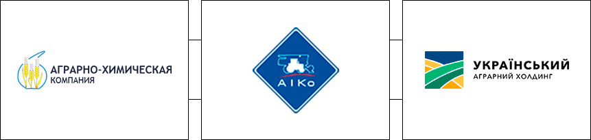
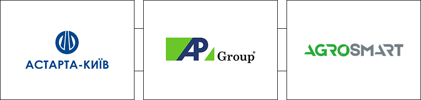
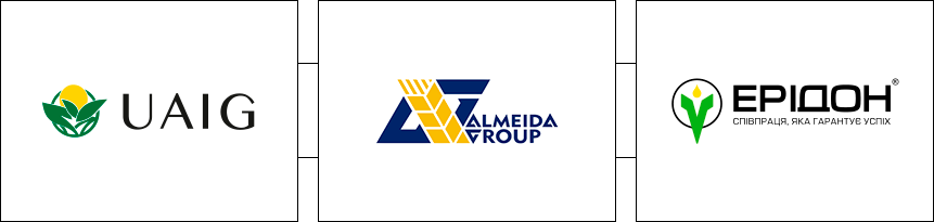
Ukrainian agricultural companies prefer to use combination logos (less commonly, text-based ones). These are based on images associated with nature and the company's products. Logos with geometric shapes and abstract symbols are also common.
If you look at the logos of Ukraine's largest agricultural holdings, you'll see that the most common color is green (in both light and dark shades). It's followed by yellow, blue, and white. Black is less common and is mainly used in combination with green.
The fonts are predominantly strict, sans serif, with bold lines, and sometimes capital letters.
Europe . European companies also favor combination logos, complementing them with botanical elements (primarily leaves and plants). Geometric shapes are second in popularity. Emblems are also common, which is not entirely typical for the agricultural industry.
Text logos use both classic, strict fonts and soft, handwritten ones, but without excessive flourishes.
The color palette is more diverse than in Ukrainian ones. White, green, blue, yellow, black, gray, and purple shades are actively used.
USA .American agricultural logos are much more likely to feature combination symbols than fonts. US businesses prefer to clearly communicate their company's activities by using images of plants, vegetables, and animals. The most common colors are white, green, blue, red, and yellow.
Asia . Logos of Asian agricultural companies are also predominantly combined. Geometric shapes and abstract figures are used as symbols, and, less commonly, natural elements such as leaves and characters such as a farmer.
The most common colors are blue, yellow, green, black and red.
Fonts, as elsewhere in the world, are standard.
You can create a simple logo yourself using online resources that offer ready-made solutions and the ability to choose the desired colors, fonts, and symbols. However, if you want a unique brand identity that will stand out from your competitors and evoke the right associations in consumers, you should turn to professionals.
There are two options for finding a designer:
1. Freelance Marketplaces . If you have a rough idea of what you need in your logo, you can create a detailed specification and search for a suitable designer on freelance marketplaces. The challenge is finding a true specialist in this field, as some newbies pass off other people's work as their own, while others lack responsibility, which can lead to missed deadlines or results that don't meet your expectations. The average cost for logo development starts at $30
2. Collaboration with a branding agency or design studio .
Here, you won't have to waste time, effort, or nerves searching for a good designer, as companies value their reputation and hire only the best. Logo prices start at $150.
WeLoweBrands designers guarantee complete immersion in your project and meticulous attention to every logo element. The result is a brand that will help you market your business and inspire trust.
To get a consultation and order a logo for your agricultural company, please contact us by phone or via the chat on our website.
WeLoweBrands – with love for your brand!