Receive a presentation of services and expert advice
The best experts in the industry will oversee your brand development process.
→ Need branding, design, or creative solutions? Call us at +48 505 648 022 or message us on WhatsApp.
 WeLoveBrands.pptx

The best experts in the industry will oversee your brand development process.
Providing accounting services, including bookkeeping and preparing various reporting forms, is a responsible and meticulous task that requires specific expertise. Therefore, it's important for companies in this industry to demonstrate their professionalism and reliability from the very first encounter. And to attract clients and inspire trust, it's essential to have not only an excellent reputation but also a reputable visual image.
A good accounting firm logo emphasizes professionalism, strengthens its image, and reassures consumers of the reliability and quality of its services. A corporate logo communicates the specifics of its work and identifies the firm in the marketplace, so it's important that it's clear and easy to remember.
 Differentiation from competitors . A logo attracts attention and creates a specific image of the company in consumers' minds. A successful logo will be easy to remember and associated with your business.
 Strengthening reputation . A logo that reflects the company's character and creates a sense of trustworthiness will enhance the company's image.
 Increased trust . Companies with original and engaging logos not only attract attention but also inspire trust.
An accountant's logo can encourage consumers to order a service or force them to look elsewhere. The ultimate decision depends on the design features and the associations the logo evokes. To convey the desired message and create an image of a responsible and stable company, appropriate symbols, shapes, and colors should be used.
Various design techniques are used to create a brand logo, but the main thing is the idea that needs to be conveyed to consumers and the impression it will make.
To engage clients and evoke the right associations, an accountant's logo should be modern, serious, and distinguished. Its message is conveyed through a variety of shapes, symbols, and colors.
Images of books, stationery, calculators, and numbers are popular in the accounting industry. These images are associated with finance, so they are widely used in logo design. But to visually differentiate yourself from other companies and attract consumers, you can experiment with symbols and shapes to create unique logos.
The design can reflect the company's line of business and key advantage. For example, the company may provide full-service accounting (taxes, reports, payments, payroll, documentation, and accounting) or focus solely on report preparation. It may have a large staff, or it may be a small family-run business with two or three specialists.
When choosing design elements, it's also important to consider your target audience. Accounting services are needed by a variety of companies and individual entrepreneurs, and it's important to convince them they can't go wrong by hiring you.
To create an effective and recognizable logo, contact WeLoveBrands. Our designers are full of ideas and innovative solutions for creating a stylish and trustworthy visual identity. For more details and a consultation, please call or chat.
Conveying the right message and evoking specific associations can be accomplished through the careful selection of images, colors, and fonts. Each of these elements is crucial for creating a cohesive, appealing image, and their harmonious combination allows for the creation of a unique brand identity.
How to Create an Effective Accounting Logo:
 Image
Icons related to finance and office supplies (calculators, abacus, books, folders, pencils, pens, graphs, etc.) are widely used in this area. They can be depicted in their familiar and recognizable form or stylistically enhanced and mixed with letters and other elements. Monograms are also often used in place of familiar images. Such logos create a sense of grandeur and authority.

 Color
The accounting industry is characterized by neutral and sober tones. Black, gray, and blue are particularly popular. Red, green, and other bright colors are sometimes used for accents.

Blue is used most often in the financial industry because it is associated with stability, responsibility, and reliability, while gray looks stylish and modern, especially when combined with other shades.
Black's popularity stems from its perceived formality, elegance, and understatement. At the same time, it connotes power and status. A black logo can be conservative or modern, depending on the other design elements.
You can choose a different color (as a main color or as an accent), but it is desirable that it speaks of the company’s competence and seriousness.
Despite the restrictions on the use of colors in the financial sector, vibrant logos combining more than three colors are still being created. This suggests that strict adherence to all the rules isn't necessary. The key is to find a solution that presents your business in a favorable light.
 Font
Font type reflects character and influences logo recognition. Accounting firms most often choose sans-serif fonts to convey authority and stability.
To create a unique brand identity, you should ditch the standard options and develop your own font. Adapting an existing font style to your business (by widening, thickening, or removing lines and parts of letters) is also an interesting solution.
A logo whose elements are well-thought-out and aligned with the company's values has a powerful impact on consumers. It conveys the overall idea and reflects the company's character, while highlighting its strengths. Therefore, don't limit yourself to standard symbols and techniques; instead, embrace your imagination and create a stylish brand mark.
Common images include stationery, numbers, pens, and abacuses. These images are used by many companies, so they no longer impress anyone. Such logos communicate a company's activities but fail to distinguish it from competitors. Therefore, it has become important to move away from traditional symbols in favor of abstract and unexpected elements.
Popular images for creating accounting logos:


If you want a modern logo that inspires trust and is memorable, then you should give us a call. WLB Studio's designers will consider your needs, research your competitors and target audience, and create a brand identity that will enhance your company's image.
Both small accounting firms and large Ukrainian and international audit firms are active in Ukraine. Depending on the scope of services and scale, different logo designs and techniques are used.

Ukrainian companies are characterized by national symbols and bright colors, while international companies more often use simple logos in 2-3 colors.
Blue, gray, black, green, and yellow are common shades. Logos predominantly feature geometric shapes and unexpected imagery, and fonts tend to be simple and austere.
American accounting firm logos are characterized by simplicity and bold accents. Two-color fonts are most common, but single-color and multi-color options are also available.
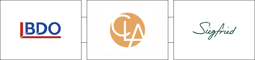
Common shades include green, red, blue, gray, and black. When text is colored in neutral colors, the symbol often serves as a bold accent.
Logos are primarily based on various geometric shapes.
The logos of European accounting firms exemplify creativity and originality. They challenge stereotypes about restraint and austerity in the design of logos for this industry, showcasing vibrant and modern options.
Here, a bright color is always added to black, and if two shades are used, they either blend harmoniously or create a contrast. Violet, yellow, gray, red, and blue are widely used.
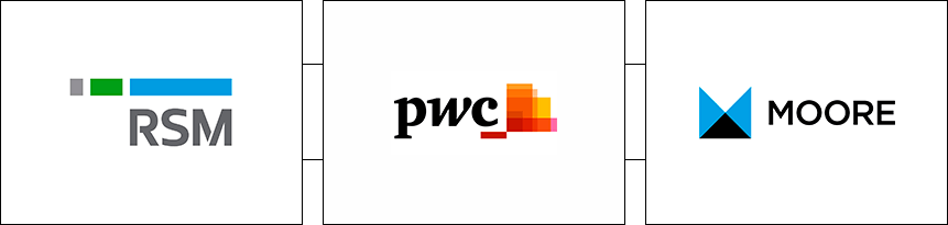
In general, all European logos can be roughly divided into laconic and colorful. As for images, geometric shapes and abstract elements are often used.
In Asia, you can see a variety of accounting logos (font, symbol, and combination). Abstract images and simple fonts are most common.

The primary colors in the logo design are blue and red, sometimes accented with yellow or green.
If you need a unique logo that won't clash with other companies in your industry, seek help from a designer. You can find a specialist freelancer or in a design studio.
Where is the best place to order a logo:
Freelance . To ensure the result meets your expectations, you need to create clear technical specifications outlining all your wishes and requirements, and find a responsible and experienced designer.
The advantages include a large selection of specialists and a lower cost compared to studios (from $30-40, depending on the region and the designer’s qualifications).
The downsides of this method include the lengthy search for a specialist and the risk. Finding a competent person requires time and effort, unless, of course, you're lucky and don't find the right person right away. Freelancing is also always a risk. While you can certainly get a high-quality and original logo quickly, that's not always the case. Sometimes, after the commission, the designer disappears from sight or delivers a simple, template-based design.
Design studio . The workflow is almost the same as with a freelancer, only more organized and risk-free. You create a specification, communicate all your requirements, and the designer begins working on the task. The specialist studies your competitors and target audience, determines what might appeal to them, and develops options.
These companies employ talented designers who know their craft and generate diverse ideas, ensuring high-quality work. Prices are higher than freelance services (starting at $150), but the results are worth it.
WeLoveBrands Studio offers three pricing plans, each with different pricing, delivery timeframes, and the number of ready-made designs and revisions available after approval. To clarify details and order a logo for your accounting firm, please contact us by phone or send a message via the website chat.