Receive a presentation of services and expert advice
The best experts in the industry will oversee your brand development process.
→ Need branding, design, or creative solutions? Call us at +48 505 648 022 or message us on WhatsApp.
 WeLoveBrands.pptx

The best experts in the industry will oversee your brand development process.
Gradients attract attention due to their beauty, yet they are easy to create. Along with simple, minimalist shapes, color elements effectively convey meaning. The popularity of this aesthetic stems from the need to simplify the design process, a key aspect of minimalism as the biggest graphic design trend of 2020.
Gradients are a smooth transition from one color to another. Using this color transition, you can enhance an entire design or highlight a specific part.
Depending on their shape, gradients are divided into:
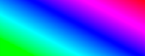
Linear- when the gradient starts on one side and ends on the other. Suitable for square-shaped objects.
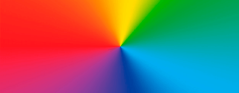
Radial- when the color gradually changes from the center to the edges of the shape. Suitable for round objects.
Moreover, the principles of their use are the same for everyone:
two-tone, less often three-tone gradient;
flat style graphic elements;
external or internal shadows.
The history of gradients began with interactive multi-user web 2.0 systems and has since come a long way. In modern graphic design, color transitions can only be created using CSS3, making them easier to create in backgrounds, buttons, and typography.
With the development of the Internet, it has become possible to add dynamics to the virtual component of a website, including using a gradient.
Gradients can be used for design elements such as:
Background . This type of background typically uses a smooth transition of adjacent colors to avoid distracting attention from the main compositional elements. Backgrounds for photographs, online resources, book or magazine covers, posters, and advertisements are all examples where gradients are actively used.
Text .Gradients can be used to personalize fonts to highlight specific sections of text or headings, to emphasize important information, or to underscore a marketing message.
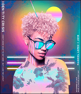

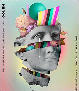
Photographs . When overlaid on photos in catalogs and brochures, on business cards and flyers, posters and packaging, gradients can create a unique effect and attract the attention of your target audience. Using gradients in corporate colors allows you to personalize any photo and align it with your company's brand identity.
Individual elements . By highlighting buttons, underlines, frames, and borders, you can achieve an interesting effect without overloading the main design.
Gradients are used in creating designs for brands in a wide variety of industries: the food industry, the cosmetics industry, and the educational sector.
Unlike the metallic or faded gradients popular a few years ago, transitions using bright, saturated colors, neon hues, and contrasts are now trending. Designers often featurecolor options such as pink, purple, lime green, mint, red, yellow, and light blue.
How should you use gradients in design?
Before applying a gradient, it is advisable to develop a single-color version of the design or logo .
It is recommended to use gradients in cases where it is necessary to emphasize important details of a logo or design and underline their significance.
Gradients should be applied taking into account the scale at which the finished image will be used.
We recommend taking into account the peculiarities of color reproduction on paper and black-and-white printing options.
How not to use gradients in design?
It is not recommended to combine different gradients in one logo, as well as in all design elements from the very beginning of its development.
Gradients are not suitable for creating abstract images that play a purely decorative role.
We do not recommend using gradients when drawing small details and non-functional elements of the logo.
Printing and color rendering issues that may be affected by a gradient cannot be ignored.
Gradients are used in the design of printed materials , such as business cards, brochures , and advertising posters . Posters, movie posters, concert posters, and other event posters are also among the products that utilize gradients, both as backgrounds and as fills for individual elements or overlays for photographs.
Gradient transitionsareanother way to make lettering stand out from the background. This technique can also enliven a photograph and add perspective with the right shadows and transitions, immersing the client in the atmosphere depicted in the illustration.
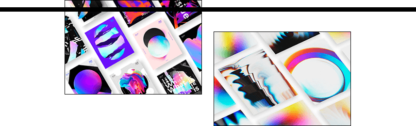
Just a couple of years ago, gradients were considered the preserve of logos from the 1990s. But this isn't due to the concept itself, but rather to the flaws inherent in the design of brand logos at the time, most of which were characterized by the use of gradients. This is why gradient logos have acquired a negative association.
Today, the use of gradients in logos, as well as in typography, is considered a relatively new technique. Designers add color transitions to text that needs to be highlighted on the page, to icons, and other elements. Used in logos, gradients add volume to the image, thereby helping to draw attention to that element of the page.
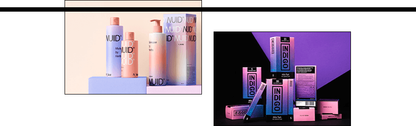
Gradients combined with translucent elements are popular not only in interior design but also in packaging design . These can be used for beverages, sweets, eau de toilette, eau de parfum, and cosmetics. Among the latter, the packaging design for Dove's premium hair care line is particularly noteworthy.
The current trend is to use gradients with a captivating holographic effect in packaging, making the product shimmer with different colors and thus attracting more attention from potential consumers.
In 2016, gradients became a new trend in web design , a logical extension of the 32-tone flat design that had peaked in popularity two years earlier. Large companies and brands, always striving to stand out online, were the first to take notice of this interesting color transition.
Gradients serve as backgrounds for web pages and mobile apps. They can also be used to highlight specific web design elements, such as menus, buttons, and banners. They're a tool that allows you to customize your website and create your own style by simply changing the background or image.
Using vertical or horizontal gradients on web pages can help direct the visitor's eye to a call-to-action button or order form. To achieve this, the starting point is designed in lighter shades, and the end pointindarker shades. This is a great technique for online stores and e-commerce websites.
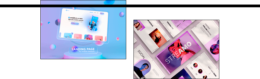
Color effects can also be used to enhance images, making website designs more vibrant and adding depth to photographs and backgrounds. Furthermore, by mixing individual colors, you can create new and interesting color schemes.
Gradients are currently a trending trend in virtually all areas of design, both internationally and in Ukraine. For example, color transitions are actively used in interior design.
Ukrainian web designers are also increasingly using color transitions in digital design when developing online stores, sales websites, and blogs. In particular, gradients can be found in the design of product cards and CTA buttons. And thanks to constant experimentation with intense gradients and color saturation, it has become possible to create more vibrant, eye-catching designs.
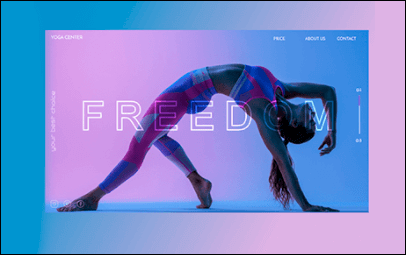
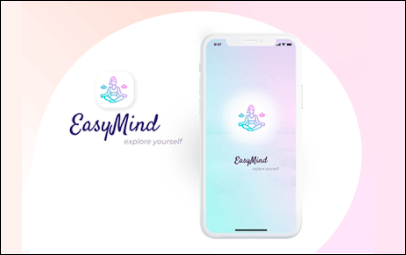
One of the most popular trends right now is the use of gradients in headers. This type of design, which allows you to add more color to a design or expand its color palette, can be found on many websites.
In global web design,two-color gradients are the most common. Notable examplesincludeApple's new iOS style and the current icons for Instagram, LinkedIn, and Firefox Browser.
In 2019, Adobe proposed using a 70s-inspired color palette with its characteristic gradients and vibrant colors.

In 2020, packaging with blurred edges is trending, giving gradients a more abstract look and taking them to a new level. Designers believe that consumers try to discern the image behind the blur, which makes this design more appealing.
Experts predict that unusual gradients created using incompatible colors or acidic shades will be trendy in the near future.
If you need a design developed using gradients, there are two options to order it:
Freelancing . In this case, be prepared for the fact that finding a good specialist can take a long time. And if you turn to the first person you see, you risk getting work of much lower quality than you expected. However, many are attracted by the relatively low prices of freelance designers: from 10 $ for packaging, from 30 $ for a logo, and from 50 $ for a website.
At the web studio . The higher prices here (from $20 for printing, from $130 for corporate identity, from $150 for logo) are due to the team's high level of professionalism, which values its reputation. Therefore, the specialists strive to provide each client with an original and memorable design that best meets their business objectives.
Contact WeLoveBrands —you won't regret it! The cost of the service will depend on the number of options prepared for you, the complexity, and the turnaround time. To order a design with color transition effects and to find out the price, submit your request on the website or contact us by phone.