Receive a presentation of services and expert advice
The best experts in the industry will oversee your brand development process.
→ Need branding, design, or creative solutions? Call us at +48 505 648 022 or message us on WhatsApp.
 WeLoveBrands.pptx

The best experts in the industry will oversee your brand development process.
New advertising agency logos are created every day. Like human faces, they must be unique, striking, and recognizable. In old Westerns, cowboys branded cattle to mark their ownership. The purpose of a logo is the same: its presence on your website, business cards, and other products indicates ownership and tells potential clients what type of service you offer.
An advertising agency's logo reveals its character and reflects its individuality. Some companies want to emphasize reliability, stability, and status, so they choose simple, sometimes austere, minimalist logos, while others prefer to attract attention with bright colors and unexpected images, emphasizing their creativity and positivity.
When creating a logo for advertising companies and PR agencies, an unconventional approach is essential. This will not only help showcase the company's capabilities but also allow it to stand out in the market and generate consumer interest.
Creating a unique logo for an advertising agency starts with a great idea. Every day, your branding will explain to potential clients why they should work with you. Before you begin creating it, answer these questions:
 What are the beliefs and values of an advertising agency?
What should a logo tell potential clients?
What makes you special?
What do you do better than your competitors?
An advertising agency logo should instantly convey who you are and what you do. Colors, shapes, typography, and other design elements directly influence how your audience perceives your brand. If done correctly, potential client loyalty is guaranteed. There are 5 characteristics of the perfect advertising agency logo:
# 1 Correct form
# 2 Perfect Business Lines
# 3 Unique color combination
# 4 Smart alignment with trends
# 5 Correct sizes
A successful advertising logo will be memorable, evoke emotion, and build trust and loyalty among audiences. Therefore, its development requires a strong concept and carefully selected design elements (color scheme, font, shape, and symbol).
In the advertising industry, text and combination logos, which combine a symbol and text, are most common.
When creating brand logos in Ukraine and around the world, abstract elements, geometric shapes, lines, and stylized images of animals are most often used, while simple sans-serif fonts and handwritten font styles are chosen for text.
As for the color scheme, the most common are one- and two-color logos using blue, gray, red, black and orange shades.
Advertising companies around the world predominantly opt for two-color logos, but single-color logos are also common. Popular combinations include black with other bright colors, as well as gray-blue and gray-orange color schemes.
Combinations of three or more colors are less common. Multicolored logos are more typical for the Ukrainian market than for the international one.
Features of using color in advertising logos:
Ukraine . Ukrainian advertising companies choose black, blue, yellow, and red tones, with popular combinations being black with red, white, or blue.

USA . Single-color advertising logos are most common here. Black is the most popular, followed by orange and blue. When two colors are used, combinations of gray and red, and black with various bright shades (blue, purple, orange, etc.) are prevalent.
Europe . European countries are also more likely to have single-color logos. Advertising agencies' favorite colors are black, red, and blue, and when choosing a two-color logo, black-and-blue or red-and-white combinations.
Asia . Unlike Europe and the US, Asian companies often use two colors when creating logos (blue and orange, red and yellow, gray and black, and black with bright shades).
Looking at the bigger picture, we can conclude that the Ukrainian and global advertising markets are very fond of black, blue, and orange/yellow shades. These colors are quite common both as the main tone and as an accent.
According to statistics, the majority of advertising logos, regardless of continent, country, or region, are font-based. Companies prefer simple logos because they are easily perceived by the audience and are easy to remember.
The second most popular logo is a combination logo, which combines text and a symbol. They attract attention to the company and emphasize its individuality.
Most often, such brand logos utilize geometric shapes, various lines, and abstract elements. However, if companies want to stand out from the competition and intrigue consumers, they choose stylized images of various animals and birds.
Ukrainian and European agencies prefer geometry and animals, American agencies use predominantly geometric shapes (circles, squares, triangles), and Asian agencies prefer font logos without any symbols, but if an image is present, it will still be geometry and lines.
Scientific foundations of graphic design: every shape has its own visual associations, so it is necessary to align the logo's shapes with the brand's message to its target audience.
Circle or oval – inviting and friendly.
Volumetric lines are relaxing, intriguing and playful.
Geometric shapes – dominance, leadership, authoritarianism, efficiency, security and reliability.
Spikes and sharp corners – aggression, harshness and unusualness.
Horizontal lines – reliability and stability.
Vertical lines – success and prosperity.
Brainstorming can help you find a brilliant solution. When creating an advertising agency logo, try to think like your potential audience. Create a list of words that evoke associations that describe your advertising agency. Once you have a clear idea of your brand, it's time to start translating your ideas into a design.
Ukrainian and foreign companies choose font and combination logos (the former in two out of three cases).
The most popular are simple sans-serif fonts and font styles with soft lines. Handwritten fonts are also often used to emphasize creativity and lightness.
Features of using fonts in advertising logos:
in terms of writing, Latin fonts prevail over Cyrillic ones (even in Ukraine such characters make up more than 60%);
by appearance – sans-serif and handwritten font styles are most often used;
by register – uppercase fonts are used in 50% of advertising logos, followed by lowercase and mixed fonts;
by style – the straight writing of words predominates in advertising logos, but slanted and italicized ones are also often found;
In terms of line thickness, the largest number of brand names are those with medium-thick letters, while bold lines are in second place.
When comparing the usage of fonts in branding in different countries, we see that sans-serif and capitalized fonts are the most popular.
The emotional tone of the font solutions in the logo:
Serif fonts are associated with tradition, reliability, respectability and comfort.
Sans serif – clean, objective and modern.
Handwritten fonts - creativity, elegance and grace.
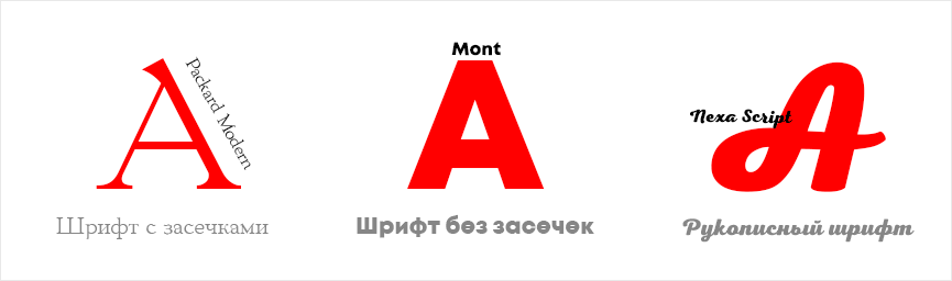
As you've already noticed, each font conveys its own mood and personality for the brand: seriousness and sophistication, or playfulness and casualness. When choosing a font, consider not personal preferences, but the specifics of your advertising agency.
Ukrainian advertising companies choose simple and soft fonts. To attract attention, differentiate themselves from competitors, and create a unique accent, they like to experiment with typefaces, for example, by breaking up letters or creating blurred edges.
Similar techniques are used in the US, Europe, and Asia. To create unique logos, simple fonts are chosen and interesting features are added, while handwritten fonts are used to emphasize creativity and positivity.
When creating a logo for an advertising campaign, the designer's first priority is to choose a timeless, aesthetically pleasing design for the brand. While a trendy logo may attract attention for a while, as new trends emerge, there's a risk of ending up with an outdated trademark. Classic aesthetics preclude the use of wild color palettes. However, using a classic style nevertheless conveys to potential clients that your advertising agency is reliable and practical.
When creating a logo, try to think through all the possible associations that might come to mind when looking at your logo. Will your potential audience understand the brand's message?
To create a logo that clearly communicates your brand message to your target audience, you need to analyze the logos of your successful competitors. There are two strategies: mimicry, matching the colors and style of your competitors, or contrasting. Avoid using too many fonts and colors. The cleaner, more legible, and simpler your logo, the more quickly it will become recognizable and memorable among your potential audience.
The curvy retro designs that have been popular for the past three years are being replaced by clean, classic designs without frills. The shifting trends resemble a swinging pendulum: we often see flat logos evolving into voluminous forms. But despite the practicality of classics, one can still sense a nostalgia among designers for the ornate fonts and gradients of 2018.
As we all know, humor sells just as well as sex. Cheerful, bright colors and cute characters are hard to resist, even during times of economic instability. Hand-drawn monsters, double-meaning text, and clashing color combinations are timeless. Such a logo will never look dated.

Strange shapes, colorful planes, unusual color schemes—yes, that's what the Color Squares style is all about, which has regained popularity among designers in 2020. Angular, flat geometry is perfectly complemented by unusual color schemes: pink with dirty green, gray with dark purple. This year, we've seen a shift toward simple, detailed branding, but despite this, Color Squares has also become popular.
For three years now, minimalism has maintained its leading position. Logos designed in this style look strict and elegant. Advertising agencies that create minimalist logos rely on the principle: the simpler the symbol, the more understandable and accessible it is to the target audience.

A trend gaining popularity among designers this year is using geometric shapes as logo puzzles. This simple technique opens up vast opportunities for branding objects. According to research by marketers and psychologists, logos that incorporate simple geometric shapes are easily perceived and highly memorable. Numerous well-known advertising agencies, whose logos are instantly recognizable to millions of consumers, have embraced this trend.
The Russian advertising holding company BBDO, which has won numerous awards (D&AD, Cannes Lions Clio, Awards, Epica, Eurobest, etc.), emphasized simplicity when creating its logo: a simple sans-serif font and red and black colors associated with energy, passion, and intuition. When developing their logo, BBDO deliberately avoided unnecessary effects (volume, serifs, shadows, and highlights), opting for simple graphics. This ensures their logo will remain an effective marketing tool for years to come.
The very unusual name Grey (meaning "gray" in English) for an advertising agency that solves creative problems suggests that the company logo will be at least unique. Their motto, "Find New Dimensions," is reflected in the logo with an orange sphere, which contrasts beautifully with the façade of the company's first office, which is finished in classic gray. The designers developing the Grey Global Group logo took a creative approach to the task, aligning the brand's character and goals with the company's history.
When creating their logo, the advertising agency "Moloko" (Minsk, Belarus) avoided pretentiousness and intrusiveness. Using a simple black-and-white color scheme and a sans-serif font, they achieved the effect of associating it with luxury services. The agency stands out from its competitors, who have colorful logos. The downside of this design solution is the need to match the logo, as the agency's services must be high-quality. The upside: the logo will look great on both black-and-white documentation and on an employee's T-shirt.
The American agency "The Pod" markets a combination logo. It's worth noting that this type of logo is one of the most popular. The logo harmoniously blends the font and icon style, creating a unique, cohesive image that is synonymous with this advertising agency. The green color in the logo creates a synthesis of energy and freshness, without creating unwanted dissonance or overloading the image with emotion.

The owner of the American advertising agency Smartsites once said, "A business's reputation is built over years, sometimes even centuries, so without a recognizable symbol, an advertising agency's existence is impossible." Thanks to its reputation, clients are willing to pay high prices for Smartsites' services. Their combined logo, meanwhile, targets the target audience, serving as an effective marketing tool capable of conveying the brand's message in 15 seconds and informing potential clients that this advertising agency offers creative solutions. The combination of black and yellow conveys power, elegance, energy, and positivity.

ThreeSixtyEight was founded in 2011. To convey the agency's values, the designer used a simple rectangle containing another geometric shape, creating the image of an entrance to a corridor, thus conveying the agency's message: "All doors and solutions are open to us." The logo designer conveyed a sense of stability, strength, and a creative approach to problem-solving. The color orange symbolizes openness and modern thinking.

Where can I find a professional to create an advertising agency logo from text, graphics, and a color palette that showcases the company's capabilities and clearly communicates its message to the target audience? There are three options for finding developers: modern freelance platforms, searching for a professional among branding agencies, or automated logo creation services.
You can find a designer who works remotely on freelance websites. Logo development will cost 40% less than a branding agency. Its quality and originality will, of course, be questionable. Furthermore, there's a risk of being sold a plagiarized design.
Not a bad idea for those who need a logo in 15 minutes for 10 $. But can a logo of this quality represent your advertising campaign?
After signing the contract, the WeLoweBrands team will begin developing your logo. By creating a high-quality visual identity, our clients have the opportunity to become style and brand ambassadors in the advertising market. All solutions offered by our specialists will be based on a detailed analysis of your business, a clear understanding of your business idea, and the competitive market. To receive a consultation and find out the cost of logo development, you can use the chatbot or call the number listed in the contact information .