Receive a presentation of services and expert advice
The best experts in the industry will oversee your brand development process.
→ Need branding, design, or creative solutions? Call us at +48 505 648 022 or message us on WhatsApp.
 WeLoveBrands.pptx

The best experts in the industry will oversee your brand development process.
A logo is part of a construction company's foundation and a reflection of its reputation. Most people first research a company, developer, or repair crew before making a choice, often relying on their intuition.
For this reason, it's important for a logo to attract attention, inform, and inspire trust. It should resonate with consumers, emphasizing the company's reliability and stability, as well as the professionalism of your team.
Since competition in the construction market is very high, the brand name must stand out and be easy to remember.
Ideally, a logo should highlight the business's strengths, convey confidence, and be tailored to the target audience. This means that the company's visual image should convey a clear understanding of what the consumer will receive and what problems the company solves.
 Helps to differentiate yourself from competitors.
 Creates a connection between consumers and the brand.
 Informs about areas of work.
 Increases trust in the company by demonstrating its reliability and strength to customers.
 Strengthens the developer's image.
The logo must be clear, recognizable, and legible. Since it will be applied to various surfaces, including signs and design documentation, it must look presentable in various formats and sizes.
The design can use both simple, business-specific elements and icons (buildings, houses, construction equipment) and more unusual images. The choice of design depends on the impression you want to make on consumers, the services you provide, and the scale of your company.
Many construction companies use thematic images in their logos—building silhouettes, images of cottages and skyscrapers, construction equipment and tools. These logos can be classic or stylized, with the image chosen based on the company's line of work.
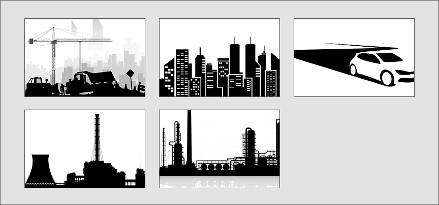
Some companies specialize in a specific field, while others build a variety of different types of homes and buildings. Therefore, when developing a logo, the primary consideration should be the type of business and target audience.
To ensure your logo doesn't blend in with those of competing companies, you need to study the design techniques your competitors have used, find your advantage, and creatively reflect it in your own logo.
If you don't know where to start but want a unique logo that sets you apart from your competitors, give us a call or chat with us on our website. WLB Studio designers will create a modern and trustworthy logo for your business.
A logo is the first point of contact with a client. A successful corporate identity will highlight the company's strengths and emphasize its reliability, stability, and authority in the construction market. This is not the case with a poorly designed and mediocre logo, which will not only go unnoticed but will also evoke negative associations in consumers, suggesting your incompetence and lack of credibility.
In the construction industry, font-based (company name and abbreviations) and combination (inscription + symbol) logos are most common, but some companies also use hand-drawn logos, as they look original and are quickly remembered.
You can create a good impression of your company with the help of correctly selected symbols, colors and fonts.
When it comes to construction, we imagine workers on site, building materials, and luxurious modern homes. Therefore, icons associated with this industry (brickwork, concrete blocks, construction cranes, hard hats, workers, timber beams, skyscrapers, etc.) are the most popular.

But if you want to be unique, use unconventional images or play with traditional ones.
To emphasize a company's reliability and responsibility, consider using geometric shapes as the basis for a logo. For example, a square or cube resembles a building and is associated with strength, while a triangle conveys power and reliability.
Color schemes attract attention and help create a certain mood, so choosing a shade for a logo is a responsible task.
The most commonly used colors in the construction industry are red, blue, and green. Red is associated with love, energy, and strength, blue reflects calm and stability, and green represents freshness and harmony.
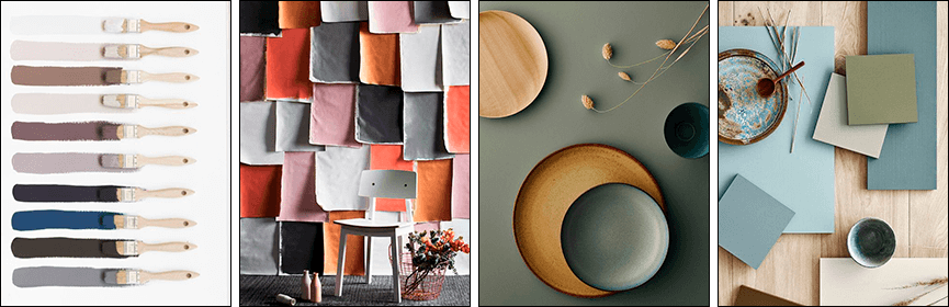
To distinguish yourself from competitors' logos, your logo should stand out in color, demonstrating the qualities essential to your industry. For this reason, consider other shades (orange, brown, yellow, etc.), as well as creating interesting two-tone combinations (blue-green, red-black, black-green, gray-orange, etc.). Just be careful not to overload your logo with too many shades, or you'll turn off customers.
Font, like color, influences the perception and recognizability of a brand logo. It should be legible and simple (without flourishes or unnecessary details), and it should also complement the icon.
When choosing a font, consider your image and the impression you want to make on your clients. What do you want to emphasize most—reliability, stability, creativity, or something else?
Each font has its own character and mood. It can be strict, casual, playful, or sophisticated. Bold, straight lines convey strength and stability, ornate fonts convey elegance, and rounded letters convey friendliness and softness.
Therefore, you should choose a font based on what quality is most important to you and how it will look next to other elements.
To differentiate yourself from your competitors, avoid using popular fonts or copying their techniques. Choose a unique typeface and create a memorable and prestigious logo.
 Use elements in your design that symbolize stability, strength and security.
 Avoid images of tools, as they are associated with an unfinished process and are more appropriate for repair crews.
 Choose legible and simple fonts. If you run an architecture or design firm, consider using handwritten fonts to convey sophistication and individuality.
 Reflect your goals and values in your logo.
 Create logos that will attract and retain attention.
 Establish a connection between the brand name and the company in consumers' minds. This can be accomplished using the business owner's name and initials.
 Use a technique such as scaling, which adds credibility and helps you stand out from the competition.
 Visualize the future. That is, show the result of the work, not the construction process itself. This builds trust.
Construction company logos are typically simple and minimalist, but a touch of creativity never hurts. Every company has its own unique selling point (an emphasis on sustainability, bold projects, etc.), and it should be reflected in the logo. Choosing an unconventional idea and an interesting accent will create a striking yet respectable brand identity. The key is to be creative.
In the construction industry, images of objects, houses, construction equipment, builders, trees, and geometric shapes are most often used. Such logos inform consumers about the company's activities and reflect qualities important to the industry.
These elements are simple and straightforward, making them trendy. But many companies are now trying to stand out and engage people, so they're using bold ideas and unusual imagery. Here are some of them:
# 1 Interpretation of the standard drawing
For example, a logo that is the first letter of the name, consisting of construction cranes, cones or bricks.
# 2 Symbolism
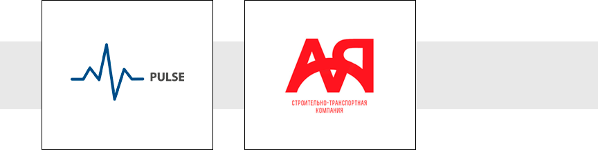
A logo can contain hidden symbols or simultaneously evoke multiple associations (reflecting the company's name, highlighting the specifics of the work, or revealing a benefit). For example, the construction company Pulse used a line reminiscent of both a cardiogram and a city silhouette, while the company "Agregatsia" took the first and last letters of the name, connecting them with elements reminiscent of a bridge and an embankment. Another option is the capital letter "E," which resembles a key.
# 3 Images instead of letters
The company name can be written in the usual way, using a suitable font, but an inscription consisting of letters and a drawing on the topic will look more impressive.
# 4 Letter Metaphors
This technique involves constructing a thematic icon from letters taken, for example, from the company name.

# 5 Strict conceptualism
An abbreviation in a logo can look stylish, modern, and original if you use your imagination and unconventional techniques.
# 6 Color Accent
A logo may be simple, but a single accent of a bright color can transform the sign, adding confidence and boldness in the best sense of the word.

# 7 Maximalism
The construction industry may be a strict one, but don't shy away from experimentation. Using multiple details and mixing vibrant colors within reason will make your logo vibrant and appealing.

# 8 History
Using visualization, you can show a client their dream home or create a positive character who will explain how they love their work and are willing to do everything to ensure people receive high-quality, beautiful housing.
# 9 Status minimalism
A simple, uncluttered logo conveys the company's prestige and authority. It requires no additional embellishments, elements, or images.

A stylish and original logo not only differentiates you from your competitors but also creates an emotional connection with consumers. Such a symbol attracts attention, intrigues, and inspires trust.


Comparing the logos of well-known construction companies in Ukraine and around the world, we can conclude that in our country, both simple and traditional construction logos and original ones are popular. In the US, Europe, and Asia, however, font-based and combination logos based on the developer's name are more common, symbolizing reliability and denoting status.
There are several ways to design a logo – it all depends on your skills, imagination, and budget.
If you have the necessary knowledge and skills, you can create a logo yourself. The advantage of this method is that it saves money. However, if you're unsure of your abilities, it's best not to take on the design. Otherwise, at best, you'll end up with a crude logo, and at worst, you'll fail completely and waste your time.
The second option is to use online services that provide icons and logo creation tools. This option doesn't require a large financial investment, but you shouldn't expect uniqueness.
You can also look for a freelance designer. But to ensure the result meets your expectations, the person must be creative, experienced, and responsible. Otherwise, you risk missing deadlines, ending up with a bland and dull logo, or even nothing at all.
The most reliable way to develop a logo is to hire a studio or agency. These agencies typically employ professionals who value their reputation and put their heart and soul into every project.
The cost of logo development depends on several factors, including the timeframe, number of variations, complexity, and scope of work. Freelancing can cost between 10 and 50 $ (depending on the region, experience, and workload of the designer). Studios offer several pricing packages that explain exactly what you're paying for. Many agencies start at $200-300.
A logo is an essential component of your business and a guarantee of quality service. It should inspire trust without being boring or generic. A successful developer logo allows consumers to understand all the benefits they will receive by choosing your company. Therefore, don't shy away from original ideas and bold solutions.
If you want a striking logo without compromising your image, contact WeLoveBrands. Call us or ask us via online chat for a consultation.