Receive a presentation of services and expert advice
The best experts in the industry will oversee your brand development process.
→ Need branding, design, or creative solutions? Call us at +48 505 648 022 or message us on WhatsApp.
 WeLoveBrands.pptx

The best experts in the industry will oversee your brand development process.
Design elements and principles are crucial to a graphic designer's success. And since contrast is one of these important principles, and contrast as a style is much more than black and white, big and small, it's interesting to explore this topic in more detail.
Have you ever wondered why our eyes enjoy looking at high-contrast images? The answer is obvious: because they look captivating and aesthetically pleasing. To enhance this effect, contrasting elements are placed next to each other.
In design, the following types of contrasts are distinguished :
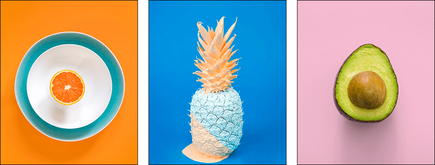
# 1 Vibrant Colors . The simplest example of color contrast is the use of black and white. But contrast in a broader sense also includes combinations of bright, saturated colors that are not neutral.
# 2 Sizes . Another way to draw attention to a design is to change the sizes of the most important elements in the layout (make them larger than the rest).
# 3 Shapes . Design elements are shaped like geometric figures or placed in differently shaped blocks. In such a composition, it's important to maintain balance and avoid overemphasizing elements.
# 4 Composition . The essence of this technique is that elements are arranged with spaces between them. The presence of white space attracts users' attention.
# 5 Typography . In articles and other types of text content, you can create contrast using typography, highlighting links, website names, and other important information. In addition to highlighting text, you can use different fonts or text sizes.
# 6 Textures . In this case, contrast between blocks in the layout is created using various textures and patterns. Various options are possible: dividing the workspace into several parts and using a pattern in one of them, or using textures as backgrounds for objects.
# 7 Creative elements . These can include unusual illustrations, interesting shapes, pop-up windows, animation, etc.
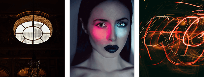
Advantages of contrasting combinations in design :
 attract attention by creating a focal point or point to which the eye is drawn;
 create a sense of balance and harmony;
 facilitate the perception of content and navigation on the site;
 improve resource memorability and brand recognition.
High-contrast color schemes combined with bright neon shades were popular back in the 1960s and 1980s.
In 2017, the use of contrasting combinations in design became popular again. This isn't necessarily due to a complete rebranding of companies' corporate identities: to stand out from the competition, some simply need to add a pop of color to their visual image, thereby moving away from bland neutral tones (gray, black, white, beige).
When developing a design in a high-contrast style, a light-colored background is typically chosen. However, in some cases, a dark background is a more appropriate option to enhance the perceived effectiveness of a product or service.
To draw attention to an object, in addition to color, designers can use a lot of white space .
When it comes to typography , it is important to follow the following principles:
use no more than 2-3 fonts on the layout;
do not use fonts that do not match the overall style of the design;
maintain line spacing, separate text into paragraphs, etc.
Color contrasts are used in the fashion and music industries, particularly in photography, as well as in clothing and accessory design, posters for solo artists and bands, album covers, recording studio logos, and branded merchandise. Contrasting styles are also suitable for corporate identity design in the sports industry.
However, for interior design, a contrasting style is not the best option: ultra-contrasting colors do not create a feeling of coziness, and being in such an interior will be uncomfortable.
To create contrasting color pairs , use the color wheel to select colors that are opposite each other. For example, green and red, purple and yellow, or blue and orange. Using such color pairs in design allows you to create a rich, dynamic, strong, and energetic composition.
As a contrast to black, you can choose any pastel or neon color, as well as any rich, pure shade.
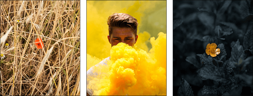
Depending on the compositions in which high contrasts are used (whether in combination with minimalist design or in complex compositions), they can create completely different impressions. If you're looking to incorporate color into your company's brand identity, we recommend adopting a minimalist approach when developing it.
In graphic design, artists use contrast to create strong focal points and visual balance. This technique is common in painting, sculpture, and even architecture.
This style is used in such popular graphic design trends as pop art, futurism, American kitsch, avant-garde, and material design. It is from the latter that the trend toward high contrasts among designers worldwide originates.

@ Anantha Nadamel
High-contrast combinations are popular in designs featuring abstract shapes or highly simplified objects. The most striking contrasts can be seen in poster designs, which are intended to attract attention and call to action.
Before choosing a color palette for a logo, it's important to analyze the brand's concept. Otherwise, it's very difficult to make the right choice based on color psychology.
When it comes to brand logos, light elements look good against dark textures—this can be called not only a color contrast, but also a contrast of “materials.”
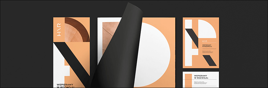
@ Przemek Bizon
@ Agata Lobaczuk
Due to their dynamic contrasts, they are often used in the creation of logos and corporate identities for sports teams, record labels, etc.
The primary purpose of packaging design is to tell consumers as much as possible about the product it contains. A dull and bland design is unlikely to attract a potential consumer's attention. However, a design in contrasting colors accomplishes this task perfectly.
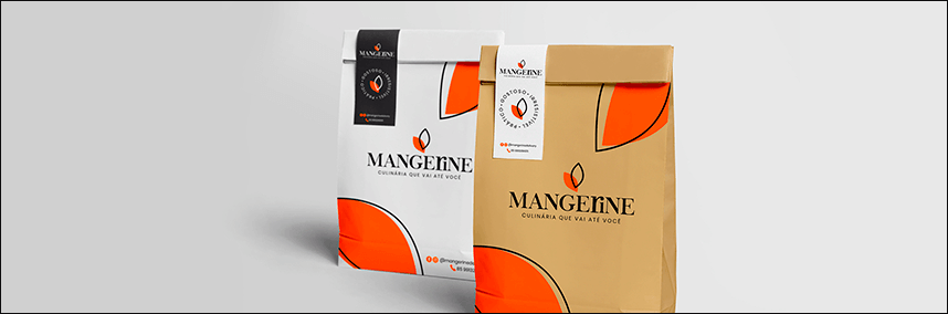
@ Lapin Art ~ Vivian Sakahara
Dynamic contrasts can be found in the packaging designs of sports nutrition, energy drinks, and other products associated with movement and drive.
On websites, contrasting colors are used to draw attention to so-called anchor elements: either objects (product images, titles, menus) or calls to action (subscribe to a newsletter, place an order, or leave contact information in a special form). In the latter case, the goal is to encourage users to perform the target action. It's important to choose a color that not only provides maximum contrast but also sufficient distinction between the content and the background.
However, it's important to keep in mind that ultra-contrast colors aren't always suitable for web and mobile app design. This is because the high contrast and often excessive amount of fine detail put additional strain on the eyes, causing users to subconsciously want to leave your website.
If your website features long text, horizontal or vertical menus, forms, and other elements, you can use a type of contrast called composition. One suitable way to place anchor elements in this case is on the sides.
On websites with a clearly defined corporate style and patterns as part of the identity, designers often practice highlighting blocks among other elements by contrast.
For Ukrainian designers, contrast has been and remains a popular technique used in logo design, online and print advertising, web design, and outdoor and indoor advertising.
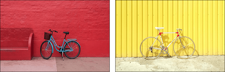
Using contrasts, you can effectively highlight important elements and information in design projects (banners with promotions and discounts, product images, text content about the company, purchase terms, etc.), create stylish layouts, and thus interest users with unusual details.
Across the world, many designers who skillfully use contrasts are the creators of cool and memorable logos and websites that compare favorably with the brand names and websites of their competitors.
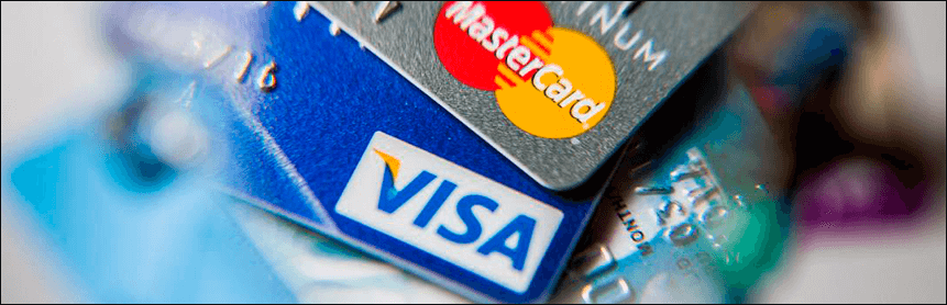
One of the most striking examples is the blue and yellow-orange logo of the American multinational payment processing company VISA. Blue is associated with trust and loyalty, while yellow evokes positivity, which has largely contributed to the brand's global popularity.
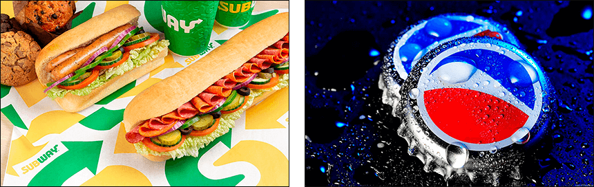
Also worth mentioning is the green and red logo of Mountain Dew, a carbonated soft drink produced by the American company PepsiCo. The green highlights the brand's connection to nature, while the red draws attention to the center of the logo.
The fast-food chain Subway uses contrast in its signage, placing white and yellow typography against a dark green background. And the renowned international hotel brand Hilton/F&B uses contrasting colors in its brochures to highlight not only the images but also the text.
Since 2019, the use of dynamic contrasting combinations has become increasingly popular around the world, replacing traditional combinations based on calm shades.
An important nuance: to be able to correctly select contrasting colors, a designer must have a high level of professionalism.
You have a choice of whose services to use:
A freelance designer —in this case, you can either save money and get high-quality work if you find a true professional, or waste your money if you end up with an unscrupulous contractor who delays deadlines and/or delivers a shoddy result.
Average prices offered by freelancers for design development services in a contrasting style, depending on the complexity and scope of the work, are: from 10 $ for packaging, from 40 $ for a logo, and 60 $ for a website.
A web studio specialist is an option where the higher cost of a well-thought-out and memorable design is offset by the absence of risks that could result in failure to achieve the desired result within the contractually agreed-upon timeframe.
Prices for services to create a contrasting design in specialized companies also vary depending on the nature and characteristics of the work: from $20 for printing, from $130 for corporate identity, from $150 for a logo.
If you value a responsible and professional approach to work and want an original design in a contrasting style, contact WeLoveBrands. You can place your order by phone or through our online chat.