Receive a presentation of services and expert advice
The best people in the industry oversee your brand development process
→ Need branding, design, or creative solutions? Call us at +48 505 648 022 or message us on WhatsApp.
 WeLoveBrands.pptx

The best people in the industry oversee your brand development process
It's important for a professional photographer to establish their business and themselves, and to inspire trust among their target audience. A business card can help you achieve success in business, highlight your status, and attract clients. It contains key information, advertises your work, and shapes your professional image.
A stylish photographer's business card creates a favorable first impression, increases recognition, and contributes to increased earnings.
A photographer's business card should reflect their personality, inspire trust, and motivate customers to book their service. Therefore, it's crucial not only to include your contact information and professional background, but also to create a striking design and use original materials. This will help highlight the professional's individuality and attract a wider audience.
Since photography is a creative profession, there should be room for creativity in design. Just be sure to use moderation—an overly complex business card will be confusing and may turn off customers.

It's best to avoid including photos or bios. This format isn't suitable for business cards, but rather for advertising brochures. The exception is expressive black-and-white photos, provided the card's background contrasts with them.

The font used should be clear, understandable, and legible, so avoid or use minimally curly fonts, as they look beautiful but are difficult to read.

When making business cards for a photographer, the material is crucial. It's best to order a smaller print run, but with premium paper. In the eyes of the client, the quality of the material equals the quality of your work.

Do not use more than 2 fonts on a business card, otherwise it will negatively affect the perception of information.

To create vibrant accents, use modern printing technologies instead of flashy colors: embossing, varnishing, heat-lifting, etc.

Order a photographer's business card in a shape and size that will fit easily in a card holder or wallet.
For a business card to fulfill its purpose, it must be clear and attractive. This means including important information about the business, using harmonious color combinations, legible fonts, and careful thoughtfulness in all design elements.
Each visual and verbal component influences not only the perception of information, but also the image of the photographer.
A business card isn't the kind of tool that can accommodate a ton of information. Therefore, it's best to highlight the key points and write them briefly on the card. Any remaining information you want to convey to your audience should be encoded in a QR code.
 first name, last name (in some cases patronymic) of the photographer;
 specialization, such as newborn photographer or wedding photographer;
 Contact information: phone number, email address, website, social media accounts, instant messengers, directions to the studio.
A slogan or a concise statement that reflects your unique approach would be helpful. You can also list additional services, such as next-day delivery, artistic design, and video. This way, you can also highlight the benefits of hiring your photography service.
When placing text, avoid clutter. Instead, leave plenty of white space. This will make the business card look neat and concise, and facilitate better information comprehension.
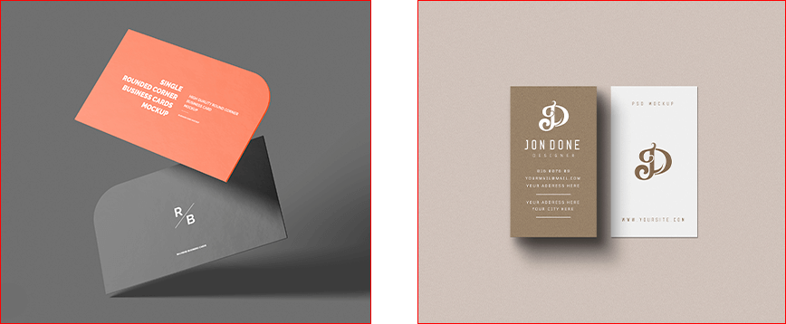
Here are a few more technical points. The business card resolution should be 300dpi. All necessary information should be printed at a reasonable distance from the edge to prevent it from being lost when cropped. The best arrangement of text and graphics is with the logo in the upper left corner and the photographer's name and contact information on the right. It's recommended to leave some white space in the lower left corner. This will make it easier to hold the card and dial the phone number with your right hand without covering it with your finger.
A photographer's business card can be either simple or creative. It all depends on your specialization, work style, and preferences. You can reflect your personality and convey the desired message to your target audience through the shape, design style, and color scheme.
It's perfectly acceptable to use not only the standard rectangular size of 50x90 or 55x85, but also a square, circle, triangle, or even a construction set. A great solution would be to choose a shape that will serve as an additional element of information about your business. For example, a business card shaped like a camera or a transparent card with a view of the surrounding world as if through a camera lens is an original way to play with shape. A more discreet approach is to use rounded or curved edges on a standard business card.
Another way to attract potential clients' attention is to use a vertical orientation instead of the traditional horizontal one, or to arrange the text diagonally. When describing your services, you can use puns, riddles, simple tests, or riddles. These techniques will keep the client's eye on your business card, increasing its memorability and encouraging them to book your photography services.
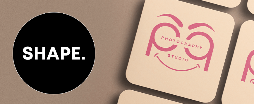
When it comes to style, successful options for a photographer's business card include minimalism, geometric shapes, negative space, and interactive elements. Depending on the chosen format, you can create a specific image and enhance your photographer's reputation.
It's a good idea to have a corporate identity. It will help you establish yourself as a professional and differentiate yourself from your competitors. Corporate elements, such as your logo, colors, and fonts, are reflected in the design of your advertising materials, website, and social media. However, they should look natural in the limited space of a business card. It's important that they are clear and informative.
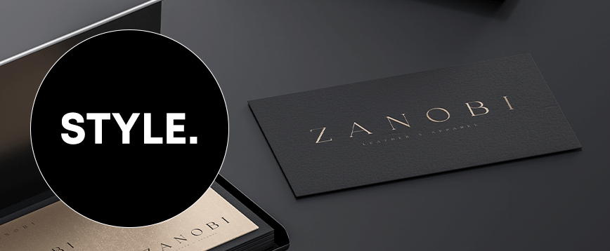
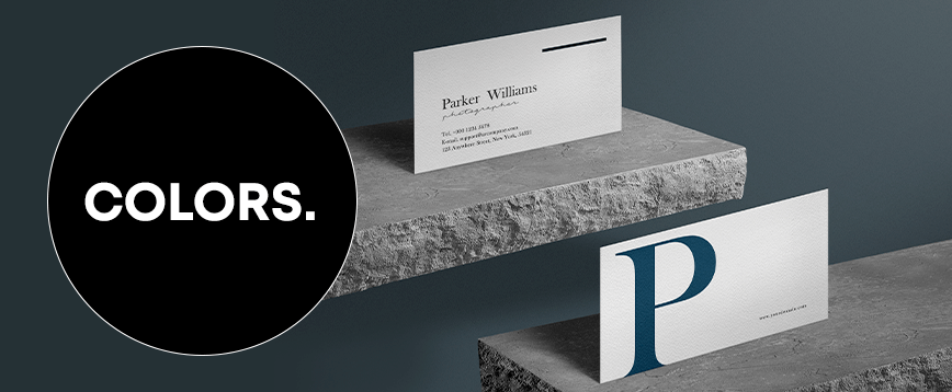
When designing business cards, use your brand colors, if applicable. Otherwise, opt for a classic palette: white, gray, and black. While these colors may seem out of place in a photographer's creative work, they're not. It's all about contrast. A black background with gold or white text, or conversely, a white background with black or dark gray lettering, look upscale and stylish, unlike using every color of the rainbow. Furthermore, using a classic palette is closely related to the colors found in most cameras (black, gray), flashbulbs (bright white), and film (black, gray, white).
Additionally, you can add a color accent to the cut, such as silver or a bright color (blue, purple, pink). The choice of a contrasting color depends on the photographer's personality and preferences. This combination of shades will look concise and interesting, not clichéd. The key is to use no more than three colors.
Original photographer business cards are more than just cards designed in line with a company's style. Their key feature is their uniqueness, which attracts attention and makes a lasting impression.
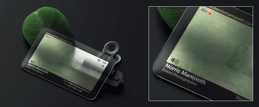
American event photographer Norris Mantooth's business card is made of black and clear plastic. Its unique feature is the transparent section, which mimics a camera's viewfinder. The black "frame" is inscribed with the photographer's name and contact information in white and beige ink.
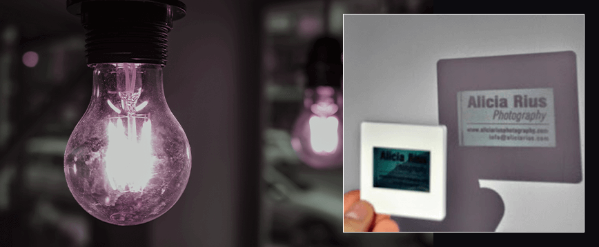
Animal and lifestyle photographer Alicia Rius styled her business card as a slide. Information about her can only be revealed by shining a light on the card.
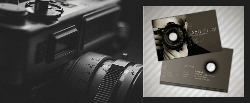
The calling card for German photographer Anne Gretl was designed by Croatian artist Marko Seper. It's rather understated, featuring gray and black tones. However, its distinctive feature is the window where the lens should be, created using a technique called die-cutting.
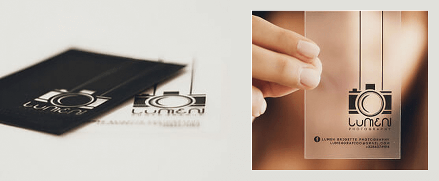
Venezuelan photographer and designer Lumen Bigott , based in San Francisco, created a single-color business card. He used translucent matte plastic as a base, and black ink for all the information and the logo, a camera on a lanyard.
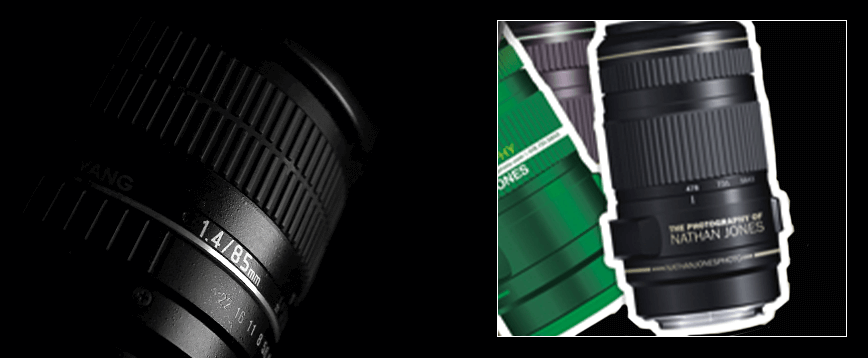
Nathan Jones designed his business card, which speaks volumes about his specialization. It's designed to resemble a camera lens. All the photographer's information is printed on the focusing rings, and the phone numbers are used as focus settings.
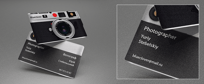
Ukrainian photographer Yuriy Stebelsky uses a double-sided business card, the front and back of which mimic the front and back of a camera. The front of the card displays only the company name, "Blueclover," while the back displays the photographer's phone number, email address, and name in both English and Ukrainian.
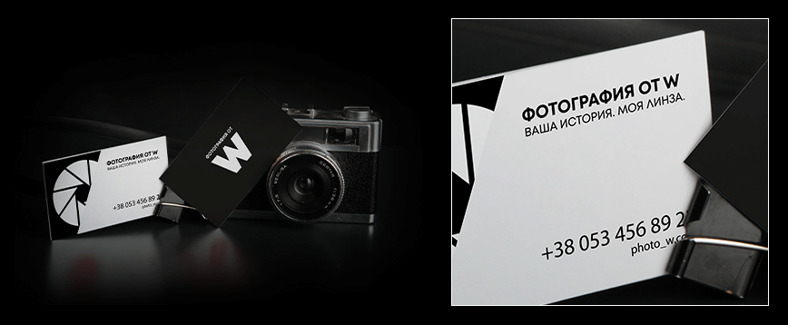
The photographer's business card, titled "Photography by W," is appealing not so much for its form and style as for its message. It uses an interesting tagline: "Your story. My lens." Otherwise, it's a typical lens, half-exposed. The rest of it appears to be obscured by a white sheet of paper, printed with contact information, the studio name, and the tagline.
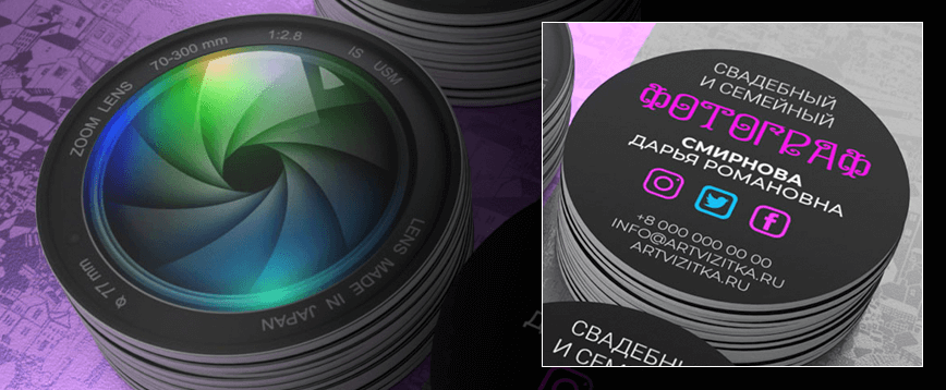
Wedding and family photographer Daria Romanovna Smirnova has a round, double-sided business card. One side features a lens and lens rim, while the other side features information about the photographer and how to contact her against a dark background.
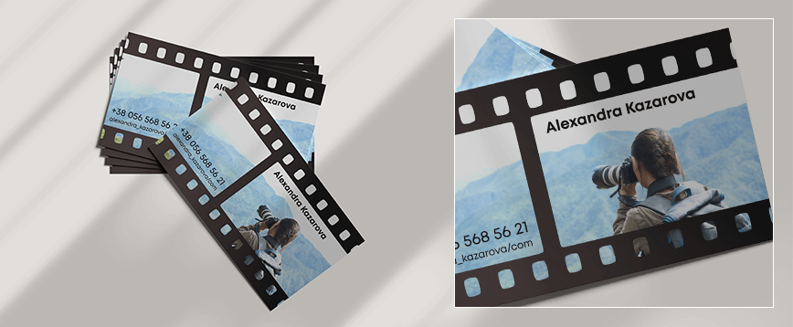
Alexander Kazarov's business card is styled like a camera roll with color photos showing the photographer at work in the snowy mountains. This is how he communicates his specialty.
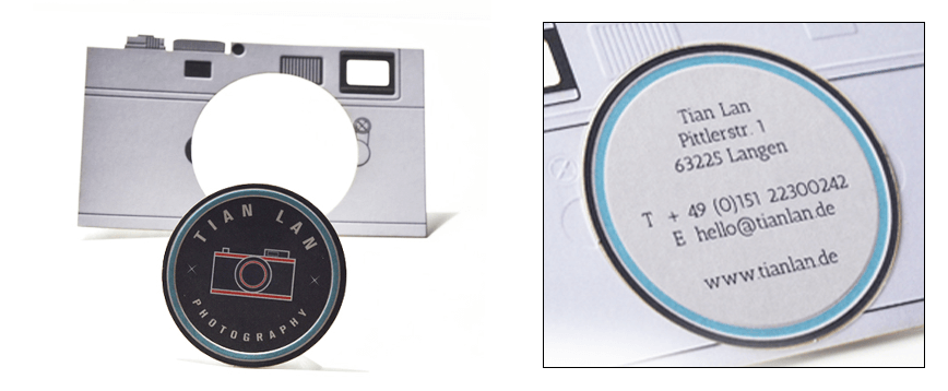
The business card of Tian Lan , a Frankfurt-based photographer, is designed to look like a camera. Its features include a removable lens and embossed and die-cut details that highlight all the camera elements. This lends a touch of realism. This attention to detail is a definite plus in the design.
Examples of business card designs by renowned world photographers can serve as inspiration. By exploring different designs, you can find ideas for your own business card design. However, don't resort to blind copying. This will backfire: you won't be able to establish your brand or differentiate yourself from your competitors.
Not all business cards are made of thick cardboard or any other designer paper. Plastic, wood, metal, and magnetic vinyl are all perfectly suitable for creative business cards. These products are considered elite, premium cards. Furthermore, these materials allow for original designs. It's important that the visual elements serve as much of an informative function as the text; for example, transparent plastic can mimic a camera viewfinder.
Some materials serve a marketing function. How exactly? For example, soft-touch paper has a pleasant tactile feel. The smooth, velvety surface of your business card will be highly appreciated by potential clients, especially those with kinesthetic needs. This will positively impact memorability, increase customer loyalty, and encourage bookings for a photo shoot.
In addition to the pleasant tactile feel of the material, customers may be drawn to the unique design achieved through modern post-printing technologies.
These include:
 Varnishing .
These include spot, 3D, and UV varnishing. This method doesn't add excessive glamour to the product, but it will definitely highlight text or graphic elements. If the business card features a camera lens, you can varnish it specifically. Twin-spot varnishing will not only highlight the background but also add a pleasant textured texture.
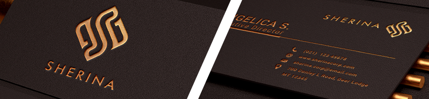
 Felling .
This method helps create unusual holes and artistic cutouts on the business card. For example, the lens window was created using this technique. Die-cutting also helps achieve realistic bulges and irregularities in the shape of the camera depicted on the paper.
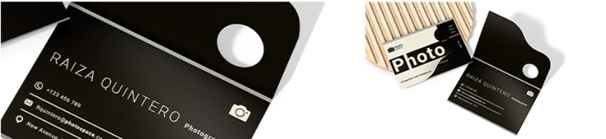
 Processing of cut .
This popular technique is used when using white paper inked with another color. For example, if black ink is applied, an unsightly white edge is left, which immediately cheapens the product and negatively impacts the photographer's reputation. This defect can be corrected by finishing the edge with gold plating or any other color that matches the ink used on the business card itself.
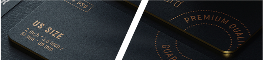
 Embossing .
This technology differs from die-cutting in that the material is not punched through, but rather pressed inward, creating grooves and indentations. This is used to create, for example, text, image details, or a logo. Embossing can be combined with foil stamping, giving your business card a prestigious and striking look.
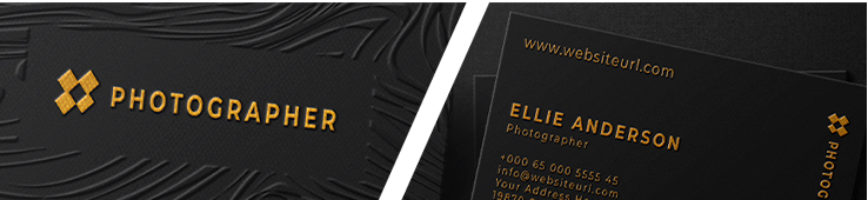
Thermal rise .
This method of surface treatment on a business card involves heating the desired areas. These areas are lifted and gain volume, allowing you to highlight your logo, text, and graphic elements.

When designing a business card, you should not use everything at once, but rather one or at most two technologies, for example, silver foiling the text and edges, or varnishing and foiling important elements of the business card.
If you're thinking about creating a photographer's business card, book a service with WeLoveBrands . Our designers will develop a layout based on your requirements and current trends, as well as market analysis and target audience preferences. Detailed information on the development stages, timeframes, and cost of a photographer's business card can be found here . For a consultation or to order a design, please call us or contact us via messaging.