Receive a presentation of services and expert advice
The best experts in the industry will oversee your brand development process.
→ Need branding, design, or creative solutions? Call us at +48 505 648 022 or message us on WhatsApp.
 WeLoveBrands.pptx

The best experts in the industry will oversee your brand development process.
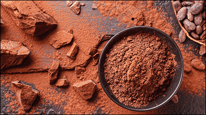
Brown lettering is the overwhelming majority of chocolate logos. If your logo is similar to your competitors', how will viewers remember you? How will new customers find your brand?
Therefore, a professionally designed logo is crucial for a successful business, especially in a highly competitive field like chocolate production or distribution. Here are four reasons to consider creating an effective logo.
 Great logos make a great first impression . Before a shopper sees a chocolate bar on a supermarket shelf or even a truck driving by, when customers are deciding who to trust, they look first at your logo. If people can easily recall your logo, you undoubtedly have a competitive advantage.
 Attract new customers . Even though people see hundreds of logos every day, they can recognize a quality logo. By communicating a clear brand message to customers, it helps them choose your brand. If you don't have a compelling argument that can convince customers that your chocolate will meet their expectations, they'll switch to a competitor. A brilliant logo is one of the most powerful first impressions.
 Stands out from the competition . If you go to a supermarket, you'll see for yourself that potential fans of a chocolate brand have plenty of other options. It's also clear that few logos stand out on the chocolate shelf. To win the battle for customers, it's important to differentiate yourself from the competition. Some do this through color. Instead of the usual brown tones, they use a cool color combination.
 It helps build relationships with brand fans . When people see a professional logo, it reassures them of a reliable image. You work with the brand year after year, and this builds trust. If a designer has created a logo that conveys the brand's message of reliability and professionalism, then much of the work has already been done for you.
First, let's decide: what should a chocolate logo be like?
Rich in cocoa aroma
Teasing and seductive
Simple but memorable
If developing an original and compelling brand image is important to you, the WeLoweBrands team is ready to create a masterpiece that will reflect your business.
When creating a logo for a chocolate bar, keep your audience in mind. Your wishes and preferences don't matter.
Think about the audience segment that will buy chocolate .
These could be:
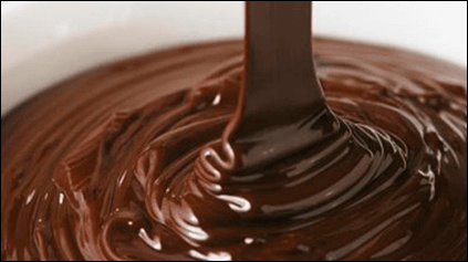
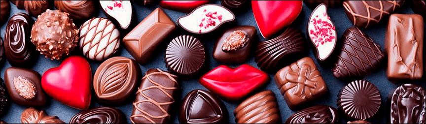
Gourmets and connoisseurs of fine taste (dark chocolate created according to a unique recipe)

Youth (milk chocolate with explosive filling)
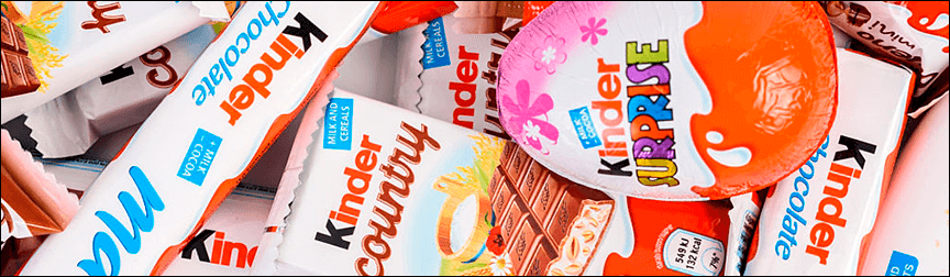
Families with children (children's chocolate with safe ingredients)
For a logo to become part of the image of a chocolate brand that will be successful in selling its products, it must accurately reflect the company's values and target a specific audience segment. While it's certainly possible to create a generic chocolate logo, tailoring it to a specific segment can achieve excellent results. Children crave celebration and fun, young people prefer an informal approach, and adults consider sophisticated and creative solutions. Creating a logo that meets all these requirements is a challenging task.
Its creation will be divided into stages:
A detailed analysis of the company's activities and the market of direct competitors by marketing and PR specialists
Working on preliminary sketches
Presentation of the new logo
Evaluation of effectiveness
Edits
Approval of the final result.
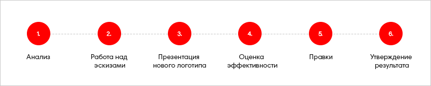
While points 2 through 5 are clear, clients ordering a logo for the first time often have questions: what is a competitive market analysis? This isn't just a quick scan of their social media accounts. This isn't competitive analysis, just simple curiosity. Market analysis is the painstaking work of marketers with digital consumer data. This data will enable them to make informed decisions that will ensure the logo becomes part of the brand's overall marketing strategy.
When creating a chocolate logo, many brands pay close attention to the design and font. The color scheme seems to be a no-brainer—every shade of brown is at your disposal. But it's not so straightforward. After all, your logo should be unique and should break free from stereotypes. So, here's a guide to choosing the best color for your chocolate brand's logo.
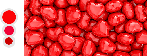
Red
One of the most controversial colors, it conveys passion, dominance, and strength. Let's face it: we all love to eat. And for many people, food is a passion. Hunger is a dominant emotion. For many brands, red is a popular choice because it attracts attention. It's also worth considering its powerful physiological effects: it increases blood pressure and metabolism.
Orange
Many companies that produce desserts and sweet drinks use orange in their logos because this color, like red, evokes hunger and thirst. However, instead of conveying power and dominance, orange conveys warmth and comfort. Note: when orange is used in a logo, it takes on different shades and is displayed differently in different print media, on the web, and on television. Before deciding to use this color in your logo design, it's worth discussing it with a graphic designer.

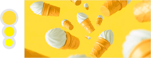
Yellow
Brands that sell sweet desserts typically use a combination of red and yellow. Red has already been mentioned, so it's time for yellow to shine. Using yellow in a logo is smart because it not only attracts attention but also conveys a feeling of happiness. If you choose yellow, pair it with another color, as it's difficult for the eye to perceive and read on its own.
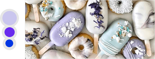
Purple, lilac, blue
These are the most challenging colors for a "chocolate" logo, as it conveys emotions of purity, spirituality, and morality. These emotions are anything but "appetizing." Blue symbolizes serenity and relaxation. Believe me, this is not the color scheme a chocolate logo needs.
Beige and brown
Your first association? Coziness, warmth, aromatic cocoa or coffee. And a sense of stability and reliability. These colors are considered the most popular among chocolate brands.

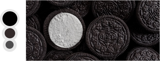
Black
This color is rarely used by "edible" brands for their logos. But if a designer is adapting a logo to a specific segment and concept, black is an ideal choice. Women will understand if I imagine a little black dress in a wardrobe as an example, as it's always in style. Black will enhance any logo. However, unfortunately, it's difficult to convey the messages of chocolate brands to the viewer.
Even before a customer encounters your brand's message, the font already tells its story. Each font conveys its own message and has its own strengths and weaknesses.
With serifs
Classic. "Serifs" are the decorative lines at the end of a character. One well-known and widely used example is Times New Roman. This is a good choice because this group is easy to read and our eyes are accustomed to their shape.

Sans serif
The name of this font family suggests the absence of a distinctive decorative line. They also have the added benefit of working perfectly in low resolutions, bringing strength, clarity, and modernity to any project. Font weights can convey completely different meanings:
Fonts with thick lines are masculine and hardworking;
Fonts with thin lines are glamorous and modern.
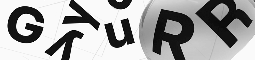
Tiled
Slab fonts feature blocky serifs that bring an old-school, almost botanical charm to a project. They should be used sparingly, but despite this, this typeface group is pleasing to the eye.

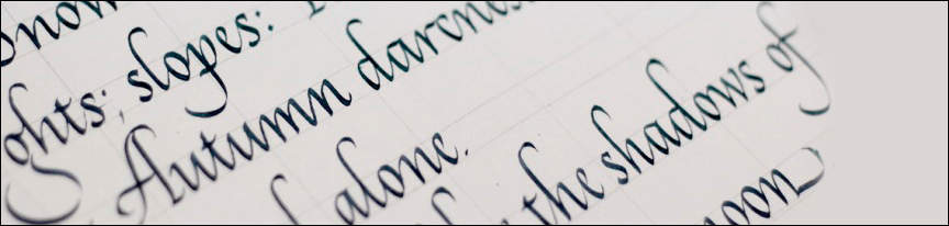
Scripted
This group resembles cursive. With people recently seeking unique ways to represent their brands, the availability and variety of fonts has increased. The unique script group ranges from calligraphic styles (usually favored for wedding invitations) to simple ones (used by bloggers to mimic handwriting).
Decorative
This group evokes a special feeling in the viewer. But when using them, one must exercise caution and think of them as fireworks. They are a lot of fun, but only professionals should use decorative fonts.
No matter what font you choose for your chocolate logo, using trendy fonts is inappropriate unless you want your brand to look outdated once the trend changes.

Every year, new trends in logo design emerge. A logo is an important part of a brand's image—an asset that communicates a business's values and quality standards. Some of this year's trends are a continuation of past ones. But this year will also feature fresh stylistic solutions.
 Retro
When it comes to trends, it's generally accepted that what's old is sometimes new again. This year will see a resurgence of logos featuring plenty of chrome, neon, and pixels.
 By hand
Digital perfection is no longer in demand. However, unedited, hand-drawn logos are becoming popular. This style offers an opportunity to add a touch of authenticity to a brand. And if a company produces chocolate using traditional recipes and uses only natural ingredients, a raw, hand-drawn logo will perfectly suit its design requirements.
 Animated logos
Still believe logos are static? The new trend of animated logos has proven that wrong. Animated graphics have become an integral part of visual advertising, and this trend has continued into 2021 because movement helps make a logo engaging on any digital platform.
 Bold typography
When it comes to logos, typography plays a crucial role. A chocolate brand's design may be a captivating creative idea, but the wrong font choice can ruin it all. This year, designers predict we'll see a lot of fun logo designs, supported by bold fonts we've never seen before.
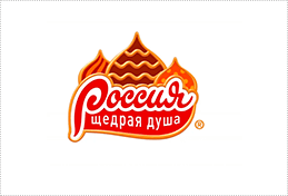
Chocolate brand "Russia"
In 2015, Rossiya Chocolate enhanced its beloved and familiar flavor in the CIS with a rebranded logo, which not only appealed to a younger audience but also complemented the brand's modern image. The logo features the beauty of Russian architecture, featuring multicolored domes with gold accents. Now, brand fans can find their favorite chocolate bars much easier to find on supermarket shelves.
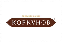
Karkunov
This chocolate brand's products are considered premium for good reason, commanding high prices and valued for their high quality. For this reason, in 2006, the brand was awarded the status of official supplier to the Kremlin. In 2011, a rebranding was completed. The logo was designed in a retro style, leading some consumers, according to a survey, to believe the company was founded during the Revolution.
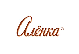
Alenka
The brand has much to be proud of: Alyonka chocolate bars have been a delicacy for generations of children, and, incidentally, the packaging design hasn't changed since 1966. As for the product range, it has been expanded. The flavor range now includes 11 flavors. The signature logo, "Red October," deserves special attention. Its retro design is clearly aimed at an older generation.
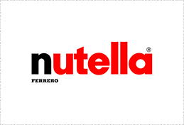
Nutella
Ferrero produces a chocolate breakfast bar loved by millions of children worldwide. Although the product is clearly aimed at children, the logo for the chocolate-hazelnut spread features the product name in red. The uncluttered typography, highly informative, allows for quick identification on supermarket shelves.
Whether you're an existing business or a startup, a professional logo will be beneficial at every level. It will not only build trust with users but also create a certain emotional attachment. So, how much does it cost to create a professional logo? If you don't work in graphic design, it can be difficult to determine a price range. Professionals may quote high or low prices, but it's important to remember that the price should be consistent with the skill level and time invested in its creation. As for professional logo designers, there are three options: an online logo maker, a freelancer, or a branding agency.
Online logo design websites are attractive not only for their low prices but also for the speed with which logos are created. However, they do have significant drawbacks:
Limited solutions (all logo templates created without marketing
research and do not tell the brand's story).
There are no SEO capabilities and therefore the product does not bring in customers.
While an online logo maker can certainly be useful for those with limited budgets and time, the logos it creates are easily considered semi-finished products in the design world.
While it's tempting to opt for remote specialists to optimize income, working with freelancers can be risky, not only due to the risk of missed deadlines but also due to concerns about the quality of their professional skills. Clients willing to take the risk should properly assess the freelancer's labor costs.
A branding agency offers more expensive, high-quality, and comprehensive services. How can you distinguish professionals from novice contractors who've rented an office? Listen to what the agency has to say about visual solutions: when talking about branding, it's important to understand that new design trends, creative approaches, or trendy graphic elements don't play a decisive role. The graphic concept developed by a team of highly specialized specialists is primarily focused on the essence of the brand, the preferences of its target audience, and marketing research. To consult with a WeLoweBrands brand manager, you can use the chatbot or call the number listed in the contacts section .