Receive a presentation of services and expert advice
The best experts in the industry will oversee your brand development process.
→ Need branding, design, or creative solutions? Call us at +48 505 648 022 or message us on WhatsApp.
 WeLoveBrands.pptx

The best experts in the industry will oversee your brand development process.
A sense of security and reliability is the core message of every organization operating in the financial sector. To win over consumers, it's important to create a brand that reassures them of the company's stability and the high quality of its services.
A logo for a financial company that highlights its strengths will inspire trust and a sense of security in customers. It will also help strengthen the company's position in the market, distinguishing it from competitors and attracting consumer attention.
A logo is a company's calling card. If you include it on advertising materials or a brochure, consumers will perceive you as a reputable company with its own character and values. Without an emblem, a company's image will appear unfinished or "raw."
Emblem made by a qualified specialist:
 ensures brand recognition;
 distinguishes the company from its competitors;
 creates a sense of confidence and security in clients;
 increases trust;
 contributes to increasing the company's profits.
To ensure a logo enhances a financial company's reputation, it's important to entrust its creation to experienced professionals. Poor workmanship can lead to frequent logo redesigns, which, in turn, confuses the audience and leads to financial losses.
What tools and graphic elements should you use to stand out from the logos of competing financial institutions? The foundation of a good logo is a legible font, clear symbols, informative images, and a well-chosen color scheme.
All these elements together help to create a strong company image and enhance the impression it makes on consumers.
 Name – increases recognition
Financial institution names are typically based on the names of their founders, as well as the cities or countries where they were founded. Bank names are typically one word long, while those of organizations offering a wide range of financial services tend to have longer names.
The font used to write the name or abbreviate an acronym is crucial in text-based logos. It should be selected in accordance with the specifics of the company's activities and its status.

 Font – emphasizes individuality
The font should be easy to read and reflect the company's focus. For example, upright letters emphasize authority, strength, and reliability, while slanted letters symbolize growth and forward movement.
Financial institutions most often use simple sans-serif font styles. However, heavy serif fonts are chosen less frequently, primarily by companies with a rich, centuries-old history.
When choosing a font, also consider that the logo may be used at a small size, as a social media avatar, or on billboards or merchandise. Therefore, the brand mark should look equally good on various media and at different scales.
 Geometric shapes and symbols attract attention
Financial institutions are called upon to preserve and increase their clients' wealth. Therefore, logos should be designed with symbols that convey reliability, strength, prosperity, partnership, and growth.
The most commonly used images are :
Animals and birds symbolize strength, reliability, wisdom, and energy. We recommend using stylized images of a lion, bull, bear, eagle, or owl.




Keys, umbrellas, and roof elements represent savings and protection.


Truncated pyramids, Masonic hammers – convey a sense of power and prosperity.


Triangles and squares—stable geometric shapes—imbue a logo with a sense of stability, solidity, and reliability. These are the most popular shapes in financial institution logos.
The circle is a symbol of life, eternity, success, and development. It is often found in the logos of Asian companies, but it has particular symbolism in Japan.




Slanted lines symbolize development and growth.
Shapes can be depicted with a colored fill or a gradient effect. When choosing a gradient transition, choose calm, neutral, and similar tones, such as blue, light blue, and white. This will ensure good perception and quick memorization of the logo.
Color influences consumer emotions and behavior. A well-chosen color scheme can attract or repel, evoke feelings of trust or aggression. When developing logos, designers draw on knowledge of color psychology, considering how a particular hue influences human behavior.
What do the different colors mean ?
 Blue is most often found in the logos of financial institutions. It is associated with authority, power, reliability, and confidence. It is also the color of stability, calm, and order.
 Green is the color of money, prosperity, and growth. While blue can be found in the logos of established financial institutions, modern companies are increasingly choosing green and lime green to emphasize prosperity.
 Red symbolizes dynamism, energy, passion, speed, and strength. It is the color of leadership and self-confidence. It attracts attention and highlights elements of the logo. At the same time, red represents aggression. It should be used with caution in financial company logos, preferably in combination with more subdued tones.
 Yellow is the color of vitality, joy, energy, and happiness. It can impart a somewhat frivolous feel to a logo, so it's often used in combination with other colors, particularly blue or green.
 Black – associated with order, power, spirituality, and luxury. It is used in the logos of reputable financial institutions and companies with a long history.
 Purple represents strength, nobility, and mysticism. It is often chosen to reflect great ideas, leadership, and prosperity.
 White symbolizes purity, tranquility, and security. It's often used as a background color or to highlight other elements, creating a "white space" effect.
The background color of a logo is no less important than the color of the text and images. A well-chosen background enhances the brand's message, while an incorrect choice often results in poor legibility. When choosing colors,it's important to understand the meaning and emotional impact of each, as well as rely on data about the target audience.
Values that until recently seemed most important—grandeur, power, grandeur, and monumentality—are fading into the background. They are being replaced by friendliness, communication, adaptability, and company friendliness. At the same time, consumers still need guarantees of safety and reliability, and confidence in the qualifications and professionalism of the institution's specialists.
The main trend in logo design in 2021 is minimalism. All components of emblems—letter, fonts, images, and colors—have been subject to the "scissors of simplification."
Names of three or four words are being shortened to two, and sometimes even one. Fonts are changing from monumental, scalloped styles to simple, light, and rounded.

Companies are abandoning complex, highly detailed images in favor of simple, flat shapes composed of one or a few schematic elements. The move away from multi-color logos has led to the emergence of single- and two-color symbols. Neon colors are also increasingly appearing in design.
At the same time, each element of such logos becomes more thoughtful and carries a deeper meaning.
The main reason for the growing demand for minimalism is the fast pace of life, which makes it difficult to recognize complex logos. Furthermore, as businesses increasingly move digitally, logos must be easily readable on device screens.
The first Ukrainian banks inherited old names and logos. Over time, a new financial market in Ukraine began to emerge. Initially, the design of the corporate logos differed little from the emblems of the "old school": they were heavy, multi-colored logos with bold fonts and numerous elements.
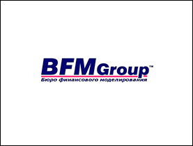
As design evolved, financial institution logos became more concise and memorable. For example, the logo of the consulting companyBFM Group Ukrainefeatures a blue italic font. This symbol simultaneously conveys reliability and dynamism, emphasized by the thin red line.
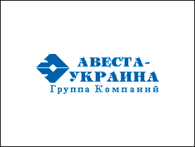
Avesta-Ukraine's diamond-shaped logosimultaneously resembles a soaring eagle and a pen nib. This communicates the company's mission to its clients: protecting business and financial information.
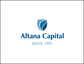
The blue color and shield of theAltana Capital investment company emblem are symbols of reliability and investment protection.
The creation of the European Union is reflected in the emblems of European financial companies. The desire for cooperation is symbolized by the colors blue and yellow, as well as stars. For example, the European Central Bank uses this graphic element in itslogo.
For over 50 years, the Mastercard logo has reflected the international payment system's commitment to connecting people. The two circles are instantly recognizable and easy to read, symbolizing the reliable security of payment transactions. Over the company's history, its logo has undergone numerous transformations. The laconic design even lost its name. Executives claim that 80% of consumers recognize the logo even without the brand name.
Logos of US organizations often play on the stars, stripes, and colors of the national flag. In this way, their founders strengthen their connection to the country and evoke patriotic feelings in their customers.
Eastern companies are characterized by logos that are simple but meaningful. Popular emblem designs include the all-seeing eye, the rising sun, golden pyramids, and infinity symbols.
Red, a color often used in branding, is often perceived as challenging and aggressive in Western culture. In the East, it symbolizes growth, vitality, activity, and good fortune.


Depending on the logo's uniqueness requirements and the timeframe for completion, you can entrust the development to:
Online services . Specialized programs and graphic illustrators can help you create a logo yourself—for free. However, don't expect originality, which means it'll be difficult to stand out from the competition.
Freelancer . The cost of creating a logo with a freelance specialist is $30–40. It's important to keep in mind that designers don't always have experience creating logos and don't always adhere to agreed-upon deadlines. When starting a collaboration with a freelancer, ask them to send a portfolio and review their work.
To the design studio team . When developing logos, the WeLoveBrands team considers traditions and modern trends, studies business specifics, and analyzes the target audience and competitors. Their expertise in design and marketing helps them create branding that helps companies achieve their goals.
When contacting our studio, clients can choose from three pricing plans. They vary in the number of logos designed, turnaround time, and cost. You can view our pricing for logo design for financial companies on our website, and for more details, please call or chat.