Receive a presentation of services and expert advice
The best experts in the industry will oversee your brand development process.
→ Need branding, design, or creative solutions? Call us at +48 505 648 022 or message us on WhatsApp.
 WeLoveBrands.pptx

The best experts in the industry will oversee your brand development process.
Line art has remained popular since 2018. Progressive brands use the monospaced line drawing method for logo design, although experience shows it's also popular in heraldry. Line art is a line art style that only began to develop in 2020, two years after its introduction. The line connects text and graphic imagery into a single whole. Simple, stylish, and modern...
What is the essence of this style? Line art differentiates between outlines and details using varying line thicknesses. This style typically uses a black and white color scheme, but not always. Shadows, color gradients, and other design-heavy elements are absent. Line is used as a means of visual expression. Generally, any pencil sketch can be used in line art. The logo design has a flat, clean outline, and is somewhat reminiscent of a children's coloring book. A logo designed in this style looks stylish and attractive.
This style emerged in the 17th century in architecture and art. It became a trend in 2018, and in 2020, line art became an absolute hit, a faithful companion and partner to minimalism, despite the fact that in the real world there are no lines around an object. By using linear techniques, logos become cleaner. Surprisingly, it was impossible to find a name for this style in Russian, so designers use the English word. Logos have become the most popular arena for line art. In 2020, the number of effects has decreased even more, but the correct placement of accents has arrived.
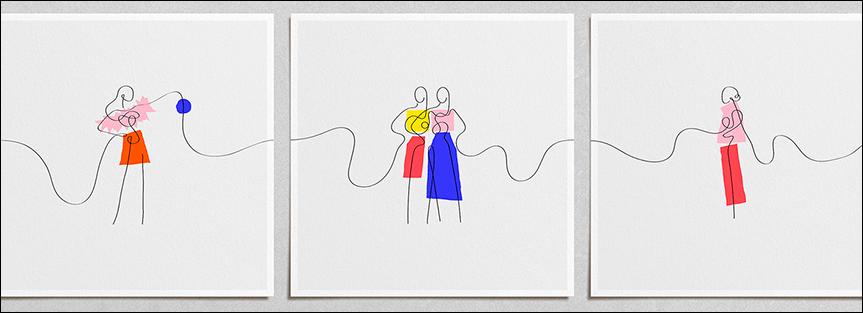
Modern logos convey a wealth of information about color, texture, lighting, and occlusion. Linear designs, on the other hand, convey only outlines to our imagination. Yet, they manage to evoke vivid, three-dimensional impressions because they tap into the neural codes of vision.
Linear design can embellish the logo of a sportswear company, a travel company, or an advertising agency. It's simple in form and content, yet clearly communicates the brand's message, making it truly versatile. Martin Christie, owner of Logo Design London, encourages considering the past before designing a line art logo. If a client wants to position itself as a brand that embraces tradition yet keeps up with the times, a designer using linear techniques can create an emblem with a fresh, futuristic edge. A logo created in this style could look equally good on a sign for a boutique selling original sneakers and streetwear, as it would on a bank's business card. The only differences will be in the color scheme and line style.
Speaking of character, the overall perception is influenced by the nature of the lines and contours (closed or open). Lines can be straight, curved, curved, with sharp angles, etc. They also influence the perception of a graphic image, making it appear strict or, conversely, airy, as in the case of curved lines.
Color can increase brand recognition by 80%. Before choosing colors for your outline logo, try to describe your brand, as Amanda Jameson, owner of a lingerie store in Los Angeles, did. She used words like welcoming, delightful, refreshing, authentic, and warm. When creating the color palette, the logo designer used colors that perfectly align with the brand's characteristics:
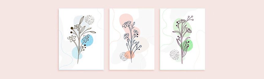
Peach pink is friendly,
Soft blue-green shades are very refreshing,
Brown is a cozy and warm color.
Regarding the line art style, it is recommended to use no more than two colors (if the logo is in color). In 2020, designers generally adhere to a black and white color scheme when creating logos in this style. In 2018, a "shaggy" or "uncertain" line was a sign of a designer's inexperience, but two years later, this technique has been recognized as "vibrant." Using hatching or so-called "dotting" techniques, shadows can be conveyed, but this year, flat line art is trending.
The Serif font family, with its perpendicular stroke at the end of each line, conveys brand values such as tradition, comfort, and reliability. Developers typically use it in Line Art emblems. Display fonts are rarely used in other styles; in Line Art, this font family is harmonious, conveying friendliness, uniqueness, and expressiveness. To convey progressiveness, decisiveness, and elegance, it's worth considering the Modern font family, particularly Futura.


Line art is excellent for conveying concepts of varying complexity, thanks to its unobtrusive, clean, and elegant lines. Although we regularly hear about line art losing ground in photography this year, graphic design and illustration seem unfazed. Thanks to a variety of textures, tools, and brushes, line art seems to have found a new lease of life in illustrators' works. It avoids depth and volume effects (although, as mentioned above, stippling and other techniques can be used if needed). This style returns the designer to the fundamentals of graphics: bright colors and simple shapes. Most illustrations are done in two or three colors, but as we know, rules in design are meant to be broken, so recently it's becoming increasingly common to see illustrations in five or more colors.
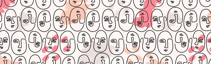
So why has Line Art won acclaim and admiration? Contour-style identities are simple, effective, and easy to perceive. This style combats skeuomorphism (the simplification of an object's actual appearance). Through its form and concept, every element of this style has been simplified. Today, an overabundance of color, noise, and information can be overwhelming for the target audience, so a Line Art identity can easily become an oasis of calm and simplicity for consumers. There are four design principles for a corporate identity developed in Line Art:
 No unnecessary effects (shadows, volume, etc.);
 Only simple elements are used;
 Minimalist fonts;
 Pure color scheme (no gradient).
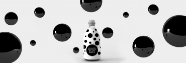
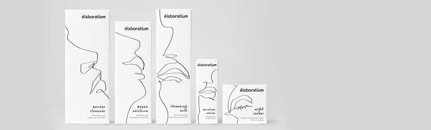
Based on a 2020 study by marketers, it's safe to say that product packaging boosts sales. Are you sure your product is the best? Without properly communicating this information to your potential customers, there's a risk that no one will know. However, line art packaging design requires careful thought. Avoid using overly thin lines, as this can make the packaging difficult to read from a distance, resulting in a blurry design. If a client wants to differentiate themselves from competitors with a sophisticated and unique brand style, line art is an excellent choice. However, it's important to remember: just one poorly designed element can make the packaging design look unprofessional.
How can you design a social media page or a company website without looking overly cluttered? Marketers, designers, and social media managers face a challenging task: choosing a unique style that effectively conveys information without distracting the user with clutter. Line art in web and social media design is considered user-friendly because it places the emphasis on content, preventing the user's attention from being distracted by irrelevant page elements. Here are three advantages to choosing this style:
The page's visual effects are not used to their maximum potential, and this will result in faster page loading speeds.
The concise structure brings the typography of the page to the forefront
Line Art design is simple and memorable.
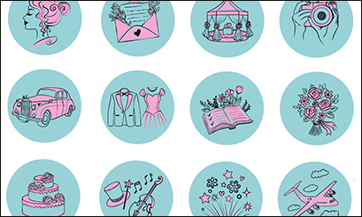

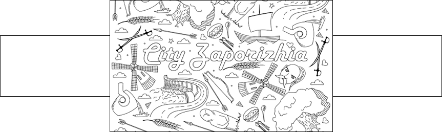
Zaporizhian Sich developed a line art logo with numerous small elements to promote an equestrian theater and a historical mini-town that recreates the everyday life of Ukrainian Cossacks on the Dnieper River. The designer used a gray and white color scheme, making the illustrations bold and memorable.
The city of Rivne (Western Ukraine) developed a Line Art logo to attract tourists. Incidentally, this is one of the few examples of the "shaggy line" technique used, which just two years ago was considered a sign of inexperience. The logo depicts three of the most popular tourist sites: the Tunnel of Love, Dubensky Castle, and Ostroh Castle. The logo will be unveiled at the Warsaw Logo Exhibition in October.
Fishmater, a company offering fishing tackle and equipment in its online store, also delighted with a distinguished line art logo. When creating the logo, the developer used blue, light blue, and gray on a white background. In this case, using more than two colors in this style creates a harmonious effect.
The nightclub's logo designer decided to stay true to the classic line art style, so today, dancefloor patrons see a black-and-white logo. Given the poor lighting, the logo was designed without fine lines or visual effects.
The company plans to rebrand. The legendary brand unveiled a new logo, designed in the Line Art style. For an automobile manufacturer, the use of a monochrome black-and-white logo is natural. Two rings linked together represent teamwork, authority, strength, and charisma.
The Italian company, renowned for its exclusive clothing and perfumes, boasts a simple, almost schematic, line art-style logo. The Gorgon Medusa instantly transforms from a monster into a beautiful woman, captivating the designer's imagination. The only element the designer changed in the logo was replacing the Gorgon's serpentine hair with beautiful, golden human curls.
Habits, character, appearance, and style are the building blocks of a unique personality. Identity is also one of the ingredients that can set your company apart from the competition. Linear style offers the opportunity to go beyond the usual colors and realistic images. Developing a line art identity requires the involvement of specialists and experts from various fields within a branding agency. Implementing the five key stages is only possible through collaborative efforts.
1. Create a specification and fill out a brief
2. Analyze all initial data: consumer market research, brand research, and competition research
3. Develop a list of criteria that the identity and its constituent elements must meet.
4. Working on a Line Art Logo: Searching for Ideas, Presenting the Final Result
5. Development of corporate identity elements
The cost of brand identity development depends on the choice of developer, the scope of work, the number of revisions, and the deadline. There are two development options: a branding agency or a remote specialist. A team of specialists works on brand identity development at the agency: a marketer, a brand manager, a content manager, and designers. Therefore, despite Google's hype, developing an identity by one person is an impossible task. To consult with our brand manager and find out the cost of developing a line art identity, you can use the chatbot or contact us at the numbers listed in the contact section .