Receive a presentation of services and expert advice
The best experts in the industry will oversee your brand development process.
→ Need branding, design, or creative solutions? Call us at +48 505 648 022 or message us on WhatsApp.
 WeLoveBrands.pptx

The best experts in the industry will oversee your brand development process.
Along with factors such as price, product quality, and manufacturer, the external design—that is, the packaging—is of great importance to consumers. No matter how valuable a product may be, thoughtlessly and tastelessly designed packaging can often undermine the manufacturer's efforts to convey its contents to the user. Therefore, during the design stage, it's crucial to carefully select and apply a style that reflects the packaging's interior contents.
The following are some of the best style options for creating an original packaging design:
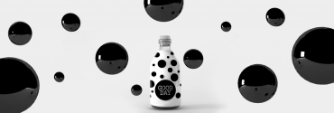
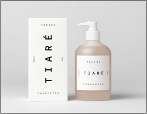
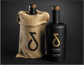
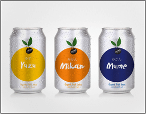
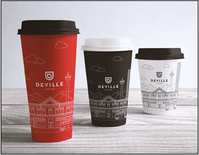
Believe me, minimalist design isn't dictated by designer laziness. Sometimes it's even more difficult to express and convey the idea of a specific product this way than using multiple elements. Therefore, a style characterized by a lack of excess is considered "smart." You won't see elaborate patterns or color mixes on the packaging here—everything is very restrained and concise.
 |
 |
 |
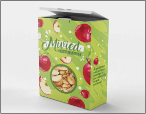
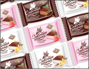
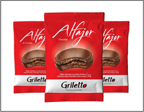
Timeless classics are a surefire design solution, particularly when it comes to packaging products whose consistent quality consumers should be confident in. Symmetry, regular geometric shapes, and versatility are characteristic of classic design. This latter feature allows this style to be successfully combined with others (an additional argument in favor of choosing it), creating unusual combinations.
 |
 |
 |
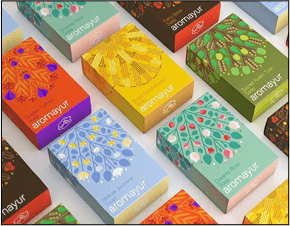
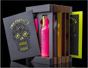
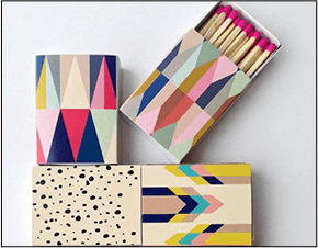
In contrast to simple minimalism and restrained classicism, bold Art Deco on product packaging will appeal to those with a creative bent. It is based on a combination of bright colors and an interweaving of various geometric shapes and patterns. Playing with contrast is the key feature of the Art Deco style, popular in the modern world.
 |
 |
 |
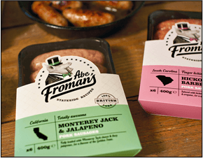
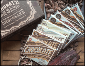
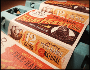
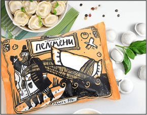
The main advantage of this packaging design style is its distinct positioning on store shelves from competitors' products, which attracts consumer interest. Typical features of the retro style include simple geometric shapes, subdued colors with a distressed effect, and typography. Retro style is particularly suitable for packaging designs for limited edition products.
 |
 |
 |
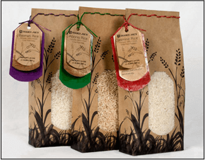
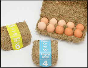
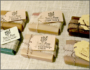
If you want to highlight a product's natural ingredients and organic origin, an eco-friendly design is a natural choice when creating packaging. Its essential attributes include landscape images and natural textures, which emphasize the value of the product's naturalness.
 |
 |
 |
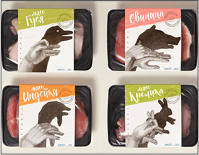
Packaging in this "sketch" style creates the impression that each piece has been specially hand-painted by an artist. This creates a sense of uniqueness and exclusivity in the buyer, making them more likely to purchase the product.
 |
 |
 |
Contact us – and with the help of the WeLoveBrands creative team, we'll help you find the perfect packaging design style! As a result, countless consumers will be tempted to buy your products.
Let's briefly list the main trends in packaging design that caught the eye and were purchased by consumers last year, and the trend towards choosing which continues in the current year.
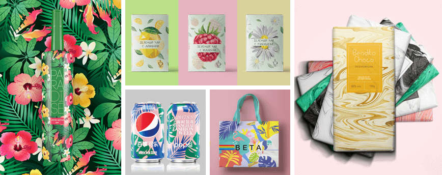
The motto of this packaging design trend is "Be Closer to Nature." It's worth noting that it resonates strongly with city dwellers who are perpetually deprived of contact with nature. The style is easily identified by prints inspired by flora and fauna, watercolor images, and complex textures.
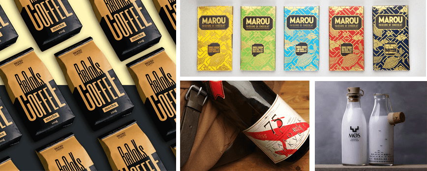
Using a vintage style in packaging design can transport consumers to one of the eras it represents. This authentic design, inviting a "back to the past," is characterized by muted colors, solid color fills, distressed textures, and vintage fonts.
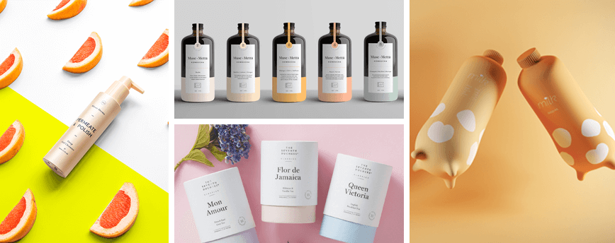
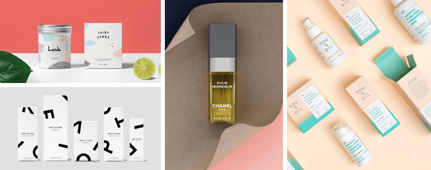
Minimalism itself isn't exactly considered a trend, as it's always in demand to some degree. However, one of its branches, called "less," enjoyed considerable popularity in 2017. This typically applies to premium product packaging (such as cosmetics). The style is recognizable by the use of pastel colors and large, short lettering.
The main advantage of the so-called "lettering" or "branding copywriting" method is the ability to convey a large amount of text in a limited amount of packaging space, as well as the product's mood. It's important to choose the right font with the right style and proportions.
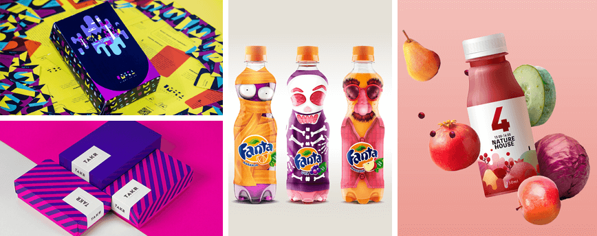
Having attracted significant attention last year, this trend has every chance of remaining at the top for years to come. Moreover, food packaging doesn't necessarily have to be food-grade—the most unexpected colors (one or more within the same color scheme) are allowed.
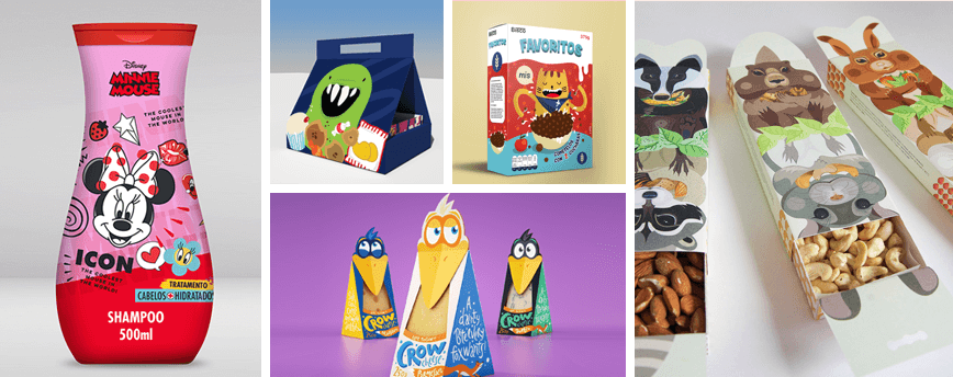
Cute illustrations of characters from children's fairy tales or cartoons, captivating with their naivety, and the hand-written inscriptions that seem to be written by a child—all these are elements of a style that is successfully applied not only to products for children, but also for adults.
Packaging design in this style evokes a sense of authenticity and uniqueness in potential buyers. "It's simple: we are who we are," the manufacturer seems to proclaim. No brightly colored images or loud slogans. For example, individual style is typical for perfume and bed linen packaging.
To ensure both clients and packaging designers benefit, it's crucial to embrace the trends described above and continue to monitor new ones. WeLoveBrands is confident they will be no less exciting!
Have you ever observed the reaction of store customers to a particular product on display? If so, one of the reasons for their enthusiastic response could well be its packaging, which is unlike other brands displayed nearby. After all, when it comes to products, the saying "you're judged by your clothes" can be taken quite literally.
Believe me, when packaging has something to grab the consumer's attention, even the fact that the product may be more expensive than similar products from competitors will become secondary. Originality will definitely win!
Below, we invite you to visually explore striking examples of packaging design that amaze the imagination with their creativity and originality.
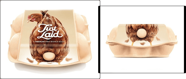
The message conveyed by the egg carton, emblazoned with the words "Just Laid" and featuring the option to view a single egg, is clear: the products are supplied directly from the farm, ensuring they are always fresh and of the highest quality. Anyone who has ever been burned by buying stale eggs from a poultry farm will likely be hard-pressed to ignore such packaging, however provocative.
 |
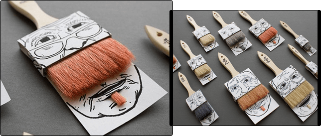
The photo below shows the packaging of a seemingly ordinary paint brush. On its own, the item would simply get lost among its peers. But in this playful "duet," the brush is sure to catch anyone's eye. Your hand will involuntarily reach for your wallet, which is exactly what every manufacturer wants.
 |
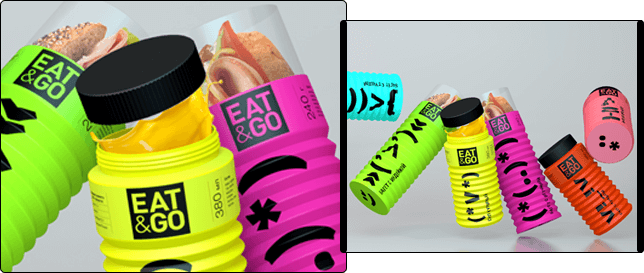
A noteworthy example of creative packaging design is the vibrant yet functional Eat&Go sandwich packaging, adorned with large symbols. As you eat the sandwich, it folds like an accordion and closes with an airtight lid, keeping the food fresh longer.
 |
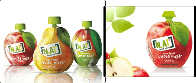
With this packaging, the manufacturer, NA!, emphasized the 100% naturalness of the juice, made from fruits grown without the use of preservatives. The designers were tasked with using images of ripe fruits as the basis for the design and adding the logo and name of each juice.
 |
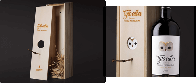
What do you think of this packaging design from Tyto Alba? Besides being simple and in keeping with the best traditions of eco-style, the box can also serve as a birdhouse after removing the wine bottle. This way, the consumer both enjoys the drink and benefits wildlife.
 |
So, do you have a product to sell and need a packaging design that won't become just another copycat? Then contact WeLoveBrands for a packaging design service – and we'll create a packaging design that consumers won't even want to throw away after using!