Receive a presentation of services and expert advice
The best experts in the industry will oversee your brand development process.
→ Need branding, design, or creative solutions? Call us at +48 505 648 022 or message us on WhatsApp.
 WeLoveBrands.pptx

The best experts in the industry will oversee your brand development process.
Designing a logo for an auto repair shop is crucial, as it allows it to stand out from the crowd of competitors whose signage features nothing but the word "auto repair shop." In this article, we'll explain and demonstrate with examples how creative, stylish, and original logos can be created for something as seemingly mundane as an auto repair shop.
The concept of a car repair shop has two direct associations: masculinity and technical automotive parts. This explains the rather limited color palette of most auto repair shop logos. Their designs heavily utilize gray and black, often featuring the traditionally masculine colors red and blue, and their various shades. Yellow and orange are much less common, although they appear very vibrant and dynamic, especially when paired with black. However, white is a much more common choice in addition to black, as it offers the most contrast and neutrality.
The images used as the basis for logo design also don't offer much variety. They can generally be divided into the following thematic categories:
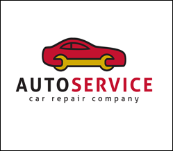
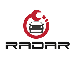
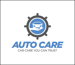
Auto repair shop logos featuring cars predominate. They can be executed in any style: flat design, negative space, sketches, etc. A schematic representation of the car is often used, which can look like an unfinished drawing. The car models chosen for these logos are powerful, sporty, and cool—recognizable even by the body's contours. Here are the best of these logos:
 |
 |
 |
In auto repair shop logo designs, this image is used as frequently as the car itself. A wrench is particularly popular—either "embedded" in the image of the car itself or two wrenches crossed over each other. This image is so frequently used because it clearly and unambiguously refers to the business's activities, thus conveying its meaning and associating it with the repair of machines and machinery. Here are some of the most successful examples of such logos:
 |
 |
 |
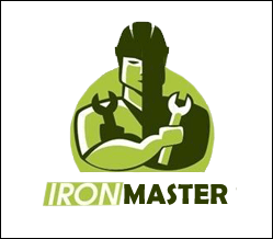
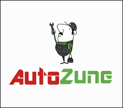
Less commonly used in auto repair shop logo designs than cars and tools are images of service station employees. This can be a silhouette, a cartoon-style character, or a minimalist image. It represents the action, work, and willingness of service station employees to help repair a car:
 |
 |
 |
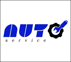
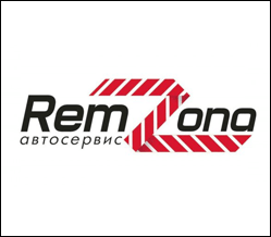
Some auto repair shops are opting to move away from traditional imagery in their logo design and instead focus on their name. They add various decorative elements, such as fenders, wheels, tools, and other elements associated with the automotive industry. Emphasizing the name helps differentiate the shop from its competitors and make it more memorable.
 |
 |
 |
The handshake image on a car repair shop logo symbolizes the closing of a deal between the customer and the repairman, approval of the work performed, and gratitude for fixing the car. Therefore, such an image inspires trust and a desire to work with customers. From a psychological perspective, this image is more than apt:
 |
 |
 |
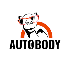
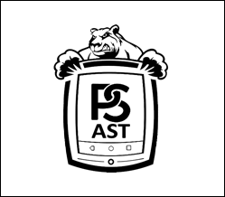
Some auto repair shops' logos are designed in a more unusual manner, using characters unusual for the service industry. These logos are unusual, engaging, and eye-catching, making them instantly memorable. These characters are often animals, birds, female figures, and so on. Here are some of the most successful examples:
 |
 |
 |
Logo designs from WeLoveBrands are always recognizable because they look so cool and stylish. We create vibrant, creative work and strive for perfection. If you want to differentiate your company from the competition and achieve a memorable and original corporate identity, order a logo design from WeLoveBrands.