Receive a presentation of services and expert advice
The best experts in the industry will oversee your brand development process.
→ Need branding, design, or creative solutions? Call us at +48 505 648 022 or message us on WhatsApp.
 WeLoveBrands.pptx

The best experts in the industry will oversee your brand development process.
A music school isn't just about teaching. It's about a special atmosphere, inspiration, and creativity. Children and adults who love music come here to learn, develop, and recharge. To attract more students, it's essential to have a good reputation and an appealing visual image. A compelling music school logo helps achieve this.
A wide range of organizations are involved in basic music education. Music schools are classified by:
Ownership and form of ownership : state, municipal, departmental and private.
Duration of study : there are programs for 5–7 and 8–9 years.
Training formats - they depend on the age of the students and their level of preparation.
Level of education - the school's teachers train professional musicians and amateurs.
Specialization degrees may teach a limited number of instruments, such as strings or brass instruments. Some music schools offer vocal lessons exclusively. Generalist schools train musicians in a variety of disciplines.
When developing a logo for a music school, the level of specialization and age group of students must be taken into account first and foremost.
Every music school is interested in attracting new students and retaining existing ones. State and municipal educational institutions have established enrollment targets, which determine the salaries and bonuses of teachers and administrators. Private schools' income also directly depends on student numbers. Furthermore, new clients may include talented individuals. Music teachers value the learning process and its results, and the entire school staff is proud of their students' success.

A good logo will attract attention, help you stand out from the competition, and increase student enrollment and revenue for your music school. It's important to approach logo design carefully, as it's often the first thing passersby and internet users see when searching for lessons.
The main goal of advertising is to provide information about a product or service. This, in turn, influences sales and customer acquisition. For a music school, increasing student enrollment is a guarantee of increased revenue.
Also the school logo :
 Attracts attention . By selecting the optimal color scheme, fonts, and graphic elements, the brand logo attracts attention on the street, outdoor advertising, school signs, flyers, and other promotional materials.
 Creates a positive image for the school . Statistics show that companies with a logo are more trusted by consumers.
 Increases brand recognition . A good logo is memorable and easily recognized online, on printed materials, and in advertising in your city.
 Distinguishes you from the competition . When developing a logo, qualified designers analyze your competitors. This allows you to create a unique emblem that will distinguish your organization and avoid plagiarism.
 Unites employees . The logo can be placed on faculty and administration uniforms, as well as pens and notepads. This, combined with a well-designed corporate culture, will help unite the team and foster a sense of belonging.
A logo shapes a school's image and enhances its reputation, so high standards are placed on its quality. These standards can be met by entrusting the creation of the emblem to a professional.
There is a specific set of requirements for developing a brand logo, compliance with which will help create an interesting and recognizable image.
The main features of a successful logo :
Simplicity . This involves avoiding a large number of elements and colors, complex graphics, and hidden meanings.
Appropriateness . Visuals should be appropriate to the services offered and the age of the students.
Appeal . It's important that the school's emblem evoke positive emotions in people of different traditions, religions, and worldviews.
Versatility . Allows the logo to be used on various printed and electronic media without compromising its visual quality or legibility.
Uniqueness . This helps distinguish the school from competitors in its niche and other companies in general.

Designing a truly unique logo is a complex task that only professional designers can master. WeLoveBrands' specialists have extensive experience creating effective, original logos . For a consultation, call us or ask a question in the chat.
Numerous studies in marketing and the psychology of color perception show that color schemes have varying effects on people's psyches and decision-making. We'll explain how to choose winning colors and other elements for a music school logo.
 Color
 Blue, yellow, and green are ideal for a children's music school logo. Blue is associated with knowledge, learning, and development. It's the color of creative people with a vibrant imagination. Blue is calming and helps build trust. Pastel blue encourages sociability and openness. Darker shades instill a sense of security.
 A logo designed with yellow conveys a positive and friendly attitude. It attracts attention. Yellow is associated with warmth, joy, and optimism. It awakens curiosity and stimulates a desire to learn, but it can also promote a frivolous attitude, so it's best to offset this with calmer tones.
 Green is the color of sociable and friendly people who are not prone to conflict. Dark green encourages self-improvement, while bright and emerald shades of green symbolize growth and harmony.
 White represents light, purity, and perfection. It is the hue of supreme knowledge and absolute harmony. It can be used as a background in logos and also highlights other elements of the emblem. A black and white logo is less conspicuous, but it is the most musical color combination. Black notes on a white sheet of paper or black and white piano keys are time-tested classics that can be beautifully presented with bright neon shades or gradient transitions.
 Red is the color of leadership, perseverance, and tenacity. When combined with more subdued shades, it can be used in logos to attract attention and call to action. By adding red as an accent, designers achieve a proactive response. Sepia, the color of dry autumn leaves and old paper, while subtle, brings a sense of nobility and retro appeal to logos. It can also be used in the emblems of music schools with a rich history.
It's not just the right color choice that's important, but also a well-chosen color scheme. A striking logo guarantees school recognition. If you want to stand out, choose a color palette for your logo that will distinguish your music school from its competitors.
 Font
Modern trends call for soft, rounded, and minimalist fonts. It's important to remember that classical children's music schools are not entertainment institutions. Avoid overly frivolous fonts and slanted lettering, as this can create distrust in consumers. Our design studio recommends a rounded sans-serif font.
 Images and graphic symbols
Abstract elements in modern emblems look fresh and original, but more traditional designs are appropriate for music school logos. These could include images of musical instruments, a stave, or the silhouette of a musician. Literal and symbolic images can be used, as long as they are easy to read, understandable, and complement the other elements of the emblem.


Today, music schools combine rich traditions with the latest educational technologies. Their programs blend classical and contemporary works, including popular music. Designers are infusing logos with a fresh twist: boring fonts are being replaced by more attractive and user-friendly ones, and flat graphics are being replaced by three-dimensional or symbolic images.
Designers are faced with the challenge of finding a reasonable compromise between the modern and the traditional.
Often the choice stops at :
neon shades;
gradient transitions;
3D graphics;
cut off letters.




Minimalism remains in demand. A striking logo can be achieved using two colors and a simple, legible, yet distinctive font. Such a logo will also be highly scalable, allowing you to use it on a variety of projects without compromising legibility or design quality.
The name of the Lviv school "MUZCOOL" can be deciphered as "music is cool," and the combination of a simple font and piano keys of varying sizes creates a fresh and dynamic look. The Kyiv-based music and vocal school "Solomriya" uses a muted orange color in its logo. The rounded font and symbolic image of a singing bird create a fresh and harmonious atmosphere.



The Lviv Jazz School logo features a black circle with white letters, and a cheerful font with yellow smiley faces instead of two "O"s in the word "school" makes the logo friendly and cheerful.
In the creative logo for the Melody school, the designers transformed part of a treble clef into the body, and a musical staff into a guitar neck. The result is unique, and the school stands out from the crowd.
In Ukraine, the term "music school" most often refers to a children's school, but in most countries it has a broader definition. It can refer to various levels, including a conservatory.
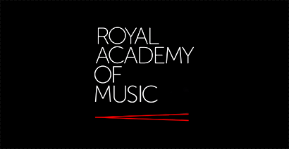
The Royal Academy of Music in London has been in existence since the early 19th century. It offers programs in classical, jazz, and theater, including opera and vocal studies. Famous vocal alumni include Annie Lennox and Elton John. The school's logo features white letters with thin, classical outlines. They have a strict appearance, adding a sense of nobility and a nod to tradition. Two unfurled red conductor's baton evoke a sense of energy.
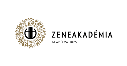
The Franz Liszt Academy is a music academy in Budapest, founded in 1875. The institution's logo, designed using a minimalist font, features a schematic representation of a lyre framed by a lush wreath—a symbol of merit in the musical world.
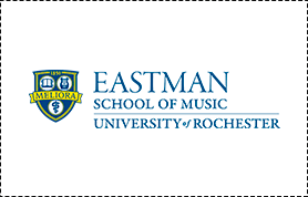
The Eastman School of Music was founded in 1921 by inventor and entrepreneur George Eastman. Its logo depicts a shield with a book, lyre, and snake—symbols of knowledge, music, and wisdom. As a tribute to the founder, a ribbon with the word "MEMORY" crosses the shield.
The logo of the Mannes College of Music in New York City consists of the inscription "The New School." It simultaneously conveys the innovative approach to education and references the city in which the institution is located.


The Peabody Conservatory of Music in Baltimore was founded in 1857 by banker and philanthropist George Peabody. It is considered one of the most prestigious conservatories in North America. Its simple and recognizable logo consists of a white shield with a calligraphic Latin letter "P"—in honor of its founder.
You can design a logo yourself for free using specialized services or graphic editors. This method is the most accessible, but it doesn't guarantee a unique logo.
A freelancer will create a logo for an average of $30–40. This option is often chosen at the initial stages of a project. To ensure a high-quality result, it's important to verify the specialist's competence before ordering and request a portfolio of their work.
The most reliable way to develop a logo is to commission it from a design studio or specialized agency. Design studios use a proven process when creating a logo, which includes:
familiarization with the school’s activities and the age category of students;
study of global experience and modern trends in business;
analysis of target audience, competitors and consumer preferences;
study of the best logo examples in this field;
selection of color scheme and other elements of the emblem;
development of an agreed number of sketches;
final development.
The cost of the work starts from $150 and depends on the complexity of the logo, the number of sketches, revisions, and production time.
WeLoveBrands studio designers research the market, brand strengths, and client requirements before beginning work. Our experience, knowledge, and expertise help us create unique and effective music school logos. Contact us by phone for a detailed consultation and to discuss the details of your order.