Receive a presentation of services and expert advice.
The best experts in the industry will oversee your brand development process.
→ Need branding, design, or creative solutions? Call us at +48 505 648 022 or message us on WhatsApp.
 WeLoveBrands.pptx

The best experts in the industry will oversee your brand development process.
We're sure there's no need to explain the importance of a logo to a company's image. After all, you already know it. It confers a certain status and builds reputation. In short, it's essential for every self-respecting company. That's why almost everyone has a logo these days. But few people realize that choosing the right color for their emblem is also crucial.
Each color has its own specific meaning and psychological impact on people. So, it's important to choose the shade that will entice customers to buy or order a service from you. Today, we'll talk about pink and its role in a color palette. Who should use it? Which shades are best for attracting customers? You'll find out in this article.
Many associate pink with tenderness, naivety, and simplicity. It can be called the color of happiness. It radiates joy and calm. It's no wonder the popular expression "looking through rose-colored glasses"—that is, seeing only the good—is popular.
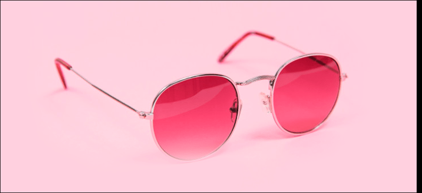
Pink is the color of kindness and sentimentality. It looks striking, stylish, and beautiful. Although considered a girly color, it would look good in more than just logos for children's dolls. Many people consider pink the color of love. In any case, the associations with this shade are positive.
Because pink is a blend of red and white, it combines the positive meanings of these colors. Red represents passion and strength, and white balances it. The result is a perfect combination of assertiveness and purity.
Pink is considered an antidepressant color. Its soft shades evoke a sense of comfort and coziness, calming and relieving obsessive thoughts. They relieve fatigue and promote self-confidence. However, overuse of this color can lead to oversensitivity or, conversely, apathy.
Each shade of pink has its own effect on a person. Looking at a soft shade lowers heart rate and blood pressure. It can calm and suppress aggression. Hot pink, on the other hand, has a provocative, sexual quality, attracting attention.
Pink has a rich palette of shades. And just as many names. Each color may have a different name in each country. In France, a soft pink is called "frightened nymph's thigh," while a slightly darker shade is called "merry widow." A paler pink is called "rosé ash." This shade also has many names associated with the rose flower. This adds a special sophistication to pink.
Of course, there are a huge number of shades. If we started listing them all now, it would take a long time. So, we'll focus on the most popular ones:
 |
Salmon This color is very similar to fish flesh, hence the name. The color is very rich, but not overwhelming. It looks stylish and unusual. |
|
 |
Fuchsia A very vibrant shade. It's hard to look at for long, so it's best used as small accents. |
|
 |
Bubble gum The color of bubble gum. Very calm and muted. It looks cool. You want to stare at it forever. |
|
 |
Hot pink One of the most popular shades. Not too bright, not too dull. It's the perfect shade of pink with a perfect balance of undertones. |
|
 |
Brownish pink This color is very close to brown. It looks stylish. It doesn't particularly stand out among other shades. But that's its main advantage. |
|
 |
The color of a withered rose The color is stunning, needless to say. It looks very stylish. And most importantly, it's a color you won't get tired of. After all, classics never get boring. |
|
 |
Pink ash We can sing the praises of rose ash forever. This color is very calm and natural-looking. It's considered a basic color. More muted than faded rose. But so cool... |
|
 |
Pink You could say this is the color that started the entire history of pink. Classic pink. Bright, bold, romantic. And it will never go out of style. |
|
 |
Soft pink If you're a fan of pastel, dramatic colors, you'll definitely love soft pink. It exudes softness and purity. It looks beautiful both alone and in combination with other colors. |
|
 |
Coral A vibrant pink-orange color. It's very reminiscent of coral reefs. It looks cool and unique. This shade will definitely captivate you. |
Pink isn't often used in business, as many people associate it with something naive and romantic. However, sometimes it's necessary to use it to relax your employees.
One of the main functions of pink is motivation. So if you want to inspire your employees to achieve new goals, you know which color to use.
Pink also inspires. It brings out the best in people and sets a romantic mood. And sometimes this can be applied beautifully in business.
This color won't evoke aggression or force. It's quite calm, so it's helpful when dealing with negative clients.
It can also bring out a sense of adventure in a person, and even encourage risk-taking. You can use this fact in your business.
But pink has its drawbacks, too. It's the most passive color. Too much of it can cause indifference and apathy. So don't overdo it.
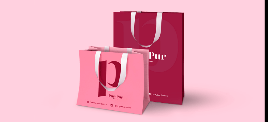
In most countries, pink is associated with romance and tenderness. However, meanings vary across cultures. We've compiled the most common ones for you:
Korea - trust, kindness, stability
Latin America - Architectural Structure
Japan - symbolizes a masculine color, although women also wear it.
In Western and Eastern cultures , pink is considered a symbol of femininity, love, compassion, romance, and sensitivity. Pink is also considered the color of a newborn girl.
For a long time, pink wasn't even considered a color in China . It was considered foreign. Now it carries the same meaning as in Western countries.
Pink is the color of tenderness, calm, and trust. It instills hope and tranquility, leaving a pleasant, warm feeling in the soul. However, it's important to remember that too much can have the opposite effect. If you don't want to make consumers feel uncomfortable, don't overuse the color. Overall, this hue is excellent for attracting attention to your brand, especially if the product you're promoting evokes positive emotions or is relaxing and calming. While pink is certainly suitable for almost all business sectors, there are some where it feels especially natural. Let's look at the industries where this color is a natural fit:
marriage agencies - romance, passion
Pink is a perfect color for marriage agency logos. Lightness, airiness, and romance are easily expressed in this color. Any shade can be used for this type of logo, depending on your preferences. After all, almost all shades of pink symbolize love. So if you're wondering how to color your agency, choose this color.

children's products - carefree, trusting
We think I don't need to explain how much kids love bright colors. Of course, they attract attention and evoke pleasant emotions. It's commonly believed that pink is a color reserved for girls. But many children's toy and clothing stores use it in their logos. Because it inspires trust and evokes a pleasant feeling in people of almost any age.

confectionery - sweetness, pleasant taste
Pink remains a popular color in the confectionery and other sweet treat industries. After all, many sweets are associated with pink. This is due to the frequent use of strawberry flavoring in desserts, which imparts this color. Pink food coloring is also increasingly used these days. So it's no surprise that many sweet-toothed establishments choose it for their logos.

clothes - trendiness, style
Pink is considered a key color in the fashion world, especially for women. As we mentioned earlier, many associate it with a girlish spirit and attitude. That's why many clothing stores, designers, and stylists consider it one of their most important colors. Pink is the color of dolls, flowers, cotton candy, and other things girls love. If you're wondering what color to choose for your fashion company's logo, go with pink—you can't go wrong.

salons and hairdressers - beauty, aesthetics
Beauty salons often choose pink as their logo color. It's the most tranquil yet stylish, fashionable, and pleasing to the eye. Many salons market themselves as a "girl's paradise." After all, this color symbolizes girlish innocence and beauty, freshness, and tenderness. Think about it: what shade would you choose for your beauty salon? Pink, of course!

Wedding salons - awe, dreams come true
Many dream of a strong, true love, just like in a fairy tale! And the wedding is absolutely lavish and luxurious. And wedding salons are responsible for the aesthetics of these events. A wedding is a very sensitive moment. The newlyweds may not yet have fully fallen in love, haven't fully opened up. And they haven't yet reached the color red—the color of passionate and intense love. Therefore, most salons choose light pastel colors for their logos, with pink being a particular favorite.

flower delivery - tenderness
Giving a bouquet to your loved one is one of the best ways to express your feelings. Tenderness, affection, infatuation, love... Flowers are a wonderful gift for every stage of a relationship. And pink in logos helps emphasize romantic intentions. That's why we recommend that delivery service and flower shop owners design their logos in shades of pink. After all, pink is the color of fresh bouquets, love stories, and unforgettable experiences.

There are certain business sectors where it's best to avoid pink accents. Avoid pink logos for tech companies, IT companies, car brands, and agricultural companies. We'll cover all the ANTI-pink industries in more detail below.
energy industry
Painting an energy company's logo pink is like signing its death warrant. The energy industry signifies strength and confidence, so it can't be associated with pink. For many, the industry is likened to fire. And where have you ever seen a bubblegum-colored flame?

agriculture
Agricultural enterprises simply don't fit with a delicate, girlish hue. Pink connotes tenderness, naivety, and trust. Agricultural companies, however, need their logos to convey strength and a bountiful harvest. This color fails to fully express the power of your enterprise.

real estate
A logo for this industry should be designed in warm colors. But definitely not pink. The color of love and purity clearly doesn't work as an identity element for a real estate company. So, a different color scheme is better for a real estate agency.

electronics stores
Pink is too rebellious for tech stores. It won't emphasize modern technology. It makes you dream and relax, but it certainly doesn't evoke the idea of buying new gadgets. Therefore, we don't recommend adding pink to logos for such stores.

financial companies
For a financial company to gain credibility among clients, it needs to demonstrate its reliability. And pink isn't the color for that. On the contrary, it symbolizes gullibility and naivety. This isn't ideal for financial company logos. It's unlikely you'll be trusted with their hard-earned money.

Sometimes monochromatic logos can look boring. Therefore, we recommend mixing pink with other colors. However, choosing the right combination of shades is crucial. A poorly chosen combination of shades will ruin the entire logo. They should look perfect and complement each other. Below are the most effective combinations:
 |
Pink and white | |
| A calm combination of delicate shades. Essentially, this is a classic combination that always looks flattering. It's romantic and soft, evoking a sense of relaxation and unwinding. It's ideal for clothing retailers and dating agencies. | ||
 |
Fuchsia and lime color | |
| Both colors are bright and fresh. Together, they look simply stunning. You might even be surprised at how cool this combination is. If you like to stand out from the crowd, you'll definitely appreciate this combination. It will liven up any logo. | ||
 |
Pink and black | |
| It looks quite unusual and bold, yet striking. Once you've seen this combination, you'll never forget it. Incidentally, it was very popular in 2007 among the emo movement. And it's no wonder they chose this particular combination. After all, the pink takes on a new meaning against the luxurious black. It's impossible to miss. | ||
 |
Pink and brown | |
| Sounds unusual, right? Just think, these shades seem so different, but they look so cool together. The bright pink complements the muted brown beautifully. Take a closer look at these colors; they might just be the perfect complement to your logo. | ||
 |
Fuchsia and gray | |
| A striking fuchsia color perfectly complements basic gray. Gray really brings out the fuchsia. This combination won't be too overpowering or eye-catching. It looks incredibly stylish. Just the thing for company branding. | ||
 |
Pink and soft blue | |
| What could be better than the combination of sky blue and pink roses? Pink and baby blue have become a timeless classic. Many companies use it in their logos. Maybe you'll join them? | ||
 |
Pink and olive | |
| A truly beautiful combination. It looks simply stunning. Stylish and trendy. Ripe olives pair perfectly with pink. So if you haven't yet decided on a color scheme for your logo, go with this one. You can't go wrong. | ||
Pink comes in many variations. They can be appealing, or they can be downright repulsive. If you choose the right shade, you can create a unique visual effect. Keep in mind that unsightly colors can backfire.
Pink logos are sure to delight customers. But only if you choose trendy shades. Let's figure out which ones will appeal to your customers. Specifically, we'll show you the most trendy and stylish shades of pink.
powdery pink
It's considered a pastel color. Although it's quite pale, it stands out from the other shades. It's calm and very beautiful.
peach cream
It's very similar to beige. But it looks more delicate and soft. It can be compared to the cream on a choux pastry. So this shade is like that.
It is also airy and visually sweet.
fruit pigeon
This shade is reminiscent of some kind of juicy, sweet fruit. It has something tropical and soft about it. It's slightly muted. It looks stunning.
living coral
Classic Coral is brighter and more eye-catching than Living Coral. Living Coral is more subdued and delicate. It's a delight to behold. It's very deep and trendy.
pink peacock
This color is very bright and beautiful. It's close to crimson, but it's more interesting. Peacock feathers usually stand out due to their color scheme. So, peacock pink is unusual, but it looks cool.
sweet lilac
Imagine pink lilac flowers. How sweet they smell. Now try to visualize that scent. This is the exact shade you'll get. A very delicate and stylish shade of pink with hints of lilac.


But it's crucial to remember that the slightest mistake in choosing a color can ruin the entire logo. Choose it based not only on personal preferences but also on the tastes of your target audience. However, we still recommend consulting professionals. After all, they'll be the ones to choose the right color, keeping your target audience in mind. And it's crucial to find true experts, like the designers at WeLoveBrands. Just look at the wonderful pink logos they've already created for other companies:
We're confident your clients will love a logo from us, WeLoveBrands . We put our heart and soul into each of our designs. That's why our work feels alive and stands out from the competition. Whether it's romance and love or naivety and trust—the choice is yours! We'll do our best to present it in the best possible light. Remember, it's crucial to entrust the execution of your ideas to professionals. So choose your designer carefully, and start thinking about the colors you'll use for your logo. :)