Receive a presentation of services and expert advice
The best experts in the industry will oversee your brand development process.
→ Need branding, design, or creative solutions? Call us at +48 505 648 022 or message us on WhatsApp.
 WeLoveBrands.pptx

The best experts in the industry will oversee your brand development process.
What does the color green mean to you? What emotions does it evoke, and what are your associations? Perhaps it's the crispness of a summer morning and the rustling of leaves. Or the feeling of fresh air and the aroma of freshly cut grass. Or perhaps it's spring and the awakening of life itself? Whatever the case, green has many admirers. Perhaps that's why it's one of the most sought-after colors in logo design.
Clearly, green is chosen precisely for the qualities it conveys to the audience on a subconscious level. Despite its versatility, a green logo isn't suitable for every type of business. Who should emphasize green, who should avoid it, how people perceive green, and how it affects psychology—read all about it in this article.
Green is generally perceived in a positive light, as the color of life and nature. For many, it symbolizes prosperity and new beginnings. Green, incidentally, has such a powerful effect on human psychology and the subconscious that it can even heal illnesses. It relaxes, calms, and soothes. That's why it's so often used in clinic interiors and in medication packaging. Doctors themselves (surgeons, for example) often wear green uniforms.
Green has the ability to neutralize the overly strong impact of other colors and can eliminate negative emotions from them. Therefore, it often serves as a complementary color in design.
Looking at green makes people feel calm, confident, and energized. Moreover, this color helps them concentrate, get into the right mindset for work, and make decisions. Green's strongest associations are with spring, renewal, youth, and naturalness. It also symbolizes health, harmony, freshness, eco-friendliness, and a balance between activity and relaxation. While too much red can cause aggression and dissonance, too much yellow can cause emotional overload and psychological pressure, and too much blue can lead to drowsiness and apathy, green has no such effect.
If you strive for harmony in your logo and want to avoid color overload, choose a green logo.
At the same time, green can bring not only tranquility to a design but also a powerful boost of energy and dynamism. This is because it comes in an infinite number of diverse and consistently beautiful shades.
 |
Chartreuse is a bright, positive, and cheerful color. Its high intensity always attracts attention. It represents dynamism, momentum, champagne sparkles, joy, and life itself. | |
 |
Jade is enigmatic, mysterious, and oh-so-inspiring. Cool yet calming and soft, it draws the eye with its ambiguity. |
|
 |
Olive is a warm, soft, and comforting shade of green. This gives it a delicate and delicious feel. It evokes a cozy, homey atmosphere and is enveloping. |
|
 |
Khaki is a calm and cool shade. It creates a sense of seriousness and focus. It lends itself to very stylish combinations. |
|
 |
Spring greenery – brightness, youth, and powerful energy are conveyed in this color. It's very dynamic, intense, and yet not at all garish. It reflects the awakening of spring and the lushness of young greenery. |
|
 |
Pistachio is a calm, muted shade. It possesses a special charm and magnetism. Being very soft, warm, and enveloping, it offers a huge scope for imagination. |
|
 |
Moss is a deep, rich shade of green. Despite its cool and reserved character, it draws attention with its mystery. It allows for incredibly interesting combinations with other colors. |
|
 |
Forest green is a very pleasing color to the eye. It's soft, positive, and warm. It's a perfect balance of richness and natural beauty, calming and inspiring a sense of complete relaxation. |
These are just a few of the shades of green. The palette itself is incredibly rich and diverse, with delightful colors and equally captivating names. Forest green, shamrock, chartreuse, lime, jade, asparagus, malachite, viridian olive, mint, pistachio—aren't they all wonderful? If you think green isn't right for you, it's because you simply haven't found the right shade yet.
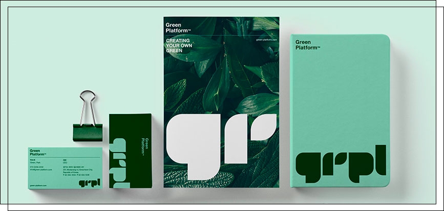
While green is a versatile color and doesn't overwhelm people emotionally, it may be inappropriate in some areas of business. Let's take a closer look at how people might perceive a company through its green logo.
In fact, the perception of green depends not on its quantity in a design, but on its shade. The right shade will convey only positive associations and the right message. However, choosing the wrong shade, choosing a tone that's too cool or "dirty," can provoke a psychological aversion even to a color as calm as green.
To avoid this mistake, entrust logo design only to professional and experienced designers. Order a green logo design from WeLoveBrands studio – our specialists will select the perfect shade of green for your business.
When designing logos for international companies, it's important to understand that attitudes toward the color green vary widely. This is due to different historical legacies, worldviews, and cultural traditions. How can you avoid misunderstandings and misunderstandings with international clients? Before designing a green logo, you need to study the cultural perception of color in the country you're working with. If you're designing a logo for a product that will eventually be exported, study the traditions and culture of the exporting country.
Here's what the color green means in different countries around the world:
China – purity, freedom from pollution, health, consumer benefit (but not environmental benefit), spring, wood, the East, green dragon. But be careful: a green hat signifies a cheating spouse.
Egypt is a positive color, an oasis, freshness, life, rebirth.
India – fertility, vitality, the color of the earth; in some states it is considered a wedding and festive color and signifies life and happiness.
Japan – immortality, continuity, eternal life, rebirth, spring, fertility, freedom, joy, hope.
France - crime, unreliability, bad intentions, buffoonery, frivolity.
The USA – security, stability, freedom, ecology, care for nature; sometimes – envy, greed, ambition.
Iran – rapid growth and development, freshness; and at the same time – misfortune, sadness, grief, misfortune, mourning.
Clearly, in some countries, it's best to avoid using green in logo design altogether, while in others, it's a must. Some countries have ambivalent attitudes toward green. In such cases, it's best to avoid green altogether or thoroughly explore its cultural perception.
Many edible brands choose green for their logos as a symbol of the freshness, high quality, and naturalness of their products. Green logos are also a constant companion to all products that emphasize a sense of freshness. A breath of life-giving moisture, a breath of fresh air, or super-fresh produce—what else can convey these messages so clearly and unambiguously as a green logo?

Green isn't often used in cafe, restaurant, and fast food logo designs. This is likely because it's not closely associated with cuisine and doesn't stimulate the appetite as much as red. However, in some themed establishments, green logos are perfectly appropriate. It's primarily used by vegetarian restaurants, as a nod to plant-based foods, while cafes and restaurants serving Asian cuisine associate it with herbs or traditional green tea. Green is often featured in Italian and Mexican restaurant logos, as a nod to one of the colors of the national flag and traditional ingredients.

Some IT companies and digital brands use green in their logo designs to convey friendliness and welcomingness. In this way, they try to dispel the stereotype that digital technology is complex, scary, and soulless. You'll agree, green makes the digital world appear kinder, more humane, open, and welcoming.

Green is a common color in the logos of financial institutions, particularly banks. It's clearly used to evoke a connection between deposits and growth and increased wealth for the client, similar to plants that grow larger each year with care and attention. Green also creates a positive image for the financial institution and fosters customer trust and loyalty.

Green conveys freshness, confidence, and purity. It is chosen by those who value order, harmony, and stability. At the same time, green relieves stress, promotes relaxation, and calms. This is why it is so well suited for logos of household goods brands and cleaning companies. Incidentally, the international recycling symbol is green.

Green is a common color for companies involved in energy and fuel. This is true for both traditional fuel companies and those involved in alternative energy sources. The latter, for example, use this color to convey environmental friendliness, care for the environment, and the safety of energy production. For traditional fuel companies and gas station chains, a green logo conveys friendliness and openness to customer interactions and conveys a sense of the purity and safety of petroleum products. It might seem that the fuel at "green" gas stations is better and cleaner, and therefore, the car will be healthier.

Green is quite common in chain store logos. It perfectly balances any other color, making it a virtually foolproof choice. Furthermore, a green logo inspires much more trust in customers, increases their loyalty, and fosters positive customer reviews.

Green is the color most associated with good health, renewal, and youth. Therefore, it is often used in logos for medical institutions, pharmacies, and medicinal products. Moreover, green evokes a sense of safety, security, and tranquility, which also positively impacts the perception of the target audience.

Travel agencies often use green and its shades in logo design. This is because it has a relaxing effect, evoking thoughts of wilderness, forests, mountains, sea green, and so on. It also creates a sense of lightness, a breath of fresh air, which every traveler experiences when traveling. At the same time, green is relaxing, calming, and relieves any stress and anxiety that can arise when planning a trip. And, of course, it sets a positive mood – what more could you want on a vacation?

You'll agree, the Victoria's Secrets brand would look very strange in green, and Tinder, too. Green is completely inappropriate for anything associated with eroticism, love, seduction, and sensuality. For that, there's red and mysterious black. But definitely not green. See how it would look:

The whole point of fast food logos is to whet the appetite and encourage impulse buying. Green has the opposite effect, which is completely undesirable for fast food chains. Besides, green doesn't exactly evoke images of a hot stove and a bustling kitchen. For vegan restaurants, where everyone is relaxed and in harmony with nature, a green logo is ideal. But for fast food, it's hardly the best choice.

Scientists have proven that people associate the color green with bitter or sour tastes. But certainly not with sweet. Have you noticed that green logos are often found on mint gum, tea, coffee, and beer, but never on candy or desserts? That's because marketers know this property of green and use it to their advantage. Incidentally, green logos are also unlikely to be suitable for candy stores.
Green is a very versatile color and suits virtually any business. However, there's always a risk of getting it wrong. To avoid mistakes and choose the perfect shade of green for your business, don't try to do it yourself. Entrust this important task to the professionals at WeLoveBrands. We know how to create the best green logo for your business.

The right combination of colors and shades in a logo evokes the desired emotions in the audience, conveys the brand's character, and conveys the right message. Yes, a person senses and understands all this nonverbally, simply by looking at the logo's colors. Green is a versatile color and can be combined with virtually any other tone. Therefore, the scope for creativity in green logo design is truly enormous. We've selected what we consider to be the three best combinations of green in logos:
 |
Bright green and dark blue. |
|
| The depth of blue is beautifully offset and highlighted by the vibrant green hue. This is a rather unusual combination, making it look fresh and original. Light green pairs beautifully with blue, evoking a sense of simplicity and harmony. | ||
 |
Light green and purple. |
|
| This color combination evokes a sense of youth, strength, and powerful energy. At the same time, the green and purple tandem appears balanced and harmonious, evoking positive emotions and being easy on the eyes. | ||
 |
Green and yellow. |
|
| A very vibrant combination that simultaneously envelops with warmth and sensuality. Together, these two colors look very "natural" and convey a sense of youth, dynamism, kindness, and positivity. | ||
Green is always perceived as a light, fresh, and natural color. It is associated with hope and peace. Some shades of green have the ability to relieve stress, relax, and create a sense of peace. Others are very dynamic, providing a powerful boost of energy and positivity.
Green is so multifaceted and diverse that it can convey virtually any emotion in a logo. Tranquility, inner harmony, peace, relaxation, brightness, youth, freshness, richness—green conveys all these feelings (and many more). We've selected four of the most trending shades of green in logo design.

If green is one of your signature colors, how effective and appropriate is its use in an office interior? First of all, remember that green energetically belongs to the element of Wood. Wood is always associated with growth, development, dynamism, and upliftment. Therefore, all organizations and companies that focus on human development, education, creativity, and overall growth belong to this element.
These could be: sports clubs, centers for psychological assistance and psychotherapy, various clinics, agriculture, food industry, publishing houses, fashion, textile enterprises, carpentry, joinery, plant and animal husbandry, work with the human body (massage, for example), furniture factories, floristry, hairdressers and beauty salons, ateliers, perfumeries, and so on.
The primary materials of this element are wood, paper, and other natural materials. If your business is aligned with this element and you incorporate corresponding materials into your office interior, they will contribute to the company's growth.
Incidentally, the fewer clients you have, the more clearly you can highlight the core element of your business's element. For example, if you run a children's development center, fill it with flowers and tree-like shapes. Add more flower pots and decorative trees, create a large display stand for children's drawings or announcements in the shape of a beautiful tree, etc. This visualization of your business's element brings harmony and, as a result, leads to significant progress.
According to psychologists, green is the most optimal color for an office. It doesn't overload the psyche, irritate, or tire. On the contrary, green in an office interior is calming, relaxing, and simultaneously increases productivity and concentration. Therefore, it's simply the ideal choice for decorating a workspace.
It's a well-known fact: the color green relaxes the eyes. This is especially beneficial for those who spend long periods of time working at a computer or reviewing documents.
Green is a perfect color for decorating an office reception area or breakout area. If you want to liven up the interior, making it more dynamic, energetic, and positive, add yellow. Remember, the cooler the shade of green you use in your interior, the more calming its effect will be. According to Eastern traditions, green is the color of wealth and prosperity. So why not incorporate it into your office interior and company logo design? Who knows, maybe money will start flowing right into your hands right away. Incidentally, this likelihood will increase exponentially if you entrust the development of your green logo to the professional designers at WeLoveBrands. See which green logos we've already created for our clients:
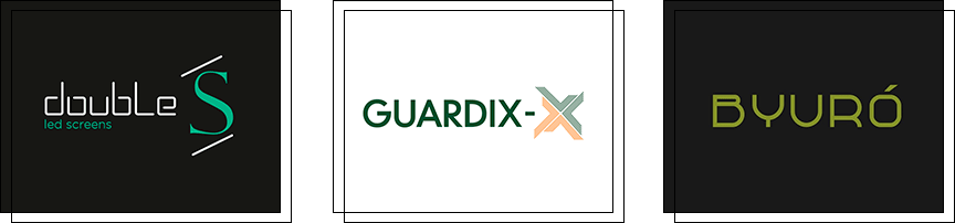
Want the same? Or an even cooler and more stylish green logo? Order a green logo from WeLoveBrands. We know the perfect shade of green for your business.