Receive a presentation of services and expert advice
The best experts in the industry will oversee your brand development process.
→ Need branding, design, or creative solutions? Call us at +48 505 648 022 or message us on WhatsApp.
 WeLoveBrands.pptx

The best experts in the industry will oversee your brand development process.
Want to know what logo design trends were popular in 2016? Then let's take a trip down memory lane into the recent past of one of the advertising industry's most important components.
Every business structure in the modern market is unique and inimitable. Just as you won't find two completely identical companies, you won't find two identical logos. However, even on a global scale, year after year, certain common features can be identified that unite the symbols of different brands.
Logos featuring flat letters not only look as transparent as possible, without any hidden meanings, but also register well in any browser. And unlike logos with textures, shadows, or gradients, flat logos load much faster on any viewing device.
 |
 |
 |
Handcrafted logos (modern handwriting) were favored by companies specializing in handmade products or one-offs. Sweet and slightly naive in appearance, these logos appeal to consumers through their simplicity and honesty.
 |
 |
 |
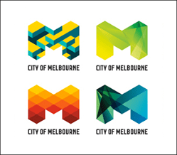
Dynamic or kinetic logos, also known as "remain-but-stay-the-same," look very fresh. Daily logo changes in Google Doodles engage consumers while simultaneously allowing them to understand the company's direction and brand diversification in real time.
 |
 |
 |
Logos with background textures also fall into the dynamic design category. They are characterized by minimalism combined with an easily adjustable set of textures to create a more striking impression of the product.
 |
 |
 |
Amidst the diversity of logos brimming with colors and gradients, many brand names were distinguished by the use of thin lines or lines of uniform thickness, monochrome colors, or combs. These logos hint at "handcrafted" and "artisanal style," enhancing consumer trust in the product.
 |
 |
 |
Creative logos using geometric shapes were also in demand among clients. Designed using flat design techniques or overlay effects, company logos featuring circles, squares, and other geometric elements provided an excellent decorative solution where simple wordmarks proved insufficient.
 |
 |
 |
So-called stacked letters, arranged one on top of another in a rectangular space and containing a coded design message, are a favorite style among fashionable youth brands. However, to create a successful creative logo, the form of the transformed text must be short and easy to understand, which is a rather complex creative process.
 |
 |
 |
At first glance, it may seem like a simple design. But in reality, it has the ability to "speak," as it conceals a deeper meaning. To read such a "speaking message," the consumer must engage their brain, which contributes to the company's logo's greater memorability.
 |
 |
 |