Receive a presentation of services and expert advice
The best experts in the industry will oversee your brand development process.
→ Need branding, design, or creative solutions? Call us at +48 505 648 022 or message us on WhatsApp.
 WeLoveBrands.pptx

The best experts in the industry will oversee your brand development process.
What does white mean to you? Purity or emptiness? Coldness or light? Limitation or freedom? For us, white is a boundless space for the realization of creative ideas. A space in which you can fly endlessly, spreading your wings.
There are so many color combinations you can make with white, so many variations, and if you think about playing with negative space – wow!, the scope for imagination is breathtaking.
We've decided to dedicate this article entirely to the color white—so simple and yet so complex. Read on to find out which companies suit a white logo, which don't, how it affects people's psychology, and whether white even has shades.

The meaning of white is very unique, much deeper and more expansive than that of other colors. Other shades are simple and straightforward: yellow symbolizes joy and caution, blue calm and confidence, red love, passion, or danger, and green nature and harmony. But with white, things are more complex. It symbolizes spirituality, the immaterial world, the light of consciousness, and higher powers. You'll agree, these are completely different categories. And the perception, accordingly, is also different. Depending on the cultural code, white can be perceived as peace and goodness or death and mourning (we'll discuss this in more detail later). White conveys feelings of innocence, purity, maternalism, unity, and rebirth. It represents absolute freedom and a new beginning. It seeks justice, always maintains neutrality, and is completely impartial. White is simultaneously everything and nothing, as it contains all colors in equal quantities.
It relieves irritation, calms, soothes, encourages reflection, and unburdens the mind. Used in moderation, white creates a feeling of flight and weightlessness.
An important detail: white visually alters the perception of space, creating the illusion of expansion. Therefore, it is often used in small spaces to make the room appear larger or to raise ceilings. Therefore, be careful with white in clothing—it can make you look larger and wider. If you want to appear slimmer, it's best to avoid using white as the primary color. On the other hand, white visually softens skin tones and enhances their undertones.
Given that white is perceived as empty, it's often enlivened by other colors in interiors. At the same time, it beautifully complements any other color, enhancing and highlighting it. Therefore, it's often used as a background shade.
White has a strong effect on the visual and endocrine systems—a person's pupils constrict and all sensations, including pain, are intensified. An abundance of white and its constant presence in clothing or interior design can be mentally draining. Choosing white as a primary color in clothing, creativity, or interior design may indicate burnout, a lack of emotion, low energy, or a complete loss of energy. In many cases, white indicates a person feeling isolated, bored, frustrated, detached, and seeking to avoid strong emotions.
Like any other color, white has shades. Although there are fewer of them, each of these undertones has its own character. Let's take a look:
 |
Sterile white – devoid of any undertones, it symbolizes purity. It's a fairly neutral color that can serve as a beautiful backdrop for any other color. | |
 |
Pale Pearl is a noble and elegant color that can add sophistication to any image or interior. It has a slightly pinkish undertone, making it always look very delicate and yet understated. | |
 |
Swan Wing – compared to standard white, this shade has a slight yellowish tint. This makes it look much warmer and more delicate than pure white. | |
 |
Antique white is a very delicate, calm, muted shade of white. It looks quite restrained and yet quite soft. It evokes a sense of nobility and sophistication. | |
 |
Gardenia is a soft, delicate, and quite sensual color. It conveys a sense of youth, freshness, coolness, and innocence. | |
 |
Meadow Dew is a shade of white with a slight hint of green. It has a very calm and muted appearance, which can make it seem boring. It's suitable for relaxation and is practically devoid of emotion. | |
 |
Floating Cloud is the color of clouds at dawn. It has a slight pink undertone. A very beautiful, delicate, and cozy shade that can add softness and warmth to any look. |
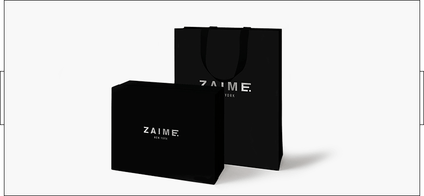
Although white is perceived as a neutral and generally positive color, in some cases it can convey negative qualities and evoke unwanted associations.
Remember that white isn't always perceived positively. Furthermore, it's not suitable for every business. Excessive use of white can create a negative impression in the audience. However, its moderate use is generally perceived very positively and is therefore encouraged.
The perception of white varies across countries. This is due to cultural heritage and centuries-old traditions specific to each ethnic group. This is important to consider when designing white logos and white corporate identities for foreign companies or export products, to avoid confusion and rejection from foreign consumers.
Let's take a look at how white is perceived in different countries around the world:
The USA is the color of neutrality and parliamentarians. It is associated with purity, innocence, the birth of new life, angels, and solemnity.
India – illness, death, mourning, ritual color.
Japan, China – the color of mourning, death, grief, farewell, rebirth, ritual color.
Ukraine – solemnity, celebration, new life, joy, purity, innocence.
European countries – purity, lightness, weightlessness, the color of peace and goodness, new life, angel.
Clearly, the color white is perceived differently across cultures. Therefore, if you're designing a logo or corporate identity for Asian countries, it's best to avoid white, or at least be extremely careful with it.
White is used quite often in logo design, though usually as a complementary or background color. It's typically complemented by other shades. There are certain business sectors for which white logos are ideal:
Simple and pure, white offers scope for imagination and creativity. It can be used to create any design project without fear of overdoing it or choosing the wrong shades. White emphasizes sophistication and understatement. It's a surefire choice and a classic, win-win option, especially when paired with black. Perhaps this is why most global clothing brands have opted for the combination of white and black in their logos.

In the medical field, purity and absolute sterility are paramount. These qualities are embodied by the color white. And although private clinics and laboratories have recently begun to gradually move away from white in their interiors toward warmer, friendlier, and more optimistic shades, white remains inextricably linked with this field. Therefore, it continues to be frequently used in medical logos. Typically, the complementary color is blue/light blue, representing reliability and tranquility, or green, representing naturalness, organicness, and health.

White is often used in charitable organization logo designs because it is associated with purity, innocence, and virtue. Moreover, in many countries, white is the color of peace and angels. These images are particularly suited to those involved in charitable work. White most often serves as a background for such logos, offsetting other colors. However, it still conveys its message.

The world of innovation and new technologies is a world of fresh ideas and an open, unconstrained mind. Essentially, it's a blank slate, where every new project and future development begins. At the same time, white relieves stress and irritation, calms, and encourages reflection and invention. White can also be used to create original logos with negative space. This original vision and unconventional approach are highly valued in the IT industry. Clearly, it's precisely for these qualities that white is especially prized in the world of digital technology.

What could better represent air and sky than white? Only its combination with blue. Clearly, this combination is particularly popular in airline logos. Here, white symbolizes freedom, flight, weightlessness, and tranquility. At the same time, it has a calming effect, relieving stress and fear, which is crucial in the air travel industry.

A white logo is not very appropriate for those areas of business where it is important to awaken passion, desire, spontaneity, and other strong feelings in the audience.
For food service establishments, the main goal is to whet the appetite, attract customers, and provoke spontaneous purchases. White conveys the exact opposite message, so it's rarely used in fast food chain logos. Its only suitable use is as a background color to accentuate other colors.

Children are very emotional, so white isn't the best color to express their energy. Furthermore, children's products with a sober white logo won't attract children's attention or spark their desire to buy. The same goes for entertainment industry logos, which should convey dynamism and fun. Just look at what such logos would look like in white:

White logos aren't ideal for these types of businesses, as they convey a sense of peace and tranquility. Here, on the contrary, they need to convey passion, desire, love, attraction, and so on. Let's see how alienating and uninspiring such logos would look:

White is a neutral base color that complements any other shade beautifully. So, it's virtually impossible to go wrong. However, there are classic, foolproof combinations:
 |
Black and white logos evoke a sense of maturity, formality, and functionality. They also embody classicism and refined taste. | |
 |
White and purple, when combined, evoke feelings of wisdom, dignity, and generally positive associations. This combination has a positive effect on the viewer's psyche, evoking a positive response. | |
 |
The combination of white and red is also a classic. These logos convey a sense of strength, versatility, permanence, and timelessness. They always look bright, dynamic, and attract the audience's attention. |
Pure white creates a sense of purity, emptiness, and endless space. Pairs perfectly with any other color. Alabaster is similar to the previous shade, but has a subtle hint of ivory. Snow white is a radiant and immaculate color that creates a feeling of freshness and purity. Pairs beautifully with any other color.

If you want to evoke associations of purity, purity, and virtue in your clients' minds, choose white in your office. Given that it's often associated with health and innovation, you can freely use this shade to emphasize the safety of your product, especially if you work in the medical or IT fields.
White is often used in design studios, galleries, and other creative spaces because it can create additional space around key design elements, drawing attention to them.
According to Feng Shui, white is associated with the element of metal, so it can be safely used by all firms, companies, and enterprises that are in any way connected with the production or sale of metal products.
Knowing your business's element helps you choose the right colors for your office, corporate identity, and even logo. How do you determine a business's element? By its primary function. If we're talking about metal, its key characteristics are preservation and concentration. Therefore, any business associated with these functions can safely be attributed to the element of metal. Metal also represents discipline, hierarchy, management, and rigid structure. Consequently, such structures as the army, police, government agencies, and so on belong to this element.
Managers, mechanical engineering, computer manufacturing and repair companies, IT companies, metallurgy, jewelry, engineering, cosmetics and skin care - all of this also relates to the element of metal and the color white.
By applying this knowledge in practice, you can create a harmonious visual image, embodying the character and essence of your business. Clients will then be able to read this information subconsciously and avoid feelings of cognitive dissonance and disharmony. And when everything seems logical and harmonious, a feeling of trust emerges.
A white logo offers endless possibilities for logo design ideas. It allows you to play with negative space, highlight desired colors, and place accents appropriately. It's the color of purity and style. If you want a cool, stylish white logo that reflects your company's character and sets you apart from the competition, order a white logo design from WeLoveBrands.