Receive a presentation of services and expert advice
The best experts in the industry will oversee your brand development process.
→ Need branding, design, or creative solutions? Call us at +48 505 648 022 or message us on WhatsApp.
 WeLoveBrands.pptx

The best experts in the industry will oversee your brand development process.
The cleaning business thrives in a highly competitive environment. Sometimes, even the latest innovations, client programs, and business improvements fail to provide a unique competitive advantage.
Why does a cleaning business need a logo? Regardless of what services your company provides—general maintenance, carpet cleaning, deep cleaning, or maid services—a logo provides two key benefits:
Thanks to technological advances, word of mouth or a client's recommendation to another client is no longer considered advertising to a broad audience that generates revenue. Modern cleaning companies turn to branding agencies and web studios to create a logo that not only reflects the specifics of their offerings but also addresses the needs of their client base.
There's more to creating a brand logo than just a randomly chosen graphic symbol and a company name slapped on top. The first step in designing a logo is to compile a list of the potential audience's needs. In the cleaning industry, a popular trend is low costs for high service. This has created a desire among corporate buyers to give less and get more.
Your company's services may meet modern requirements, but the question is: do your clients know this? Therefore, when creating a logo for a cleaning company, you need to ensure that your trademark text is clear and the images are memorable. To do this, we offer a step-by-step guide to creating the perfect logo for a modern cleaning company.
 Meeting expectations.
Every industry uses specific symbols. In the cleaning business, customers expect to see symbols depicting cleaning: a broom, a bucket, a mop, a vacuum cleaner, or even a maid's uniform. And the presence of cheerful, sparkling accents adds a positive note to the brand.
 Leave your competitors in the dust.
The advantage of developing a recognizable logo is that it gives you the opportunity to outshine your competitors. Who are they? Gathering as much information as possible gives your company the chance to stand out. Conduct an analysis of large and small cleaning service companies using websites, newspapers, and flyers. This will give you an idea of the logos used by your main competitors. Consider how you can improve your favorite design.
 "Clean" trademark.
Keep your logo clean. Aside from puns, the ideal logo for a cleaning company will contain a minimum of elements. This will make your brand easier to remember and will make it effective when displayed on vehicles and marketing tools (websites, business cards, staff uniforms).
 Limitation of the number of colors.
A cleaning company's logo should look equally good in both color and black and white. Let's talk about color scheme: if your company provides cleaning services using eco-friendly products, all shades of green will look harmonious. Cleaning companies often use all shades of blue, pink, white, and other colors associated with "freshness" in their logos. Therefore, it's best to avoid yellow, brown, gray, and other "dirty" colors.
A cleaning company's logo should clearly convey two messages to potential clients: efficiency and reliability. If you've created a brand that communicates these two points, you can be sure it will help you attract new clients.
Let's look at the logo elements that can help you communicate with your target audience. The color you choose sends a strong message. White is associated with cleanliness, but a logo can't be completely white. All shades of blue are associated with water, and green with nature (for companies that offer eco-friendly cleaning products).

Font is also very important. Most modern cleaning companies choose a simple, legible, and modern font with clean lines for their logo. The logo should be easily identifiable and legible.
Unconventional shapes and images can help you achieve a unique competitive advantage. Important! Choose shapes that convey the type of cleaning you offer. However, avoid clichés. Many modern cleaning companies have similar logos, making them appear identical to consumers.
This trend will remain relevant for cleaning company logos for a long time to come. Its main idea is to ensure readability from any distance and on any medium. Following this trend, in 2020, large cleaning companies began eliminating logo elements that add weight to the design.
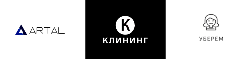
A text logo can become more original by separating one of its parts. Of course, negative space will be visible here, as our brains tend to fill in the missing pieces of the image. But in this case, it's important to maintain readability and not overdo the removal.
This trend emerged last year and continues to be popular. A specific part of the logo is highlighted through disproportion, slight asymmetry, or imbalance. Using this trend draws attention to the logo and makes it memorable.
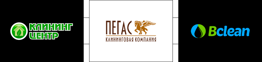
To achieve an unusual visual effect or introduce a new color, designers began using gradients, which lend originality, depth, or volume to logos. Unnatural, one might even say "acidic," colors in logos are influenced by the same trend, although neon has since become a distinct color and looks great on simple logos with large details.
This trend cannot be called universal, because vertical stripes are more suitable for companies with a desire for growth, development, and progressiveness.
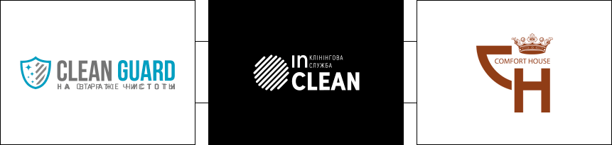
Companies looking to highlight their individual approach, creativity, and unique competitive advantage choose this trend. It utilizes pure, natural colors, soft lines, and various drawing techniques.
Cleaning services in Ukraine began to develop in 2000. By 2010, increased competition had already positively impacted the quality of services. The cleaning company "Leran" chose to use a text-based logo with a simple and clear font. The pleasing blue-to-white gradient, combined with the green font, not only creates contrast but also evokes associations of cleanliness and order in the minds of potential customers.
Diasan Cleaning , a company that has been providing cleaning services for three years, used angular design elements in its logo, positioning itself as a reliable service provider. The designers deliberately chose the gray color in the logo because Diasan Cleaning provides post-renovation cleaning services. The blue "clean" font conveys the message to potential customers that the property will be immaculately clean.

The company "Cinderella" chose to emphasize traditional values in both its name and logo. The emblem featuring a fairytale character, commonly associated with high-quality cleaning, is a successful solution. However, it's worth keeping in mind that when printed on business cards, the emblem will shrink and become illegible. The company's logo positions itself as a service provider offering customized cleaning services.

The Olva logo was a very unusual design, using a gradient and a combination of styles (text with an abstract symbol). The purple color was also a clever choice, making the company stand out in a competitive market. Most cleaning companies use all shades of blue and light blue. This is the cliché mentioned above.
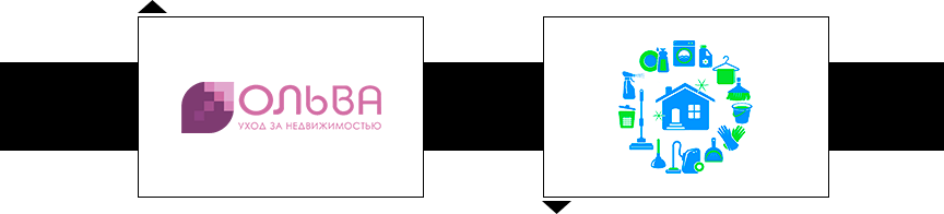
The company "Chisto Nachisto" specializes in in-home carpet, rug, and upholstery cleaning. They've successfully conveyed the range of their services through their logo. One of the large bubbles features an image of a house. The color scheme combines blue, white, and green—seemingly standard cleaning colors—but they've been cleverly executed.
Magic Mops created a logo whose design is based on an essential cleaning tool: the mop. The brand's message is that the company will magically (quickly and efficiently) clean your environment. The designer used a handwritten font, conveying the message that using Magic Mops is a comfortable experience.

The Golden Virgins company uses an image of a maid in its logo, symbolizing cleanliness and order. When creating the logo, the designer cleverly utilized the power of font, imagery, and color to convey the company's message to customers.
The logo's appearance was crucial for The Gleem Team . The designer's work resulted in an elegant color scheme and perfect typography. The four-star logo ensures the client's office sparkles with cleanliness and order. The designer was able to clearly convey the company's message to its target audience.

The cost of a logo depends on the artist you choose. You can get one completely free using an online logo maker, or you can pay several thousand dollars.
There are the following options:
During the logo development stage, the branding agency considers the cleaning company's growth and development potential. Therefore, the logo developed by designers and marketers will have significant potential for scalability.
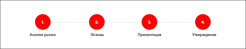
The first stage of logo design is an analysis of the market and the cleaning company itself. After collecting the information, the designer and marketer will search for a metaphor that will clearly and understandably convey the company's character and its message to the potential audience.
Once the logo design concept is formed, the designer will begin to search for shapes, colors, and determine the style, taking into account the scaling of the cleaning company's corporate identity .
The logo sketch concept receives written and visual support. The designer will demonstrate the logo's potential for use in a work environment and how it can highlight the company's uniqueness in the marketplace.
The client makes changes or approves the logo.
Do you have any questions? Would you like to order a logo for your cleaning company? For quick and convenient communication with our specialists, you can use the chatbot or call the number listed in the contact information.