Receive a presentation of services and expert advice
The best experts in the industry will oversee your brand development process.
→ Need branding, design, or creative solutions? Call us at +48 505 648 022 or message us on WhatsApp.
 WeLoveBrands.pptx

The best experts in the industry will oversee your brand development process.
It's commonly believed that a logo is only needed to create a certain image for a company. But in reality, it serves much more than that. First, it helps identify the company in the marketplace. It's important for potential clients to recognize you among similar businesses.
Secondly, it's essential for communicating your philosophy to your target audience. A logo can help you build a reputation and establish yourself. Thirdly, a logo creates a certain image. And with it, you can evoke certain associations in people. Basically, you won't get very far without a logo.
In this article, we'd like to touch on the importance of a logo for photographers. They especially need their own. By attaching a logo to their work, photographers protect it from plagiarism. Incidentally, it's precisely in this industry that plagiarism is common.
Plus, a logo will boost recognition. In this industry, it's essential.
The photography industry boasts high competition. And yet, most photographers produce worthy work. Therefore, to stand out from the crowd of similar photos, it's important to identify yours. How exactly? With a catchy logo, of course! This will help potential clients recognize you, creating a certain image.
A logo will also highlight your professionalism. It will show that you're truly serious about photography and can be trusted. It will also help people understand your work style.
Let's now look at the main functions of a logo for a photographer:
 protective
You protect your work from plagiarism. If you notice someone using your name and logo, you can hold these "thieves" accountable.
 distinctive
A cool logo will set you apart from your competitors, as emblems are how customers differentiate one company from another.
 warranty
A logo serves as a quality guarantee. By adding a logo to your photos, you assume responsibility for their originality. In other words, your logo on them is a sign of uniqueness.
Having your own logo is very important. It's also worth remembering that "clothes make the man." This phrase also applies to beautiful logos. So, if you want more clients, create a branded icon.
As you can see, there are plenty of reasons to develop one. So if you're a photographer and have been unsure whether it's worth the effort, now it definitely is.
A photographer bears a special responsibility, as they are trusted to capture the most memorable moments in others' lives. Weddings, birthdays, graduations—these are events we want to remember. If a photographer does a poor job, they will, first and foremost, deprive their clients of fond memories. That's why it's crucial to build a good reputation and inspire trust among potential clients. A logo plays a key role in this.
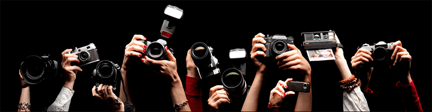
Moreover, there are a great many talented photographers these days. And their prices are often low. That's why it's crucial to demonstrate that you're worthy of capturing the client's work. Show that you're unique, and that even an ordinary person will look like a model through your lens. It's also important to highlight your pricing policy through your logo. This way, the client will clearly understand what expenses to expect. You should also highlight your skills and talent, and that you have a unique approach to everyone. It's also a good idea to highlight the type of photography you most often conduct, such as events, landscapes, fashion, and so on.
A logo should be memorable and stand out from the crowd. This will ensure you stick in a potential client's mind. It will also make you easier to find. After all, if someone sees your work on a friend's page, they'll immediately recognize your logo. And they'll use it to find you. This could even lead to a future client.
What should a photographer consider when designing a logo?
It should be different from competitors' logos.
You need to show that your work is worth the money.
The logo should reflect the scope of your photography work.
A logo needs to inspire confidence in people.
You need to emphasize your uniqueness and highlight your “zest”
It's also crucial that the logo be easy to read and visible against any background. You'll be superimposing it on a variety of photographs. Therefore, avoid confusing squiggles and faint images.
Stylish, trendy colors and modern fonts are a great way to create a cool logo for a photographer. Read on to find out how to choose them.
To create the perfect logo, you need to carefully select the font, shape, and color. But first, let's look at the different types of logos:
 Monogram/Abbreviation - used by companies with long names, just one or more letters
 Logoslovo - beautifully designed company names
 Emblem - created on the principle of coats of arms and seals
 Symbol - graphic or literal symbols
 Abstract mark - conveys the idea of the company using a simple sign or symbol
 A mascot logo is a logo that uses a character.
 Combined (text-graphic) - consists of words and images

The most common logo options for photographers are a name or nickname. This looks most flattering on any photo. However, some prefer more complex designs.
If you're a commercial photographer, it's best to choose your name as your logo. But if you photograph events, you can get creative. Choose a unique font or a beautiful image.
In any case, you should focus on your target audience and their preferences. However, we would like to point out that the most universal logo option is simply a name written in a simple font. It will look natural in any photo and complement everything.
Try each logo design on your work. Decide which one will look best. Remember, this is your calling card, your watermark. You won't likely be able to change it later.




The logo shouldn't attract too much attention. Also, try it on your social media or website. It should look good everywhere.
By the way, many photographers prefer to use an image of a lens or camera as a logo. You can play with it and design it your own way. Overall, it's not a bad idea either.
The challenge of creating a logo for a photographer is the limited color palette. It's important to choose colors that are as neutral as possible so as not to distract viewers from viewing the photographs. It's also crucial not to overload the photos with a bold logo.
The choice of shade depends on your style. However, try to stick to calming colors. Gray, black, and white are ideal options.
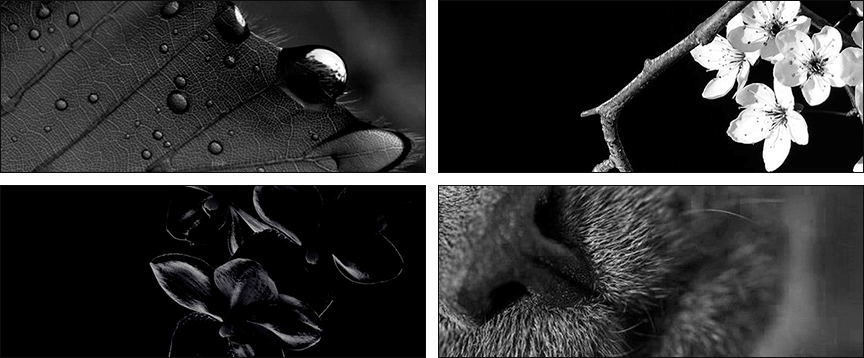
Most photographers choose black and white because they don't draw too much attention to themselves and allow the photographer to enjoy the photo. But if you still want to add a few bright notes, try reworking your logo to black and white. It'll likely look even better than before.
In any case, the choice is yours. Just remember that it's the photo, not the watermark, that matters.
Since color choices are limited, you need to make a statement with your fonts. A well-chosen font is especially appealing. Choose a font based on the theme of your photos. For example, if you photograph holidays, you might choose unusual handwritten letters. But if you prefer a classic style and enjoy black-and-white photography, stick with something simple. Minimalistic fonts without unnecessary details are ideal.
Just be sure to keep in mind that the font must be legible. Be sure to try it on in place of the watermark. This will help you determine if it's easy to read. Often, the same font can look great on a website but poorly in a photo. Try to avoid this. Choose a format that will be equally legible everywhere.
Despite the abundance of fonts, we recommend focusing on the classics. Simple fonts will never go out of style. And most importantly , they will be legible.
Here are three golden rules to follow when choosing your “dream font”:
 Avoid fonts with small flourishes, serifs, and other details. Firstly, these details will be difficult to see in the logo anyway. Secondly, they can significantly spoil your logo and make it illegible.
 Make sure the font complements all the logo components. For example, the icon. If the icon is large, pair it with a large font. You get the idea. There needs to be harmony.
 The main rule is to choose a legible font. This is even more important than its beauty. Also, be sure to check the font's legibility at different logo scales.
Each logo shape conveys a specific message. They impact the human subconscious in different ways. What emotions does a particular geometric shape evoke? Let's find out.
Circle or oval
Round shapes are associated with friendliness, warmth, and love. They hint at a stable partnership. Circles, ovals, and ellipses evoke positive, bright emotions.


Square, rectangle and other “straight” figures
The right angles and lines in the logo are associated with professionalism, stability, and strength. They represent balance, quality work, efficiency, and confidence.


Triangle
The triangular shape of the logo is associated with power and law. It is most often found in logos aimed at a male audience.
A rectangular logo shape works best for photographers. However, you can also use your imagination and create a more unusual logo shape.
As in all fields, logo design has its own trends. We've compiled the most successful logo trends for photographers.
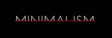
Minimalism
Minimalist, simple logos are trendy these days. They look modern. Their main advantage is that they're easy to read. And they'll appeal to everyone. After all, beauty lies in simplicity!

Logoslova with sans-serif fonts
Sans serif fonts are currently at the peak of popularity. They're timeless classics that will never go out of style. That's why, for years, famous companies and brands have chosen to incorporate them into their logos. Moreover, this font is easy to read and distinguish in photographs, making it an ideal choice for photographers.
Retro style logos
Retro logos are one of the trends of 2020. Try creating a logo in this style. Thanks to its stunning design and nostalgia, this option has won the hearts of many.
Logosology in handwritten fonts
Handwritten fonts are a popular choice for stylish logo elements. They look modern and are aesthetically pleasing. Just be sure to choose legible fonts, as handwritten fonts with fancy flourishes are currently out of fashion.

The Lost Fragment
In this version, designers remove fragments of letters or images. With this trend, even the simplest logo looks impressive. However, keep in mind the logo's legibility. If you remove too many elements, the logo will look unfinished.
Geometric logos
Logos with geometric elements are always stylish. They're a great choice for photographers, thanks to their minimalist design. Folds, lines, and sharp angles will look great as a photo watermark. Incidentally, combining angles and folds with other shapes is an interesting design solution. Experiment and mix and match.
Focus on small details
If you want to add some variety to your logo, you can simply highlight an element. Even just one letter is enough to give the logo a new look. It looks very stylish.

However, don't go to extremes and follow trends exclusively. You can create something unique that will be timeless. Study trends and incorporate them into your logo design. But at the same time, come up with something of your own. Combine your own ideas with common trends. Then you'll be able to create a unique logo that will always be relevant.
If you're still unsure what you want in your logo, take a look at the examples below. We'd like to share some successful logo examples for Ukrainian photographers. Perhaps they'll help you decide how to design your logo.
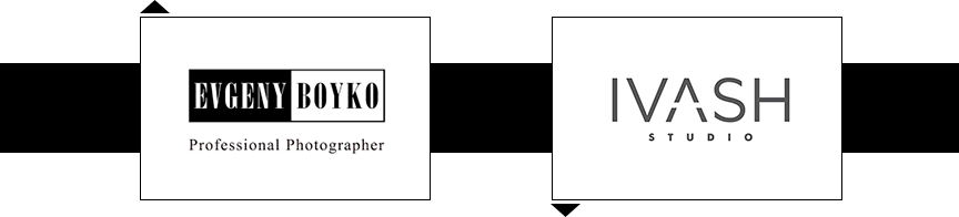

If Ukrainian logo examples aren't enough for you, take a look at global logos. We've collected some successful logo designs from around the world for you. So, get inspired!



Designing your dream logo can sometimes be challenging. That's because the process is so labor-intensive and complex. To create a great logo, you need to take a simple idea and put it through four steps.
 Stage 1. Research
At this stage, the designer gathers all the information necessary to create the logo and analyzes all your wishes. In other words, they prepare the groundwork for developing the perfect logo for you.
 Stage 2. Concept Definition
Based on all the information provided by the client, the designer develops an idea for the logo. Typically, in such situations, the "maestro" draws on the client's company philosophy and develops a formula for the "dream logo."
 Stage 3. Amending the concept
The logo is then approved by the client. They make any necessary adjustments and add any suggestions, but not in a way that conflicts with the logo's core concept.
 Stage 4. Launch
The logo is slowly starting to gain traction. It's being used in advertising, printed on business cards, brochures, and so on. It's being distributed online.
Want a stunning logo? Then make sure each of these four steps is carefully considered. Believe me, the results are worth it. They'll attract many new clients.
You can't trust logo design to just anyone. It's crucial to choose true professionals so they can bring all your plans and ideas to life. Besides, you don't have to look for them anymore. They found you.
This is WeLoveBrands! They're a team of true professionals. They'll design a logo for you that will make all your competitors jealous. Just look at the unique emblems they've already created:
But their main advantage is that they store all your wishes, like robots. They take into account every idea and comment. Basically, they're a dream, not professionals.
WeLoveBrands' prices are tailored to the individual. Designing a single logo will cost you $50. For something that will attract a ton of new customers, that's a reasonable price.
If you're unsure which logo concept to choose for your photographer, you can order several unique options at once. For example, three logo options for $100, or five logo variations for $150.
A logo is an art form in itself. So create a logo worthy of display in the Louvre. The specialists at WeLoveBrands will help you develop your logo and corporate identity. They'll bring all your ideas to life!
We wish you good luck, a beautiful logo, and lots of clients!