
Receive a presentation of services and expert advice
The best experts in the industry will oversee your brand development process.
→ Need branding, design, or creative solutions? Call us at +48 505 648 022 or message us on WhatsApp.
 WeLoveBrands.pptx

The best experts in the industry will oversee your brand development process.
What can isometric drawings be compared to? To Hollywood stars. Surprisingly? Yes, they used to be boring and little known until the internet and social media came along. Just like social media, isometric design allows for viewing an object from all angles. People want to learn more about an object, and this is possible thanks to the ability to see the top and sides of the design.
For businesses looking for more ways to present their product to their target audience in an engaging and detailed way, isometric designs are the perfect visual metaphor. This technique allows for greater detail to be shown because there's less clutter. The 3D space offers significantly more space.
What's the essence of this style? Isometric design is an evolution of flat design. Yes, it managed to not only maintain its simplicity but also add depth.
Comparing isometric and flat design :
• Flat design is not ergonomic
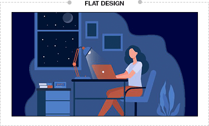
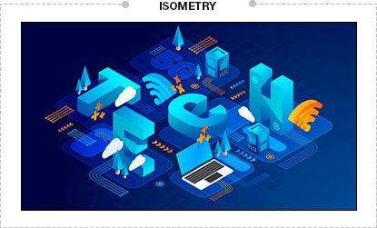
• Flat icons are mixed
• Flat infographics
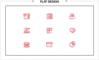
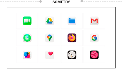
When starting to experiment with isometric design, remember three important rules for working with this style:
Many isometric designs actually violate the basic rule of this style. A design is considered isometric only if there is a 120-degree angle between the axes.
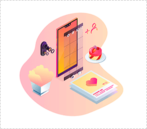
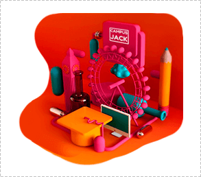
Our brain processes images of objects differently than they are shown in isometric projection. If you're standing on an elevated surface, parallel lines converge downwards to a single point. In isometric projection, things are different. Objects are depicted as they actually appear, not as the human eye sees them.
Three dimensions offer significantly more possibilities than 2D. Given such diversity, it's tempting to exploit all the possibilities offered by isometric design. But it's important to consider first: is it really necessary to do everything possible? Giving the user too much information risks turning the design into a cluttered mess.
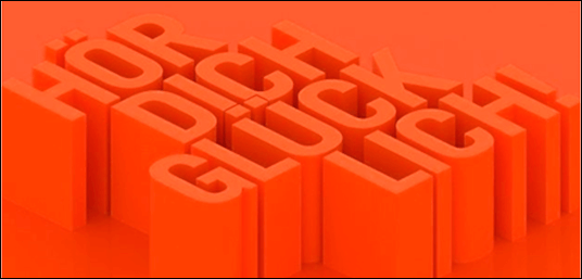
Typographic architecture takes on an elegant appearance thanks to the use of isometric techniques. The typography of a German radio station demonstrates the use of isometric techniques: the legible font is a single color with a shading effect, adding volume and depth. Translated into Russian, this text reads something like "Hear yourself happy." A wonderful message, conveyed in a unique style and cheerful colors. A great idea!
Have you decided on isometric design, but aren't sure it's appropriate? Here's how to determine if this style aligns with your brand's goals. Isometric design is an ideal choice if:
 When a simple design needs depth
 If you're looking to increase appeal and recognition, isometric icons have become popular among designers and a rapidly growing design category within this style.
 When your design has a lot of details.
2D maps convey the view of objects from above, but what if you simply need to show an object from all sides? This is possible. Isometric design is what you need!
Back in 1988, designers came up with a way to convey depth and volume in a design. Why? It's very simple: it's not just looking at a web that's interesting; the thrill comes from the sensation that it's right there...
When you create an illustration where information is interconnected
Are you creating an illustration of city life? Want to convey information in an easily digestible style? Using isometric design techniques, you can easily depict the surrounding environment: cars, people, streets, buildings, trees, etc.
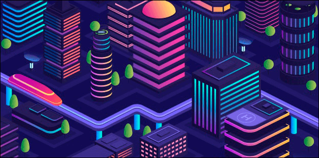
Illustrations in this style utilize isometric projection, which allows any three-dimensional object to be depicted on a flat two-dimensional surface. The isometric cube is the basic building block for compositions in this style. An illustration of an apartment in isometric view is depicted next to the cube.
Another style that allows for a three-dimensional image to be created on a flat surface is true perspective. It uses the technique of drawing objects at angles directed toward vanishing points on the horizon. The difference between isometric projection and true perspective can help you understand how isometric illustration works. True perspective images use one-point, two-point, or three-point perspective. These three methods use drawing angles that meet at the end of the perspective view, typically at the horizon.
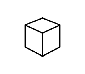
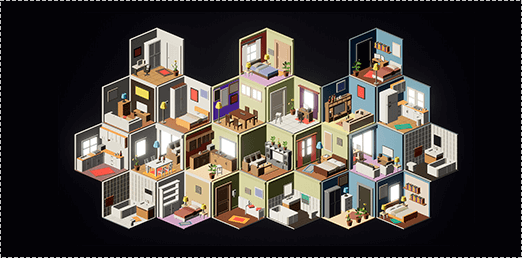
As for the angles of an isometric illustration, they never intersect. Using an isometric drawing, it's possible to disassemble and display any complex device in a way that's easy to understand and visualize. An isometric drawing allows workers to understand and follow instructions for connecting parts of a complex technical system. In our everyday lives, we see isometric illustrations in infographics, presentations, and everyone's favorite Pinterest board. How do you create your own isometric illustration for the first time? Using an isometric grid, which allows you to create simple shapes. With this help, the designer will become accustomed to isometric angles and, over time, learn to draw them without a grid.
Examples of isometric logo design, divided into groups.
A group of logos in a cube . Moving beyond blocks. This is a group of isometric logos consisting of a simple cube with straightforward symbols. To soften the image, it was recommended to round the corners and highlight the right side of the cube, emphasizing a positive outlook on growth and development.

Base . A fundamental group of isometric logos, consisting of three open cubes. Clean, sharp angles with a prominent upper edge create a symbol. The chosen shapes create an atmosphere of permanence and stability. The central "parent object" and two "children" create the impression of multifaceted growth.

Building from the Ground Up . This group of logos features a nearly flattened cube with strategically placed cutouts. The clean lines used to construct it convey a specific direction—this group of logos conveys an atmosphere of movement and progress. The triangle, which represents growth, is formed by the cutouts on the surface, and the wide base creates the impression of a solid and stable foundation.

This year, the trend for isometric views has migrated from illustrations to web design. Viewing an object from this angle creates the illusion of volume, and yes, this works even with flat illustrations. Therefore, designers are eagerly embracing this technique, and isometric design has confidently maintained its leading position in recent trends. Previously, this technique was actively used in engineering drawings, but today, isometric design is being used more boldly, and illustrations in this style have become firmly established in web design.
The construction company "Vertical" supplies high-tech block containers to the Russian market, one of which is featured in the brand's logo. To distinguish itself from the construction industry, bright colors were used and a font was developed that complements the logo's isometric design.
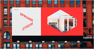
Krasnaya Strela, a residential complex boasting a new type of attic apartments and boasting its location along a steel platform (now a park), drew attention with its unusual isometric branding. The branding emphasizes architectural features and, most importantly, the space sorely lacking in large cities. The easily recognizable isometric logo and the color red, symbolizing ambition, energy, and movement, reflect not only the architectural solutions but also the company's overall policy.

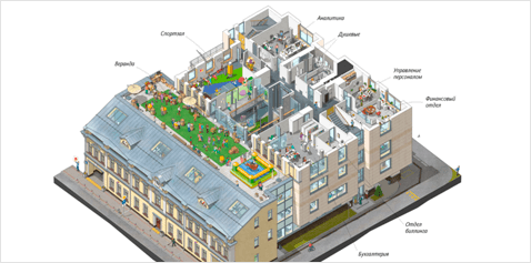
The renowned Artemy Lebedev Studio developed the isometric office map for Innova, a company that develops online games and network services. Using isometric renderings, they created a detailed isometric map that shows a cross-section of Innova's five-story office and explains to visitors the tasks performed on each floor.
Twitter co-founder Evan Williams created a platform that was a counterpoint to the well-known short-messaging service. The service's functionality was expanded and the interface was updated, leading to a new logo co-designed by the renowned Californian agency PSY/OPS. Unfortunately, little can be said about the previous logo, but the new "M," designed in isometric projection, is considered a clever idea. The text logo was linked to the graphic symbol through angles, but thanks to the illusion of volume, it avoided becoming just another geometric grotesque.
The British investment platform "Lendinvest" is considered a leader in the investment sector, and to back up their claims, they updated their already outdated brand identity. The London-based studio DesignStudio developed the new identity. The old version featured an arrow, suggesting a commitment to growth and development. The new logo, however, embodies an unusual idea: a graphic symbol—a monogram of the initial letters—created as an isometric rectangle. This graphic symbol symbolizes living space, as they invest in real estate.
Business owners don't always have marketers and designers on staff, and when the need arises for new marketing materials or a rebranding project, the search for a specialist begins, with heated discussions and pros and cons swirling. Choosing the wrong specialist can lead to a failed project, or, conversely, to exceed all expectations and become a successful start to success. There are two solutions: seek a specialist who works remotely, or go the traditional, proven route of contacting the branding agency WeLoveBrands.
When you entrust your project to one person, you're limited by the knowledge, professionalism, and experience of that one person. With a branding agency, we have a team of specialists in various fields, and we work on your project without changing service providers, leveraging the knowledge and experience of the entire team.
If a client has a number of requirements, working with a freelancer means there's no guarantee they'll be met due to human error: they might be unwell, unavailable, or simply busy with another project. If the order is handled by an agency, then, according to the contract signed by the parties, if someone is sick or on vacation, the client doesn't have to worry about these issues – the project continues on schedule.
Thanks to our well-established processes, the agency guarantees the quality of our services, allowing us to fulfill our commitments to our clients. To ensure WeLoveBrands employees stay up-to-date on the latest tips, tricks, and trends in digital technology, our agency invests heavily in training events and professional development courses. For freelancers, time off from work is sometimes an unaffordable luxury, so not all remote professionals can afford to invest in their professional development.
To find out the project cost, please allow our brand managers to interview you. You can use the chatbot to contact the agency. If you prefer a live conversation, we'd be happy to hear from you at the number listed in our contacts .


