Receive a presentation of services and expert advice
The best experts in the industry will oversee your brand development process.
→ Need branding, design, or creative solutions? Call us at +48 505 648 022 or message us on WhatsApp.
 WeLoveBrands.pptx

The best experts in the industry will oversee your brand development process.
An exchange is an organized trading platform for communication and transactions. There are stock, commodity, currency, and cryptocurrency exchanges. Trading operations are conducted through specialized agents—brokers.
The prototypes of modern exchanges were the merchants' meetings on the square near the inn in Bruges, which belonged to the Belgian merchant family Van der Beers. As early as the early sixteenth century, traders negotiated deals, which were recorded using promissory notes. The main difference from market trading was the wholesale sizes of the lots and the absence of goods on the spot.
Today, the annual turnover of international commodity exchanges reaches $4 trillion. On 250 stock exchanges worldwide, traders buy and sell shares and securities worth tens of billions of dollars daily. A strong logo will help identify the exchange and brokers, attracting and retaining clients.
Exchanges and brokers operate in a highly competitive market. The financial well-being of a company and its staff depends on a constant flow of customers and their loyalty. A unique and memorable logo is one way to increase revenue.
The emblem is also intended to solve the following problems:
 Identification . Consumers should understand the company's identity from the logo. A good logo will evoke relevant associations and distinguish the organization from its competitors.
 Communication . A logo conveys information about the company and its services, its idea, mission, and core values.
 Increased trust . A high-quality, professionally designed logo demonstrates the company's commitment and reliability.
 Image formation . A logo, whether friendly, energetic, or formal, conveys the brand's character.
 Protecting the company and its products . A trademark confirms the product's ownership, providing a guarantee of quality and protection against counterfeiting.
A unique logo created by professional designers can solve these problems. The specialists at WeLoveBrands studio have the knowledge and experience to develop effective logos, helping you stand out from the competition and establish credibility with consumers.
The requirements for an exchange and brokerage company logo are primarily determined by the specifics of their relationship with consumers. The relationship between broker and client is built on trust and confidence in the organization's competence. Therefore, the purpose of a broker or exchange logo is to attract and retain clients, as well as instill trust and a sense of reliability.
Three key elements in creating a brand logo— color scheme, fonts, and graphic elements— will help achieve this. Let's take a closer look at them:
 The choice of color determines whether the logo will attract attention, what feelings and emotions it evokes, and whether it will motivate the audience to choose the company. When creating a broker logo, it's important to draw on knowledge of the psychology of color perception. The best shades for an exchange logo are blue, green, black, gray, red, yellow, and orange.

Blue evokes trust and calm. It is also the color of stability and harmony. It symbolizes a conservative, measured approach to business—something clients expect from brokers. Green is associated with growth, development, and money. It is the second most common color in brokerage and financial company logo designs. It stimulates activity without causing anxiety.
Black and gray are the colors of intelligence, security, seriousness, and consistency. They represent stability and practicality. Logos using black are typically used by exchanges and brokers with a rich history.
Red symbolizes strength and energy, stimulating action. Its aggressiveness and challenge are offset by pairing it with calm tones such as black, blue, or green.
Yellow and orange , like red, attract attention and stimulate activity without evoking aggressive emotions. They make for effective logos when paired with black.
 Fonts are the second most powerful tool for emotional impact. They set the tone of a logo, allowing a company to stand out. An italic font conveys activity and calls to action, while a classic serif font conveys reliability. It's also chosen to convey a commitment to tradition. A unique logo can only be created with an original font style and striking color schemes.
 In early logos , graphic elements dominated text. Logo creators attempted to convey maximum information about a company's activities or core product through complex designs and extensive detail. Now, with the emergence of other ways to communicate information, symbolic logos have disappeared entirely or been simplified to the point of being oversimplified. In brokerage logos, graphic symbols symbolize growth and development. These are most often represented by ascending lines, sections of graphs, and charts.
One of the most common mistakes when designing a logo is a mismatch between the color scheme, font, and image. It's important that all components are balanced, harmonious, and free of hidden meanings.
A good logo will last a company for ten years or more. By following basic guidelines, you can avoid frequent logo redesigns and create a positive impression of the company.
Recommendations for logo creation:
# 1 Simplify . The trend toward minimalism has been around for about five years now. Graphics are becoming lighter, with fewer details. Many companies have completely abandoned images and are using only text. Multi-color designs are moving away from two- or three-color ones. Serifs are disappearing from fonts.
# 2 Use unique fonts . Creating fonts from scratch is a current trend. A logo created with an original font will be unique and will help differentiate your company from the competition.
# 3 Use negative space between letters . This will ensure the logo is more readable.
# 4 Use original geometric shapes . This is another popular trend and a proven way to transform a mediocre logo into something original and memorable.
# 5 Be friendly . Even the most reputable brokerage firms with a century-long history are replacing their stern logos with friendlier ones.
If you're ready to experiment with a predictable outcome but lack the experience and knowledge to create a high-quality, unique logo, the designers at WeLoveBrands Studio will help you put these recommendations into practice.
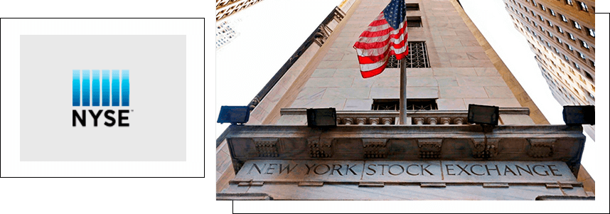
The New York Stock Exchange is one of the oldest and most influential financial institutions. Its logo is a combination of the capital letters "NYSE" and six vertical stripes rising above the wordmark. The stripes range in color from dark blue to light blue. The graphic element references the country's Stars and Stripes. The logo is instantly memorable and easy to read on all media.
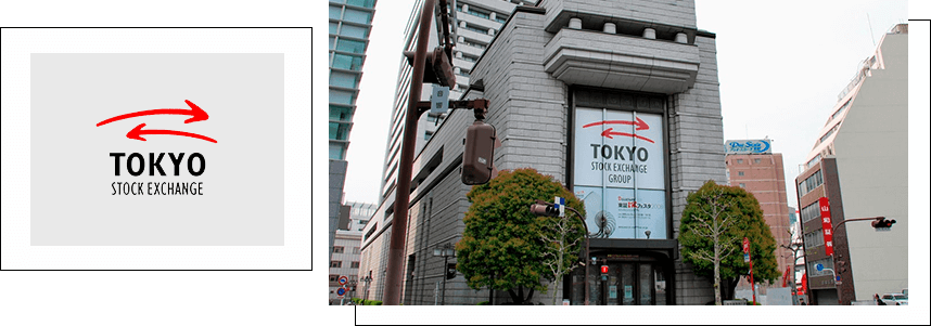
The Tokyo Stock Exchange logo features two curved stylized arrows above the double-rowed "Tokyo Stock Exchange" inscription. They represent protection and also symbolize mutual benefit in the partnership between the company and its clients.
The London Stock Exchange is one of the few financial institutions whose logo has remained unchanged since its founding. A ribbon bearing the motto "dictum meum pactum" ("my word is my bond") rests on two griffins, each holding a shield in their paws. The shield depicts a cross, the symbol of the Union Jack, and scales—a guarantee of fair trade and the balance of supply and demand. Above the shield is a knight's helmet with a lion and crown—the embodiment of courage and noble birth.

The American NASDAQ (National Association of Securities Dealers Automated Quotations), the second-largest company in the world by trading volume, is remembered for its logo with a bright blue ribbon folded into an upward-sloping graph.
The Swiss Forex broker Dukascopy Bank features the flag of the country, the guarantor of global financial stability, in its logo. And the Ukrainian ForexClub uses a symbolic double rising red chart in its logo. It encourages action and symbolizes prosperity.
Logo creation is a complex and comprehensive process. To complete the job effectively, you'll need knowledge of marketing, color, branding, and identity. You can order or create a logo:
Do it yourself . A start-up company can save money on logo development by using an online logo maker. The downside of this method is that the logo is unlikely to be unique.
Freelancers . The average cost is $40. The downside of this approach is that you might end up with a designer who lacks knowledge and experience or who misses project deadlines. To avoid any negative consequences, it's important to clearly define the terms and responsibilities of the contractor in advance and review previous work and reviews from other clients.
At the design studio . Before starting work on a logo, WeLoveBrands designers research the target audience, the company's products, and competitors' brands. Depending on the complexity of the project, the number of preliminary sketches, revisions, and final logo versions, the cost ranges from $150 to more.
You can view case studies and pricing information on the design studio's website. For a consultation or to clarify further details, please contact us by phone or via chat!