Receive a presentation of services and expert advice
The best experts in the industry will oversee your brand development process.
→ Need branding, design, or creative solutions? Call us at +48 505 648 022 or message us on WhatsApp.
 WeLoveBrands.pptx

The best experts in the industry will oversee your brand development process.
People choose a book by its cover, and alcohol by its label. While this may not always be the case, labels and logos can influence consumer choice. Their design is the first thing people notice, before considering the geography of the main ingredient, the year of blending, the aging period, and other criteria.
An alcoholic beverage logo can convey a lot about the product even before consumers discover it. It serves several important functions, including attracting audiences and strengthening the brand's position in the market.
The ultimate goal of logo design is to increase sales. This is achieved through the careful use of font styles, color schemes, graphic elements, and symbols.
What makes an effective alcohol logo :
 Creates a positive image . Good alcohol usually has a well-designed logo and label.
 Informs . The ultimate goal of a label is to communicate information about the product. How this is accomplished, as well as whether to go into detail, is determined by the design: the number of elements and their hierarchy, the choice of fonts, images, and symbols. Everything should be consistent with the overall concept and highlight the product's benefits.
 Stands out from the competition . The alcohol industry is a highly competitive niche. A unique logo, designed with color psychology in mind, with a carefully chosen font and image, stands out on the shelf, stimulating purchase.
The logo and label are the "facade" of a company's products. They can contribute to its reputation for over a decade. To avoid frequent redesigns, entrust the logo design to professionals. Furthermore, advertising and promotion of alcohol are limited. When building a brand, it's important to understand that the name, logo, and other visual components are practically all that can promote a product in the marketplace.
The main requirement for a logo is clarity and ease of perception. The emblem should look equally good on a label, a website, or a backlit presentation screen. Furthermore, the logo should fit harmoniously into the overall brand concept and the spirit of its "colleagues in the barrel."
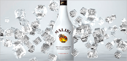
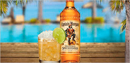
For example, beer encourages you to support your favorite team (Carlsberg, Heineken) or be inspired by cinema (Stella Artois); whiskey motivates you to keep going (Johnnie Walker), and rum is ready to awaken your spirit of adventure (Captain Morgan, Malibu).
Special requirements are also placed on fonts, colours and graphic elements.
Choosing a logo font shouldn't be random. For a French wine design, it's logical to use fonts of French origin. This will be considered good form, emphasize professionalism, and provide comprehensive information about the wine. For a strong spirit with a history, such as whiskey, minimalist bold fonts or serif options are equally effective.
Each font evokes a specific mood and associations. It has a national character, a timeless appearance, and, in some cases, even a negative reputation. It's best to stick with proven options rather than jumping on hyped fonts. Trends will fade, and consumers will become so tired of the typeface that they'll have to put it aside for a better time and commission a redesign.
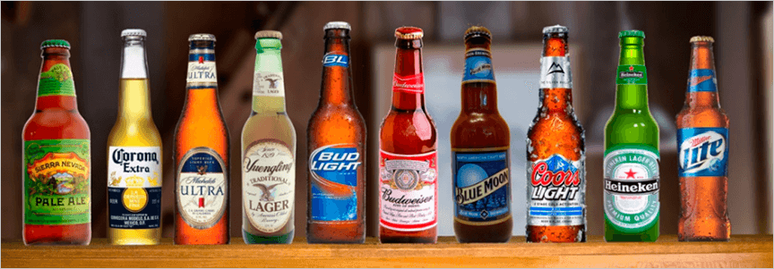
It's also important to use a font that will be instantly recognizable and familiar to the alcohol company's history. It allows for the company's distinctive graphic features to be highlighted and captured.
In his book "On Type," Erik Spiekermann described the associations of certain typefaces with human emotions. He also compared type to a musical instrument, and its use to music. This approach leads to "dry," "semi-sweet," and "branded" typefaces. Choose one that tells the story of your company and product.
90% of brand judgments are based on color alone. Therefore, it's not worth evaluating shades based on "good/bad" or "like/dislike" principles. Decisions based on how the color is perceived by consumers, as well as how the product looks on the shelf and how it stands out from the competition, will be more effective.
Choose shades based on their suitability for the product. Collecting customer feedback, conducting A/B testing with the question, "Is this color right for my product?" and predicting the outcome will help you choose the right color.
But what if you want to stand out? Follow these principles :
 The color must match the product.
 It must demonstrate the uniqueness of the brand.
 The hue should appeal to the audience. For example, according to research, men's favorite colors are blue, green, and black, while women's favorite colors are blue, green, and purple.
WeLoveBrands experts recommend choosing a minimalist design with contrasting elements: black with red, and blue with orange. These accents will help you stand out from other brands' bottles. Moreover, neutral tones—black, white, and gray—are often used in label and logo designs for spirits brands, paired with pastel beige, cream, and pale blue. This is a great opportunity to express your boldness and stand out.
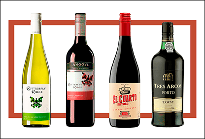
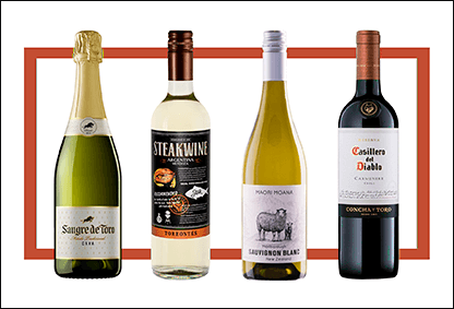
In addition to the psychology of color perception and "opposition" to a competitor, it's important to consider the specifics of bottling and storing alcohol. For example, wine is traditionally sold in blue, dark green, pink, yellow, and light green bottles.
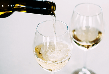
Red wines are sold in dark green bottles to block sunlight and prevent oxidation. White wines are sold in clear bottles or pale-colored glass, as they are consumed quickly and oxidation is less of a concern. The logo and unique label design are developed accordingly.
Animal images are quite common on alcoholic beverage labels. For example, the legendaryBacardílogo features a bat, suggested by the founder's wife after seeing bats under the distillery's roof. The animal image proved to be a winning choice for three reasons.
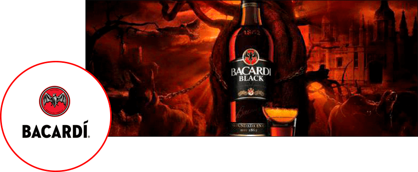
Bats pollinate the sugarcane crop—the main ingredient in rum—and also destroy pests. Furthermore, bats are a symbol of good luck in Latin American countries. Finally, most rum consumers at the brand's inception couldn't read. However, they remembered the bat well and later eagerly ordered "el ron del murciélago" (rum of the bat).
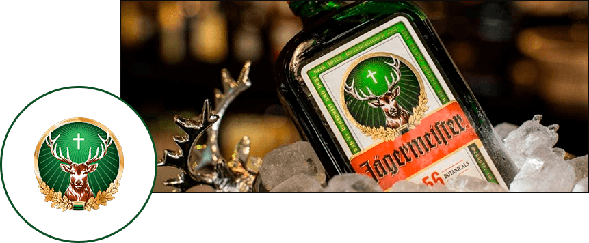
Kurt Mast, the creator of Jägermeister liqueur , chose the name and logo based on his personal hobby: he was an avid hunter. Furthermore, the "Jägermeister" and its stag with a cross in its antlers clearly reference religious themes. It also features a clever play on words: the phrase "Oh dear God," often uttered after several servings of a good liqueur, sounds similar to the word "deer."
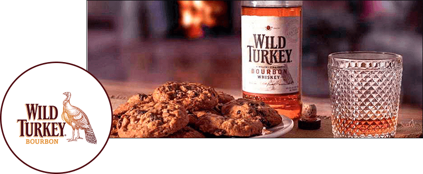
The story of Wild Turkey bourbon began among a close circle of friends. One day, Thomas McCarthy, a distillery manager, went wild turkey hunting with friends. He took along several sample bourbons, 50.5% ABV. The men liked the drink so much that they later asked for "wild turkey bourbon." Thus, the liqueur with the bird on the label was born.
It's believed that the more refined the alcohol, the more formal and classic the label and logo will be. A well-known, venerable product needs no proof—producers have long since established its taste, nobility, and advantages. In this case, a conservative, minimalist, and classic logo design is appropriate. This design is typical, for example, of Old World wines.
But what if you want to stand out, break with tradition, and still be just as successful? In that case, you could redesign the bottle packaging, create a burlap label, or add a vintage seal. Wine packaging, for example, could be designed as a folded grape leaf with the company logo.
Branding agencies have talked about minimalism before, and they'll talk about it again and again. But what can you do with alcohol, other than simplify? The answer is simple: experiment.
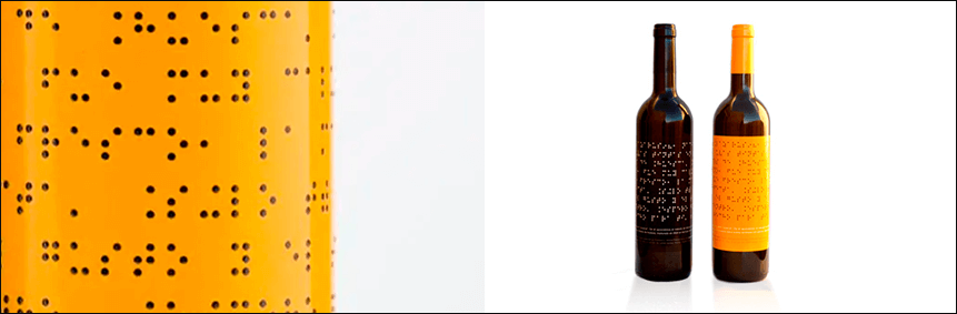
The founder of the Spanish company Lazarus Wine realized that visually impaired people couldn't access the information on wine bottles. So, he created labels with Braille instead of the usual printed text. A similar principle could be applied to logo design.
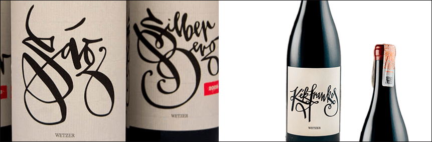
Wine labels featuring a calligraphic font, produced by the home-based winery Péter Wetzer, are perfectly suited to a craft product. The font complements the company's handmade concept.
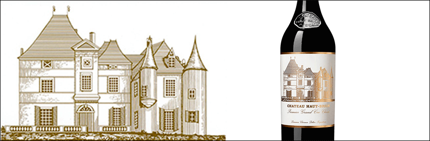
The French winery Chateau Haut-Brion has been producing this product since the 16th century. For many years, the company has used a schematic representation of the building and grounds of the estate where the chateau is located on its label. This approach would be appropriate for other types of alcohol as well.
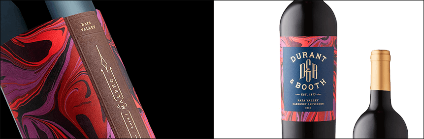
This has been a popular trend for the past few years. It would look great in logos and label designs for wine, champagne, and martinis. Wine brand Durant & Booth combined splatter patterns with book covers. For each wine, the brand designers created a unique pattern with a unique color scheme.
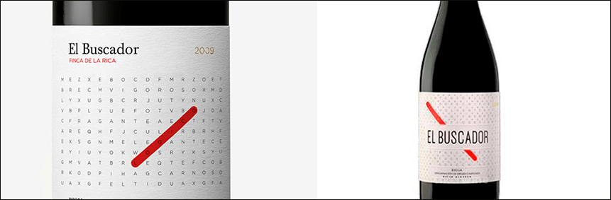
Who said you forget about the alcohol label as soon as you uncork the bottle? Spanish winemaker El Buscador fills its branded labels with... word searches.
Bottles of Ukrainian Monte Cote feature cute cats. The label uses contrasts to prevent the silver animals from stealing the spotlight. The dominant feature is the brand name, displayed in bold, sans-serif fonts in bright colors.
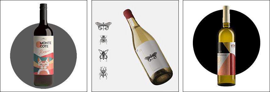
Bottles of wine from the Prince Trubetskoy winery are easily recognizable by their coat of arms and calligraphic fonts. The minimalist logo of Vinoman, the first licensed winery in northern Ukraine, is complemented by the bold calligraphic inscription "natural wine." The logo also features a graphic element of the joined Latin letters "V" and "M," while the labels feature images of insects, seemingly hand-drawn.
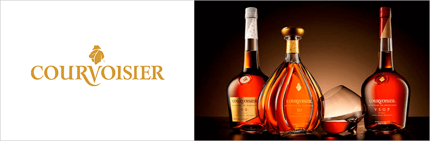
The history of the Courvoisier logo is as unusual as what inspired the Frenchmen Emmanuel Courvoisier and Louis Galois to abandon the wine trade for a stronger spirit. Rumor has it that Napoleon I once visited a friend's wine shop and later, on long voyages, took barrels of cognac from another manufacturer with him. The officers guarding him enjoyed the drink so much that they nicknamed it "Napoleon's brandy." Félix Courvoisier and Jules Galois, sons Emmanuel and Louis, changed the direction of their business and began producing cognac. Napoleon's story is reflected in the Courvoisier logo.
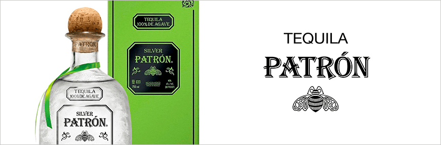
The Patron blue agave tequila logo features a simple serif font and a detailed bumblebee image.
The logo of Moët & Chandon, Claude Moët's elite champagne house, features a crown and minimalist font. Despite the label's simple design, the brand still supplies the court of Queen Elizabeth II. The brand sells 16 million bottles annually.

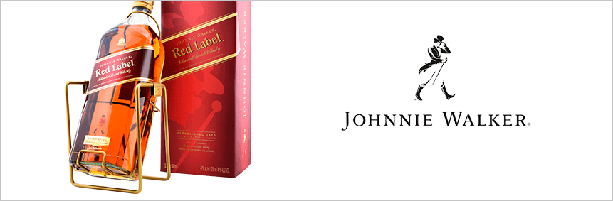
The logo for Johnnie Walker, a blended malt whisky created in 1867, features the eponymous lettering in a serif font. The emblem also features an image of a strolling human figure in three shades: white, black, and red.
Spanish wine producer Maquinon's wine labels, featuring a 3D logo, are adorned with comics featuring heavy use of robotic themes.
You can create a logo online, using apps and graphic editors. The advantage of this approach is its low cost, but without specialized knowledge, creating a good logo is impossible.
Companies most often trust the development of :
Freelancer
When to delegate:when a specialist has a portfolio of work in logo or alcohol label design. You can find a contractor through their work or website, or by posting a job posting on job boards.
The downside of collaboration:the work requires a clearly defined task, a description of the product's uniqueness, and details about the target audience and competitors. A freelancer won't always dig deep, so the analysis often falls to the client.
Design studios
When to delegate development:when an effective result is needed. Design studio specialists always stay on top of trends, monitor best practices in the niche, and possess knowledge of bottle design and casting technologies. They generate ideas, develop concepts, and create original logos for alcoholic beverages.
The downside of working with a company:the service will cost more than freelancing. However, before starting work, designers at companies research the market, business specifics, competitors, and target audience needs to ensure you receive a high-quality brand identity.
Alcohol logo design has its own set of rules—regarding information placement on the label, language overlay, color intensity, and so on. Therefore, to achieve a logo that evokes interest and trust, it's best to entrust its development to experienced designers. In vino veritas.
For a logo that draws people in and encourages them to pick up a product from the shelf, contact WeLoveBrands . We design logos from scratch and rebrand existing ones. For a consultation, call us or submit a request on our website.