Receive a presentation of services and expert advice
The best experts in the industry will oversee your brand development process.
→ Need branding, design, or creative solutions? Call us at +48 505 648 022 or message us on WhatsApp.
 WeLoveBrands.pptx

The best experts in the industry will oversee your brand development process.
A logistics company's logo is its visual identity and image. To showcase the benefits of cargo delivery, engage consumers, and build trust and loyalty, the logo must be striking and memorable.
Nowadays, logos featuring trucks and arrows are nothing new – there are plenty of them, and they all blur together in the eyes of consumers. To stand out from the competition (and competition in this market is quite intense), you need a simple, yet striking and attractive brand identity. How do you create one? Let's look at it in this article.
 Indicates the type of business. A consumer understands the company's business at a glance. The logo reflects the business's personality and communicates the benefits the customer will receive.
 It builds a company's image. A successful logo is quickly remembered and becomes associated with your company. If it highlights advantages, such as speed or reliability of transportation, consumer trust will increase and the company's reputation will be strengthened.
 Distinguishing a brand from its competitors is crucial. A logo can be an effective way to differentiate yourself from competing companies. To achieve this, you need to create a simple yet compelling symbol that attracts attention, is easy to remember, and creates the desired image in consumers' minds.
 Promotes services. A key feature of transport companies is that their logos appear on a variety of media—from business cards and souvenirs to websites and trucks. A customer may not need freight transportation yet, but seeing a vehicle with a distinctive logo will make them remember it and, when the time comes, they'll know who to contact.
A good logo is one that informs, attracts, and inspires trust. It not only reflects the company's operations but also looks equally aesthetically pleasing on paper, digitally, and on vehicles.
Freight transportation is all about speed, reliability, and stability, so it's best to create a modern and vibrant logo for a transport company. It's also important to consider the nuances of the business and the desired impression on consumers.
Depending on the logistics company's field of activity and the services it provides, the logo design may differ.
So, if we're talking about a company that transports goods over any distance to any country and handles customs clearance, its "international" identity should be highlighted in the logo. Similarly, if the company exclusively transports cars and partners with manufacturers and dealerships, or organizes the transportation of hazardous and toxic goods.
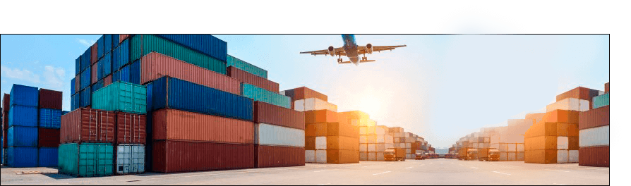
Some companies offer a full range of services for storing and transporting any type of cargo to any location worldwide, while others transport small loads within a single country and focus more on domestic relocations than industrial needs. All of these characteristics are closely tied to the needs of your audience and the pain points you can alleviate. These are your key advantages, which should form the basis of your logo.
It's important for a transport company to convey its message and values to consumers. This message is conveyed in the logo through various icons, thematic images, and color schemes. For example, when wanting to convey the speed of cargo delivery, companies often use arrows and a clock.
To stand out from the competition and attract consumer attention, you need to study other companies' logos and choose something unique. If your competitors use images of vehicles to represent their business (trucks, cars, ships, airplanes), you can play with these visual images, enhancing them with a special feature, or choose a different solution. For example, take a truck logo and transform it into a lion, symbolizing speed, leadership, and dynamism.
When transporting toxic cargo, the logo most often includes special symbols indicating danger (fire, exclamation mark, radiation symbol, lightning, skull, etc.) and uses characteristic colors (red, yellow, orange).
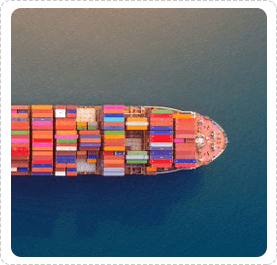

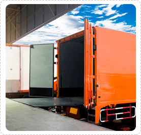
If a transport company specializes in office and home relocation, then the logo could be based on images of furniture, various types of premises, and modes of transport. If it organizes the delivery of building materials and goods for industrial enterprises, then this feature could be reflected in the emblem.
When designing a logo for a logistics company, it's important to consider that the symbol will be applied to small items and large vehicles, so it must be clear, legible at various sizes, and easily visible from a distance. Since the surface on which the logo is applied will not always be smooth, it's best to avoid using small details in the logo to avoid distortion.
To attract consumers, it's not enough to just show what a company does. People need to be told a story. This can be done through various icons, shapes, colors, and design elements.
Icons are understandable in any language, they catch the eye, facilitate information comprehension, and make the logo memorable. You can choose themed images from specialized resources, but then there's no guarantee that a similar image won't appear on another company's logo. Alternatively, you can develop an icon specifically for your business. This way, you'll get a unique and emotive image.

Icons for transport companies should emphasize the company's speed of delivery, reliability, and responsibility. These traits can be conveyed using images of trucks, clear lines, and arrows.
Color selection. A logistics company logo can be designed in any color associated with dynamism, technology, and progress. Typically, red, blue, orange, gray, and black are used.
But if you want to stand out, consider other options and choose unexpected color combinations. This approach works well if you don't have a corporate identity. If your company does have corporate colors, then they should be used in the logo.
To choose a shade, consider the psychological impact of different colors on people. For example, orange is considered invigorating and playful, red is energetic and life-affirming, yellow is cheerful and friendly, blue is associated with reliability and stability, and green is associated with eco-friendliness and harmony.
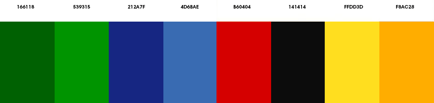
The optimal solution is considered to be the use of 2-3 colors, as well as black and white options.
If you're planning international shipping, learn the meaning of each color in different countries. This will help you avoid awkward situations and double meanings. For example, in Russia, white symbolizes purity and innocence, while in some Eastern cultures, it's the color of mourning.
It's best to avoid pink and lilac shades in transport company logos, as they connote softness and femininity, which aren't qualities that cargo companies should have. However, again, it's a matter of personal preference. If this color helps you showcase your unique personality and stand out from the competition, then you can play with it.
Symbols. The most popular elements in this field are arrows, lines, and clocks. They reflect the direction of the activity and advantages such as speed and dynamism.

When choosing a symbol, keep simplicity in mind. Since the logo will be applied to a variety of surfaces, it should be easily readable and visually appealing on all media.
For a stylish and recognizable logo, order one from WeLoveBrands. Our designers not only have a wealth of ideas but also extensive experience creating branding of various types and for any topic.




If you're lacking inspiration and ideas, seek professional help. Our designers know how to create a stylish and original logo that will stand out from the crowd, generate interest, and enhance your company's image. For a consultation, call us or chat on our website.
The world's best transport companies predominantly use font-based and combination logos. The design is often based on the company name or an abbreviation of the founders' names.
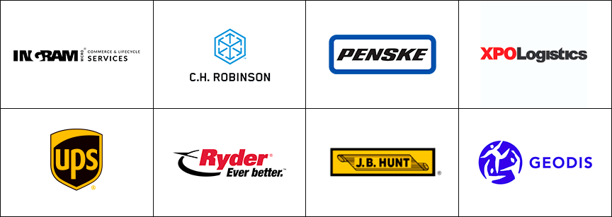
In the US, most logos are simple and straightforward. Some companies use symbols and icons, and the world-renowned logistics operator FedEx Express hid a hidden symbol in its logo—an arrow indicating high delivery speed. It's nestled in the space between the letters "E" and "x" in the second part of the word.
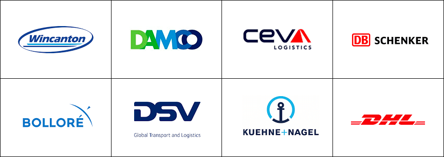
European countries typically favor laconic and understated logos that emphasize a company's reliability and status. However, colorful and unconventional designs are also common.

In Asian countries, red, blue, and orange are popular colors in logistics company logo designs. Logos typically consist of company names complemented by themed icons.
Logo design is a creative process that requires specific knowledge and skills. You can try creating one yourself using specialized resources that allow you to select icons for any topic.
But if you want a unique logo that will not only reflect your business and attract consumer attention, but also position your company in the market, revealing its values and enhancing its image, then it's best to avoid template solutions and familiar icons.
Yes, ordering a custom logo from a designer will cost more than creating it yourself, but the results are worth it.
When choosing between a freelancer and an agency, you don't risk paying money and ending up with nothing. Studios typically employ a team of professionals who know their craft.
This doesn't mean freelancers can't create a high-quality logo, but finding a competent and responsible person is still a challenge. And as practice shows, clients often encounter either novice designers who need to practice their skills, busy experienced designers who are consequently faced with tight deadlines, or people who promise a lot for a small fee but then deliver subpar designs.
For this reason, we recommend hiring a studio or agency to create your logo. You'll be offered several pricing packages, each offering a specific number of logo designs with the right to make revisions within a specified timeframe. This means you'll clearly understand what you're paying for and how much.
WeLoveBrands Studio will develop an emotionally engaging and recognizable logo or character for your logistics company.
If you're still unsure, you can ask our designer any questions and receive a detailed consultation. To do this, please contact us in any way convenient for you – by phone or online chat.